To make a photo look cinematic in Lightroom, you shape the light first, then grade the color, then finish with grain, vignette and a wide crop. Once you know the order of operations it takes about 20 to 30 minutes per image, and it works on any RAW or JPEG file in both desktop and mobile Lightroom.
There is no single “cinematic” recipe, and that is worth saying up front. What reads as cinematic is mostly a set of repeated habits: controlled contrast, a limited color palette, deliberate shadows and an image that was cropped and framed with a story in mind. Sliders are the last part of that, not the first.
This guide walks the full workflow in the order that keeps results repeatable, with the slider ranges photographers actually use rather than a single magic number. If you have never graded an image before, follow it top to bottom once and the sequence will make sense fast.
Table of Contents
- What You Need to Make a Photo Look Cinematic in Lightroom
- Step-by-Step
- Set a Cinematic Foundation with Exposure and Contrast
- Shape the Light with Curves and Tone Controls for a Cinematic Look
- Add a Consistent Color Grade
- Create Depth with Texture, Clarity, and Dehaze
- Use Local Adjustments for Selective Color and Light
- Add Finishing Touches with Grain and Vignetting
- Review the Result and Create a Consistent Preset
- Common Mistakes
- Frequently Asked Questions
- Is there a cinematic preset built into Lightroom?
- How do I make my photos look like film in Lightroom?
- Can you make a photo look cinematic in Lightroom mobile?
- What is the cinematic look in photography?
- How long does a cinematic edit take in Lightroom?
What You Need to Make a Photo Look Cinematic in Lightroom
Before you touch a single slider, set yourself up so the decisions you make on screen transfer to other screens. Most disappointing cinematic edits are display problems, not grading problems.
- A consistent display. Set monitor brightness to match the light in the room you are editing in, usually somewhere between 80 and 100 percent of full output. Grade in the same lighting every session if you build a look you want to repeat.
- A chosen camera profile. In the Profile Browser, pick Adobe Color, Neutral or a manufacturer profile on purpose rather than leaving it on whatever loaded last. Adobe Color keeps more saturation headroom for grading.
- The Develop module panels you will use. Basic, Tone Curve, Color Mixer, Color Grading, Calibration, Effects, Detail and masking tools, all on the right-hand side.
- Comparison views. The backslash key holds the before image and Y shows a side-by-side split. Use them constantly instead of guessing from memory.
- The histogram, switched on. It tells you when shadows are crushed and highlights are clipped, which your eyes cannot judge on a bright screen.
- A subject worth grading. Light falling across a face or a street with depth reads as cinematic. A flat, evenly lit wall of concrete will stay flat no matter what you do to it.
Step-by-Step
The order matters because each stage changes what the next one can do. Light first, because grading a badly exposed image just makes a bad problem more colorful. Curves second, because they set the contrast you will build color on top of. Color third, detail fourth, local adjustments fifth, and finishing effects last, when you can see whether the image still needs them.
Set a Cinematic Foundation with Exposure and Contrast
Open in the Basic panel and get the brightness honest first. Set Exposure so the histogram sits comfortably left of the right edge, then pull Highlights down until bright windows or skies hold detail. Shadows come up afterward, in small passes, because lifting them too early flattens the depth you are trying to build.
Then handle Whites and Blacks. Dropping Whites until the brightest areas stop clipping and pushing Blacks down toward -30 to -50 gives the punchy contrast most movie frames have. A lot of people on r/Lightroom do the opposite, dropping Contrast to -40 first and then rebuilding punch through the tone curve, which gives a smoother result because the curve shapes the transition instead of clipping it.
Whichever route you take, check the histogram. Shadows touching the left wall means lost detail, and that is what makes an edit look cheap and over-processed.
Shape the Light with Curves and Tone Controls for a Cinematic Look
The tone curve is where cinematic contrast actually comes from. Select the point in the lower shadows and drag it up slightly to lift blacks into a soft, faded film look, then select a point just above the midtones and drag it down a touch to deepen the shadows without touching pure black. The result is an S-curve: lifted foot, firm middle, controlled top.
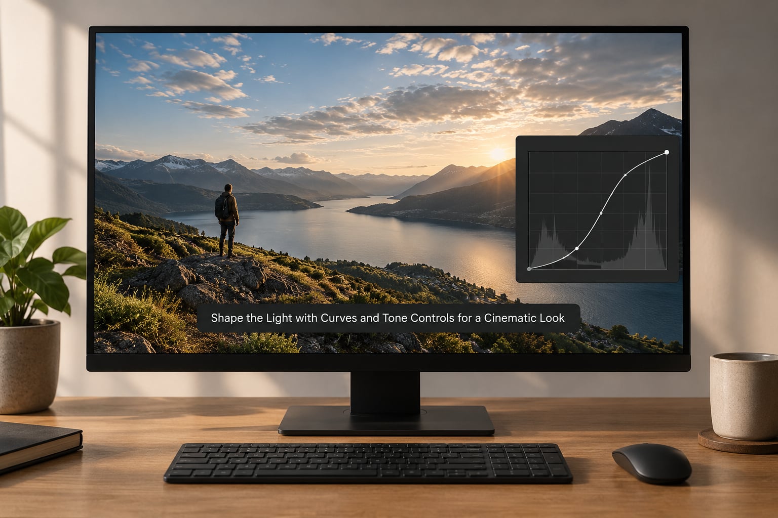
Read the curve after every drag. A proper S-curve has a steeper slope through the midtones and gentler ends, and it should never dip downward, because that inverts local contrast and makes skin look strange.
Tone controls handle what the curve handles badly. Shadows at -15 to -30 deepen the lower half, Highlights at -10 to -20 tame the upper half, and Midtones decide the overall mood. Push Midtones negative for something cold and heavy, positive for a warmer, softer frame. Many photographers also drop Clarity here rather than in the Presence panel, since it affects only the tone range you are working in.
Add a Consistent Color Grade
Fix the white balance before you grade. Use the Temp eyedropper on a neutral surface, nudge Tint until skin looks right, and stop. Pinning the white balance across a series is the single easiest way to make a set feel like one shoot rather than ten different afternoons.
Then add restrained saturation in the Basic panel, usually Vibrance around +10 to +20, before moving to the Color Grading panel. Shadows toward teal and highlights toward a warm amber is the classic pairing, and it works because they sit opposite each other on the color wheel, so your eye separates subject from background without you touching clarity. Keep the three wheels in balance: strong shadows, gentler midtones, strongest highlights. If skin turns orange or green, pull the midtone wheel back toward neutral, since that is where skin lives.
Two smaller moves help. The Calibration panel, often overlooked, shifts shadow, midtone and highlight response separately and changes the character of the color rather than its hue, so try small moves there before pushing vibrance. In the Color Mixer, nudging orange and yellow saturation down by around -10 keeps skin from going neon, and pulling blue saturation down slightly is a quick way to stop skies turning purple.
Create Depth with Texture, Clarity, and Dehaze
Detail and Presence are separate tools and they behave differently. Texture works on small-scale detail, so raising it makes an image look sharper and more tactile. Clarity works on mid-scale contrast, so lowering it gives the softer, dreamier finish most people mean when they say cinematic. Dehaze controls haze, adding depth and atmosphere when you raise it, and pulling atmosphere out of a flat scene when you lower it.
Typical starting ranges run Texture between -10 and +15, Clarity between -10 and -25, and Dehaze between +5 and +15. Anything past -30 on clarity starts looking out of focus, and heavy positive dehaze creates crunchy halos along high-contrast edges. If the image needs more bite after you reduce clarity, add a little more curvature in the tone curve rather than cranking clarity back up.
These three controls are global by default, which is why they age a whole image at once. Mask them when you want the effect in one place: dehaze on the far background for atmosphere, clarity left alone on a face. That single change is the difference between a graded photo and a photo that looks filtered.
Use Local Adjustments for Selective Color and Light
Global grading treats the sky, the pavement and the subject as one thing. Local adjustments let you treat them separately, and they are what separate a good cinematic edit from a heavy-handed one.
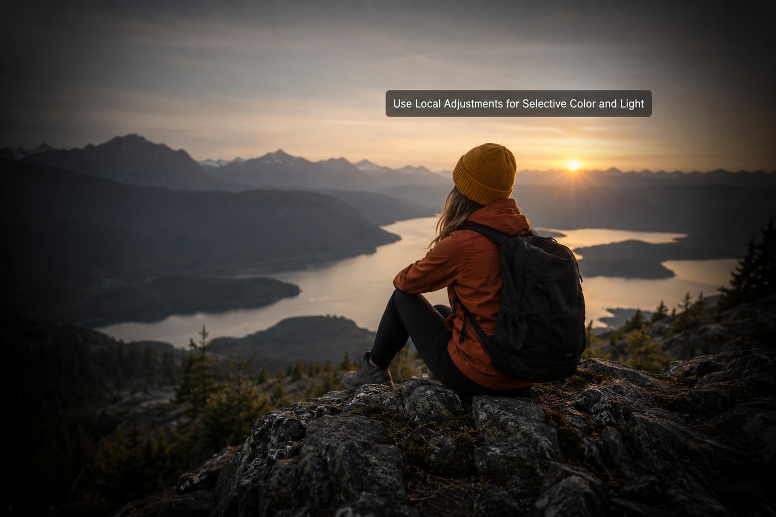
A few patterns cover most images. Brush a slight exposure drop over the edges and corners to darken the surroundings and direct attention to your subject. Brush a small amount of warmth onto skin if the grade left it cool. Paint dehaze onto the background of a distant view so depth builds from front to back, and use a Color Mixer mask to pull saturation out of a single distracting object such as a road sign or a bin. Eyedropper masks on skies and hair speed all of this up, and AI masking in recent Lightroom versions does most of the selection for you.
Keep local moves subtle. If you can see the brush edge at full size, the correction is too strong. Build it up in two or three passes instead of one.
Add Finishing Touches with Grain and Vignetting
Two effects do most of the work here. Grain breaks up the perfectly smooth gradients that make digital images look synthetic, so start around Amount 15 to 40, Size 25 to 50 and Roughness 50 to 70, then zoom to 100 percent and check that it reads as texture rather than dirt. Grain should be coarser in the shadows and finer in highlights on many film stocks, so a radial mask with exposure dropped a little is a reasonable approximation if you want to go further.
For the vignette, use the Post-Crop Vignetting panel and keep Midpoint near 40 to 60 with Amount around -20 to -35. If the effect looks too obviously applied, brush a custom vignette instead: darken the corners in an Exposure adjustment, drop Exposure to -100, then raise it to around -40 and pull it back in with the brush edges.
Crop last. Widescreen ratios such as 2.35:1 and 16:9 read as cinematic because they borrow from film, and they force you to commit to a composition. Leave a little room above and below when you shoot so the crop does not cut into faces.
Review the Result and Create a Consistent Preset
Now do the part most people skip. Hold the backslash key to see the original, then toggle back and check for edits that only exist because of the previous step: a face that got too dark, a sky that lost its cloud detail, saturation that climbed too far. Check the image at 100 percent for halos and brush edges, then shrink it in the grid, because a vignette that looks fine large often looks heavy small.
If the workflow held together, save it as a preset. Start with a name that describes the look, not the photo, and remember what each slider does, because a preset you cannot explain is a preset you cannot fix on the next image. Apply it as a starting point, then correct exposure and white balance per photo. For a series, sync the settings across selected images and use the Sync module to push the same graded version everywhere.
Common Mistakes
Most failed cinematic edits share the same causes, and each one has a straightforward correction.
1. Pushing orange and teal until skin turns orange. Complementary color grading only works when skin stays near neutral. Pull the midtone wheel back toward neutral, and if that is not enough, mask the skin and drop orange saturation by around -10 there.
2. Crushing blacks until shadows turn to solid blocks. Watch the histogram and keep the shadow edge just off the left wall. If detail is gone, lift the curve foot instead of leaving it clipped.
3. Blown highlights. Lower Highlights before anything else, and remember that pulling clarity down can reveal clipping you missed. Highlights are easier to recover in a RAW file than you think.
4. Too much clarity. Past about -25, faces start to look greasy and edges get crunchy. Recover the contrast you removed with curvature on the tone curve instead.
5. Halos around masked edges. Raise the mask feathering and drop the adjustment strength. A halo you can see at 100 percent will be obvious on a full-screen display.
6. Applying the same preset to every photo. Presets assume a similar exposure and white balance. Fix the basics per image first, then apply the preset as a starting point, and correct after. This is why a series can look cohesive even though nothing was identical.
7. Forgetting what “cinematic” means for the picture. Mood, contrast and a deliberate palette help, but a flat composition with no subject and no depth will still read as flat. If a frame does not tell you anything, grading cannot fix it. Shoot with a focal length that isolates your subject and leave negative space for the crop.
One last habit worth keeping: edit one image at a time, not in batches of sliders. Do the whole sequence on the first photo, then look at five photos from the same session together. The pattern you want will show up in the group, not in the single frame.
Frequently Asked Questions
Is there a cinematic preset built into Lightroom?
Lightroom does not ship with a preset officially called cinematic. What it offers are legacy presets plus free Adobe and camera-manufacturer profiles such as Adobe Color and Neutral, and they give you a clean, contrasty base rather than a movie look. Build your own from the steps above, then save it as a preset so it appears in your preset panel.
How do I make my photos look like film in Lightroom?
Film looks come from four things: a fixed white balance, an S-curve with slightly lifted blacks, restrained saturation with warm highlights, and visible grain. Add a subtle vignette and a 2.35:1 crop and the resemblance strengthens further. Emulating a specific stock, such as a warm gold tone or a cooler portrait film, is easier in the Color Mixer and Color Grading panels than through a one-click preset.
Can you make a photo look cinematic in Lightroom mobile?
Yes, with a few limits. Lightroom mobile has Basic, Tone Curve, Color Mixer, Color Grading, Calibration and Effects panels, plus masking and brush tools, so most of the workflow above works on a phone or tablet. Desktop-only extras include finer masking controls, higher bit-depth export and faster batch syncing across a large set.
What is the cinematic look in photography?
There is no official definition, and anyone who tells you otherwise is selling something. In practice it means controlled contrast, a limited and deliberate color palette, shadows that hold shape, a subject that separates from its background, and finishing touches such as grain, vignette and a widescreen crop. Composition and light matter far more than any single slider.
How long does a cinematic edit take in Lightroom?
Budget 20 to 30 minutes for a full grade on desktop once you know the workflow, and closer to 45 minutes for your first few. Skipping masks or the review pass takes about 10 minutes and usually leaves the image looking generic. If you only want a quick result, grade one hero image properly and use it as the reference for the rest of the set.
If you only remember one thing, do this: pick your photo, set exposure and whites and blacks honestly, then stop and look. Most images that read as cinematic fail on light, not color.
Once the light is right, work down the steps in order and save the result as a preset you can explain. After a handful of photos the sequence becomes muscle memory, and the whole grade drops closer to 15 minutes.