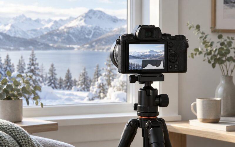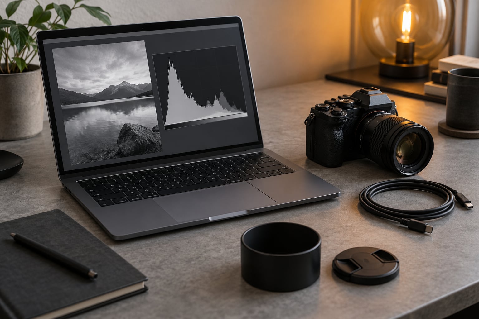
A photographic histogram is a bar graph that shows the distribution of tones in your image, running from pure black on the left to pure white on the right, with each bar’s height showing how many pixels sit at that brightness level. Knowing how to read a histogram takes about thirty seconds, and it is the fastest way to know whether you just lost detail to blown highlights or crushed shadows.
Most beginners get lost because they were told a good histogram looks like a mountain in the middle. That is only half true. The mountain shape describes a low-contrast scene, not a correct exposure. What actually matters is what sits at the two edges and whether the picture you wanted is still in there.
Table of Contents
- What You Need
- Step-by-Step: How to Read a Histogram
- 1. Turn On the Histogram
- 2. Understand the Axes
- 3. Recognize a Balanced Exposure
- 4. Spot Clipped Shadows and Highlights
- 5. Adjust Your Camera Settings
- 6. Check the Result in the Final Image
- Common Histogram Shapes and What They Mean
- Common Mistakes
- Tips for Using Histograms in Different Shooting Conditions
- Frequently Asked Questions
- How should a good histogram look?
- When not to use a histogram?
- Does white balance change the histogram?
- Should I shoot RAW or JPEG to judge exposure?
- Why does my camera screen look brighter than the histogram suggests?
- Conclusion
What You Need
You already own everything required. There is no accessory, add-on filter or app purchase involved in learning how to read a histogram.
- A camera with a histogram option enabled in the shooting display. Most mirrorless and DSLR bodies have it in the menu.
- Either the rear screen or an electronic viewfinder, depending on the model. Some cameras show a live histogram that updates as you change settings.
- An editing program with a histogram panel for the checks you cannot do before the shot, most commonly the Levels panel in Lightroom or the Histogram panel in Photoshop.
Where the menu lives is the only part that changes from brand to brand. Everything else about reading the graph is identical across cameras.
Step-by-Step: How to Read a Histogram
1. Turn On the Histogram
The graph is hidden by default on most cameras, usually because manufacturers expect you to use the exposure bar instead. Menu names shift between models, so treat these as close approximations and check your own manual for the exact path.
On Canon EOS bodies, hit the Info button to cycle display options, or open Menu, then Tab icons, then Shooting menu, then Histogram grid, and set it to Brightness. Canon’s newer mirrorless models also carry a Histogram Assist grid overlay for Live View.
On Nikon, press the Info button to add the histogram to the shooting display, or set Display menus, then Monitor settings, then Viewfinder display, then Histogram. Older bodies place the option under a Custom setting instead.
On Sony, hit the DISP button until the histogram appears, or use Menu, then Network, then Display, then Monitor, then Histogram Display. Most recent Alpha bodies sit on the same menu path.
On Fujifilm, go to Menu, then Setup, then Screen Display, then Viewfinder, then Brightness, and pick Histogram. The X-T and GFX lines also let you assign the graph to a function button for one-touch access.
Whichever brand you use, look for the display in Live View as well as on playback. The live histogram updates before you press the shutter, which is the whole point.
2. Understand the Axes
Two axes carry the meaning, and they are easy to mix up.
- The horizontal axis runs from left to right and represents brightness, from tonal value 0 for pure black to 255 for pure white. In editing software this is often labelled in exposure stops instead.
- The vertical axis shows pixel frequency. A tall bar means a lot of pixels share that exact brightness; a flat bar means few do.
That vertical scale is why a tiny area of the frame, such as a clipped sky, can produce a spike nearly as tall as the midtones. The graph counts pixels, not square centimetres. One click of the shutter and you can see exactly how the picture distributes itself across those 256 brightness values.
3. Recognize a Balanced Exposure
A broadly distributed graph with data spread across the range and clear space before both edges usually signals a balanced exposure with detail in the shadows and highlights intact.
Here is the honest caveat: the histogram tells you what the sensor recorded, not whether the picture works. A wedding couple backlit at sunset may need a silhouette, and a deliberately dark interior might be exactly the mood you wanted. The graph is evidence, and you are the judge.
4. Spot Clipped Shadows and Highlights
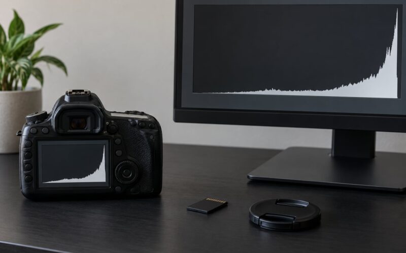
Clipping happens when a large block of pixels piles against the far left or far right edge. Those pixels have hit 0 or 255 and stopped recording detail. You cannot pull them back in editing.
Data jammed against the left edge means crushed blacks. Shadows have merged into solid black and texture is gone. Data jammed against the right edge means blown highlights. Bright areas have merged into flat white.
Turn on your camera’s warnings and they save you hunting for the offending area. Blinkies, called highlight alert on Nikon, flash any pixel that has reached white. Zebra stripes cover anything approaching a set brightness threshold, which is your early warning before true clipping.
One detail most guides skip: a clean luminance histogram does not mean a clean file. Switch to the RGB histogram view and a colour channel can be clipped while the brightness graph still looks fine. That is how a pale blue sky turns chalky or a red sign goes flat orange, and only the channel view reveals it.
5. Adjust Your Camera Settings
When the graph leans hard to the left, your frame holds more shadow than the sensor can hold. Four levers move light into the picture, and you usually need only one.
- Raise the shutter speed. A full stop or two halves the light and often solves a backlit face instantly.
- Widen the aperture. Going from f/5.6 to f/2.8 adds roughly two stops and blurs the background as a bonus.
- Raise the ISO. Each full stop doubles sensitivity. Modern sensors handle it far better than the reputation suggests, so this is the least embarrassing option.
- Add light or reframe. A reflector, a flash, or moving to shade beats any setting change when the light is simply going the wrong way.
If the graph is crowded left with detail still intact on both sides, that is a contrasty scene your sensor cannot fully hold. A graduated neutral density filter on the sky, or bracketed frames merged later, will preserve what a single frame cannot.
Leave it alone when the darkness is intentional. High-key, low-key and silhouette work all show graphs that look wrong against the mountain rule and look completely right in the finished picture.
6. Check the Result in the Final Image
The rear screen is not a calibrated monitor. In bright sun it dims itself, and at night most cameras crank the brightness to help you frame, which makes everything look brighter than it will print. An electronic viewfinder is no better for judging, since RAW data passes through several tone and colour conversions before display.
So use the histogram, not the screen, as the authority. Some cameras also conceal roughly a third of a stop of highlight headroom from the displayed graph, which is why a tiny sliver of warning there deserves more respect than it looks like it deserves.
Do the check again on playback, where the graph reflects the file you just wrote. Shoot RAW where you can, since clipped JPEG data is discarded at the moment of capture, while RAW keeps more room above the whites to recover in post.
Common Histogram Shapes and What They Mean
The table below maps each shape to its usual cause and the change most likely to help.
| Shape | What it usually means | Most useful next action |
|---|---|---|
| Balanced mountain | Low-contrast scene, detail away from both edges | Nothing to fix; confirm nothing touches either edge |
| Left-heavy, peaking off the left edge | Underexposed, shadow detail crushed | Add roughly a stop: shutter speed, aperture, ISO or light |
| Right-heavy, touching the right edge | Overexposed, highlights blown | Remove roughly a stop and watch for meter flicker |
| Narrow spike in the middle | Flat, hazy light with a small tonal range | Fine as is; look for added contrast later in post |
| Bimodal, two humps apart | High contrast, subject and bright background | Expose for the subject and recover shadows, or bracket frames |
| Data touching both edges | Range wider than the sensor can hold | Bracket, use a graduated filter, or move to a softer hour |
Common Mistakes
- Treating the histogram as a brightness meter. It has no correct middle. A foggy morning and a hard noon shot can both be perfectly exposed with wildly different shapes.
- Assuming anything at the left edge means underexposure. Black clothing, a dark subject and low-key portraits pile pixels there on purpose.
- Panicking about the right edge when clipping is the look you wanted. Blown street lamps and blown sky in a silhouette rarely hurt the photograph.
- Judging exposure on an overly bright rear screen at night, then wondering why the file looks flat and grey.
- Reading the graph without looking at the scene. The numbers describe the data; only your eye says whether that data is the picture you came for.
Tips for Using Histograms in Different Shooting Conditions
Backlight is where the graph earns its keep. Meter for the face, watch for shadows piled against the left edge, and open up until the face clears the crushed zone.
Snow and bright sand fool meters badly. The camera sees a white field, darkens the exposure, and the histogram slides left while your snow turns grey. Dial in positive exposure compensation until the right edge nears but does not touch white.
A black subject on a dark background is the mirror case. The graph hugs the left, the meter wants to brighten it, and brightening turns the subject into a grey blob. Protect the separation between subject and background instead of chasing a mountain shape.
Portraits put most of the picture in the midtones, so a graph with a healthy hump around the centre third and no edge clipping is usually right, whatever the scene looks like on the screen.
One debated technique is exposing to the right, pushing the graph as far right as possible without touching the edge, then pulling brightness back in editing. With RAW it can recover shadow noise and a small amount of highlight detail. The gains are marginal on modern sensors and the clipping risk is real, so it suits RAW shooters working in flat light, not fast-moving scenes.
White balance shifts the graph too. A warmer white balance nudges tones right and a cooler one nudges them left, which is why the histogram moves a little between frames even when nothing else changed.
If you shoot video, the same idea scales up. A waveform monitor replaces the histogram for exposure and a vectorscope replaces the RGB view for colour and skin tone. Once you are comfortable clipping and midtones here, that jump is short.
For anyone printing, check the file histogram in the editor before it leaves your hands, and calibrate the monitor you are judging on. A monitor off by a stop puts your carefully protected midtones at risk on paper.
Frequently Asked Questions
How should a good histogram look?
A good histogram spreads data across the tonal range with visible space before the left and right edges, so nothing is clipped. It does not have to form a mountain in the middle. Judge it against the scene you shot: a foggy morning produces a narrow hump, a backlit portrait produces two humps, and both can be correct.
When not to use a histogram?
Skip it when the clipping is deliberate, such as high-key white backgrounds, low-key interiors or silhouettes against a blown sky. Also ignore it when white balance is doing the work, since warm and cool settings shift the graph without changing exposure. Shoot JPEG and the graph reflects a finished file with less recoverable data, so RAW gives you a more honest read.
Does white balance change the histogram?
Yes. A warmer white balance pushes tones to the right and a cooler one pulls them left, because the camera renders colour temperature as a shift along the brightness axis. The exposure itself has not changed, so if your graph moves when you adjust white balance, that is normal. Judge exposure with white balance set, and do not compensate twice.
Should I shoot RAW or JPEG to judge exposure?
Shoot RAW whenever you can. A JPEG histogram shows a finished file where clipped detail has already been discarded and the camera has applied its own contrast curve. A RAW histogram shows the data the sensor actually captured, including a little headroom above white that a JPEG file throws away. JPEG is fine when you are shooting straight to final output.
Why does my camera screen look brighter than the histogram suggests?
Most cameras adjust rear screen brightness automatically, dimming it in bright sun and boosting it in the dark, and electronic viewfinders apply their own tone curve on top of that. RAW data also passes through conversions before display. So trust the graph over the screen. Some cameras additionally hide about a third of a stop of highlight headroom on the right edge.
Conclusion
Check the far left and far right edges first, every time. Data piled against either one means detail you cannot get back, and no amount of editing fixes it. If both edges are clear, read the shape against the scene you actually shot and decide whether the exposure matched your intent. Adjust one setting, take another look, and move on. Once that habit is automatic, knowing how to read a histogram stops being a technique you look up and becomes something you glance at between frames.