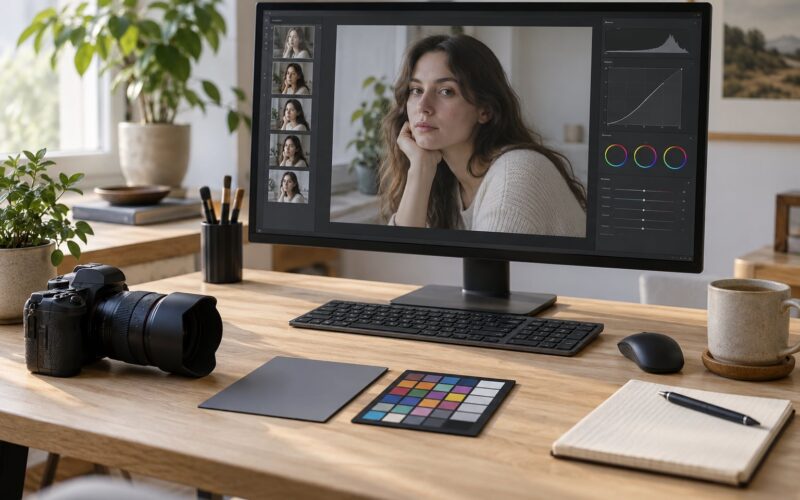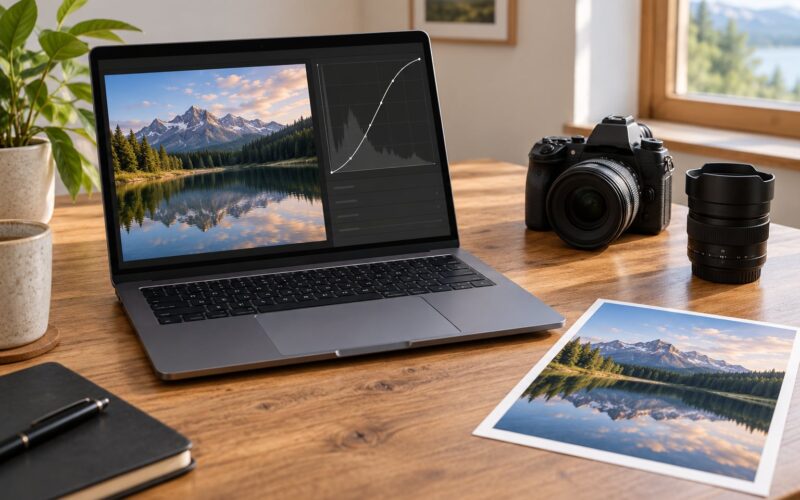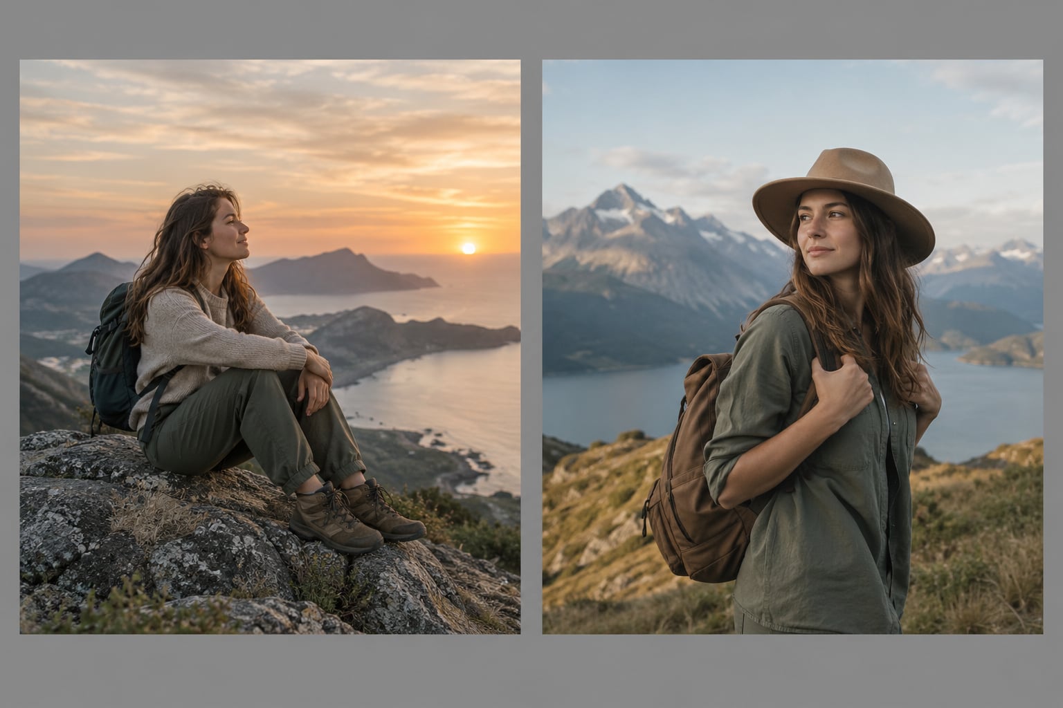
To make a composite look believable, you match the things a camera records: perspective and camera height, scale, light direction and quality, colour temperature, edges, depth of field and grain. Anyone can paste a person into a beach scene. Keeping it believable comes down to nine checks in a fixed order.
I have shot, retouched and critiqued enough composites to know where the eye catches a lie. It is almost never the masking skill. It is the brightness, the angle, or the shadow under the subject’s feet that give it away in under two seconds.
Here is the short version before we go into detail:
- Photograph the background first, then reproduce its light, angle and colour for the subject.
- Match camera height and lens before you match anything else.
- Verify scale with something of known size in the frame.
- Line up light direction on both elements.
- Match colour temperature before you match contrast.
- Clean edges with a small feather and a real Select and Mask pass.
- Add a contact shadow and ambient occlusion at the join.
- Match depth of field, sharpness and grain.
- Check the file at thumbnail, full screen and 100% before you call it done.
Work down that list and you solve most of what makes composites look pasted in. The rest of this guide goes step by step on each one.
Table of Contents
- What You Need
- The source photographs
- Editing software with layer support
- Selection and masking tools
- Transform and warp controls
- Colour matching tools
- Blur, haze and grain controls
- Comparison tools
- Step-by-Step: How to Make a Composite Look Believable
- Start With a Compatible Base Image
- Match the Perspective and Scale
- Build Clean, Natural-Looking Edges
- Match Light Direction and Intensity
- Match Color and White Balance
- How to Make a Composite Look Believable With Texture
- Check the Composite at Several Sizes
- Diagnosing the Usual Failures Mid-Workflow
- Common Mistakes and Quick Fixes
- Frequently Asked Questions
- What makes a photo composite look realistic?
- Do I need Photoshop to create a believable composite?
- How do I fix the lighting when combining two photos?
- How do I make cut-out edges look natural?
- Should I add grain or noise to a composite?
- How can I tell if my composite still looks fake?
What You Need
Before you open anything, gather the pieces. Half of a believable composite happens before the software loads, and skipping the preparation is what leaves people stuck for hours.
The source photographs
You need the background and the subject as separate files, ideally as the raw or highest-quality versions you have. Raw files keep the colour and tonal data you need for matching; a flattened jpeg has already thrown some of it away. If you took both photos yourself, keep the notes.
Editing software with layer support
Photoshop is the usual answer, but Affinity Photo, GIMP, Pixelmator Pro and Capture One’s stacking tools all handle the same operations. The workflow below names Photoshop menu paths where they differ, and the logic transfers fine elsewhere.
Selection and masking tools
Pen tool for the hard path, Select and Mask workspace (Select, then Select and Mask) for refining it, a soft round brush for painting back hair and fur, and layer masks rather than deleting pixels. Pen tool paths and layer masks are the two things worth getting good at.
Transform and warp controls
Free Transform with Shift for scale, Edit, Transform, Warp for fixing a pose or an angle, and guides or the Move tool with V for straightening. Without warp you cannot fix a perspective error, and perspective error is the most common one.
Colour matching tools
Curves, Levels, a Vibrance or Hue and Saturation adjustment layer, Image, Adjustments, Match Color, and Selective Color. Selective Color is the one that quietly fixes a green cast on skin without touching the whole frame.
Blur, haze and grain controls
Camera Raw Filter for a real blur and noise source, a soft brush for contact shadows and dodge and burn, and Filter, Noise, Add Noise set to Overlay at low opacity to match grain between two files.
Comparison tools
Two diagnostic adjustment layers, a squint test at arm’s length, and the thumbnail view at 100% zoom. Backing out to a small size tells you the truth faster than any amount of zooming in.
Step-by-Step: How to Make a Composite Look Believable
The order matters. Fixing colour before the angle just hides the problem until the angle gets worse. Nine steps, in sequence, each with a way to tell whether it worked.
Start With a Compatible Base Image
Pick the base frame first and check whether the subject you want to place can actually work in it. Look at three things: where the camera was, where the light came from, and how clean the background area is where the subject will sit.
A wide shot at golden hour gives you a lot to work with because the light is warm, low and directional. A flat midday shot of a busy room gives you nowhere to hide a bad edge. Choosing the harder base frame is what makes later steps harder.
How you know it worked: you can point at the background and name the light direction, the camera height and the approximate time of day without guessing. If you cannot, the frame is not ready yet.
Match the Perspective and Scale
Match the camera height before you match size. A camera at chest level sees the horizon and the vertical lines differently than one at waist height, and no amount of scaling fixes that difference.
Drop in two guides. One along the true horizon, one along a straight structural line such as a wall edge or roofline. Then open the subject file and warp it until those lines agree. Nudge the Move tool along the guide line rather than eyeballing it.
For scale, find one object in the background with a size you know, a door, a car, a person further off, and check the subject against it. Photographers on critique forums regularly spot a wrong scale before anything else, because the brain reads proportion instantly.
Watch the focal length too. A 200mm shot has almost no wide-angle stretch; an 18mm shot pushes near objects outward. Mixing the two puts an odd bend on a face.
How you know it worked: flip the two layers back and forth with the group selected. The guides line up in both directions and your shoulder does not twitch at any mismatch.
Build Clean, Natural-Looking Edges
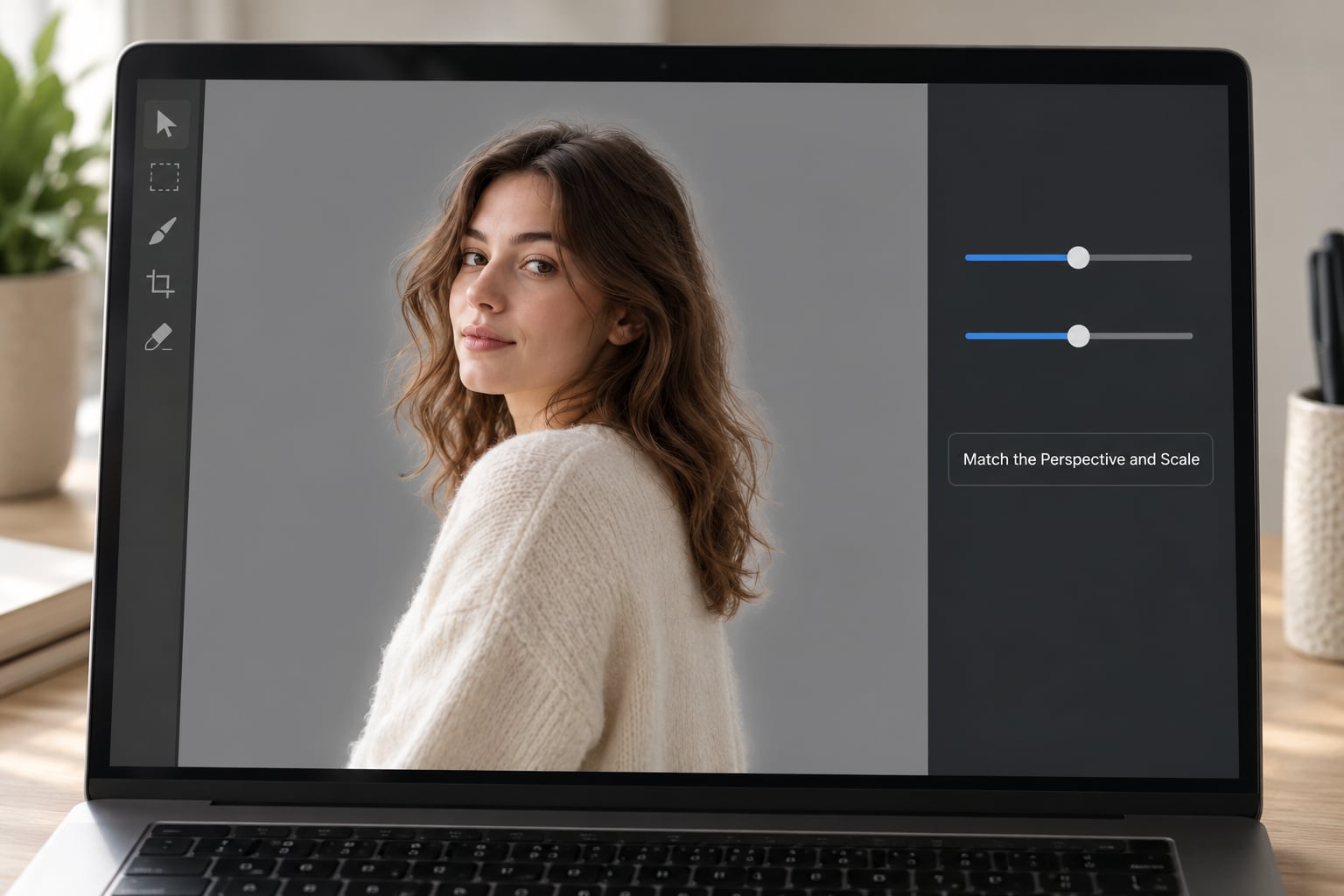
This is the five-step pass I use. Trace a rough path with the pen tool and close it. Open Select and Mask, set Radius to about 2 pixels and check Smart Radius so the radius adapts to detail. Move to the Refine Edge Brush Tool and paint over hair, fur and motion edges at a low size so it samples the right radius. Use the Refine Edge Brush Tool to pull back the edge in flat areas where it eats into the background, then add about 0.5 pixels of Feather and a very small amount of Contrast if the edge is picking up background colour.
Two mistakes ruin edges most often. A hard, crunchy line means zero feather or too little sampling, and a bright fringe means the edge is still holding a pixel of the original background. Fix the fringe by painting back with a soft brush on a 50% grey layer and colour-dabbing from the surrounding background.
How you know it worked: at 100% zoom the edge has no halo and no hard line, and at 25% it disappears completely.
Match Light Direction and Intensity
Find the shadows in the background and follow them back to their source. If the background’s cast shadows run to the right, your subject’s light is on the left, and nothing else you do will hold up.
Then match quality. Hard shadows with sharp edges mean a small or distant source, like direct sun. Soft edges that fade quickly mean something large and close, like an overcast sky or a big softbox. A subject lit with hard edges placed in an overcast frame looks like a sticker.
For intensity, use dodge and burn on a soft brush rather than a global adjustment. Paint the subject’s highlights back up or down to sit in the same part of the tonal range as the background, then do the same for the shadow side. I burn in the contact shadow along the join line and lift the highlight side slightly; that one pass does more for believability than any colour change.
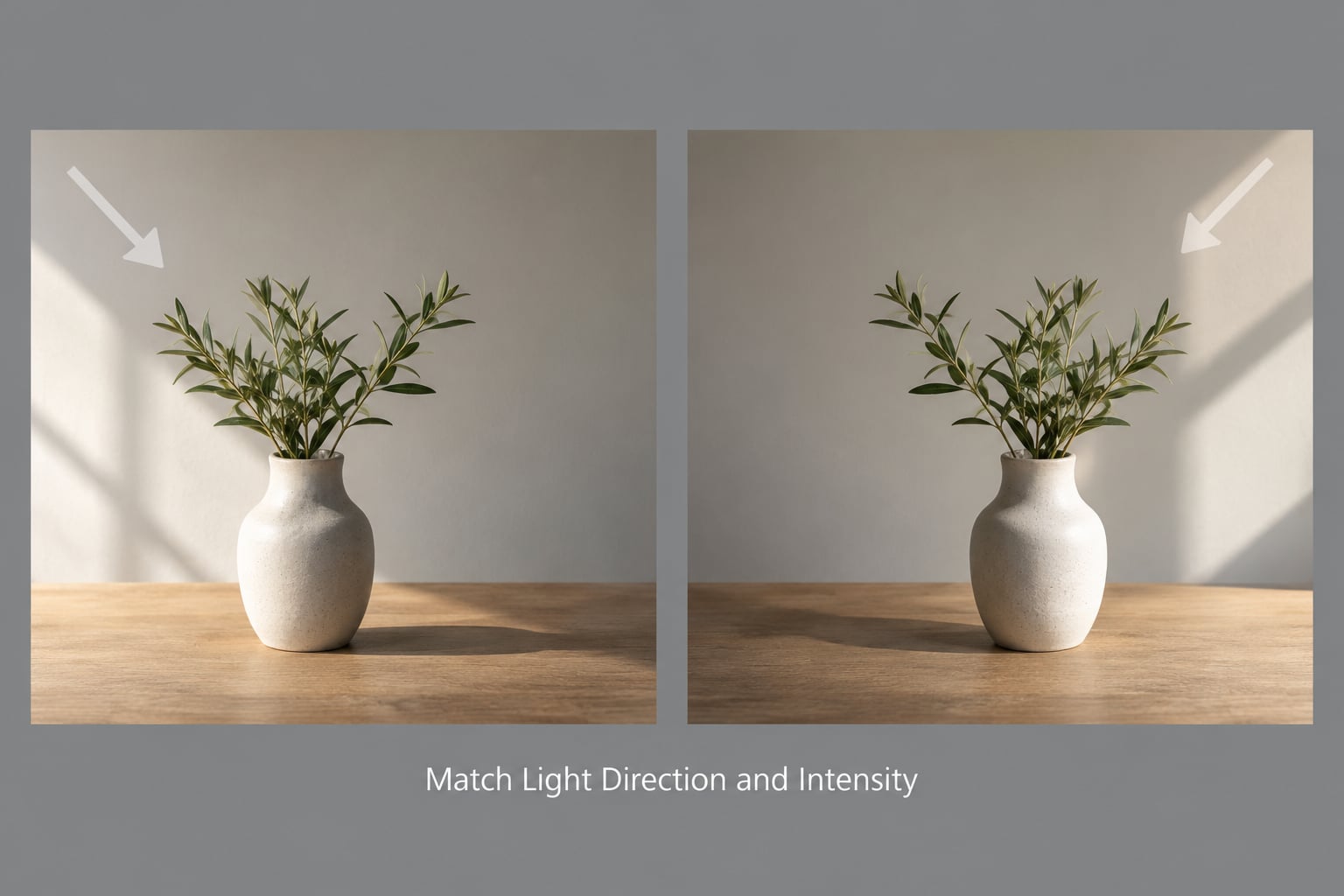
How you know it worked: turn off the background for a second and look at the subject on black. If it looks like a lit object rather than a flat shape, its light is described well enough to match.
Match Color and White Balance
Set both layers to the same white balance first. A frame shot under a tungsten bulb and a subject shot in shade will disagree in hue no matter how much you grade afterwards. Pick one as the reference, use the eyedropper on a neutral or set the temperature by eye.
Then match tone. Curves on a clipped adjustment layer, one for the subject, lets you match the black point, white point and midtone contrast without wrecking the highlights. Aim for a histogram that sits under the background’s rather than a peaky one beside it.
Use Match Color as a shortcut, then correct what it leaves behind. It shifts overall tone and tint fast, but it can introduce a cast that eats into skin. Selective Color on the reds and yellows is the safer fix for skin that reads green or grey. For a scene with several distinct colours, build a gradient map from the background and apply it to the group; that forces both halves into one palette.
How you know it worked: drop a black and white check layer over the whole group. The tonal structure matches, so a greyscale thumbnail looks like one photograph.
How to Make a Composite Look Believable With Texture
Two files from two cameras carry two noise patterns, and the eye notices the odd one even when it cannot name it. Open both with Camera Raw Filter, look at the noise in the shadows of each, and match the amount on the softer one with Add Noise set to Overlay at low opacity, around 2 to 4%. Then take a little detail and sharpness off the sharper element so the two sit at the same crispness.
Depth of field does the same job. If the background is soft and your subject is tack sharp from nose to ear, apply Camera Raw Filter with a negative clarity or a Lens Blur at the matching radius, masked to the subject. Most portraits want the sharpness dropped on the ear rather than on the eye.
Add atmosphere last. Distant objects carry less contrast and more blue or grey haze, so if the background has depth, tint the far edges of your subject or your foreground element to match. A touch of the same cast over the whole group ties everything together faster than any single fix. Once the texture matches, stop. Over-processing here is the most common way to undo good work.
Check the Composite at Several Sizes
Four checks, in this order. Squash the view to about 10% and look at the thumbnail; if something jumps out, it is a tone problem, not a detail problem. Then flip the whole group on and off and watch only the transition line. Then open it full screen at 100% and inspect the edges and the join. Finally add a saturation layer pushed hard and look for one element that pops out, then remove it and check a greyscale view for structure.
The squint test works too. Blur your own vision by half closing your eyes or cupping your hands around the screen. Shape and value still register, and the details that hide an error disappear. Anything that still feels wrong when the details are gone is a real problem.
Diagnosing the Usual Failures Mid-Workflow
If you are partway through and something still reads as fake, run this in order rather than fixing whatever caught your eye. First light direction, then scale and camera height, then brightness, then colour, then edges, then depth of field. Community consensus on the Photoshop and photography forums is consistent on this point: the work fails on lighting and perspective far more often than on masking technique, and beginners tend to burn out chasing edges when the real problem is two steps earlier.
Keep the whole thing in one group with a layer mask on it, so you can nudge the subject by a pixel or two without rebuilding anything. That single habit saves more time than any tool in this list.
Common Mistakes and Quick Fixes
| The tell | Why it fails | The fix |
|---|---|---|
| Subject too bright or too dark for the scene | The eye reads brightness as position in the real world | Dodge and burn the subject on a soft brush until it shares the background’s tonal range |
| Shadows point a different way | Two light sources are implied | Trace the background’s cast shadows, then rebuild them on the subject |
| Hard crunchy outline or bright fringe | Edge holds the original background and has no feather | Select and Mask with Smart Radius, then under 1 pixel of feather |
| Subject floats or cuts into the ground | No contact shadow or ambient occlusion | Paint a soft dark shape under the contact points and one along the join |
| Horizon or rooflines disagree | Camera heights did not match | Guides plus Edit, Transform, Warp |
| Everything is sharp in one half and soft in the other | Different apertures or distances, so depth of field does not agree | Camera Raw Filter blur masked to the sharper element |
| Grain looks like two textures stacked | Different sensors or ISO, or one file was heavily compressed | Add Noise on Overlay at low opacity to lift the cleaner file to the noisier one |
A few habits prevent most of these. Work on a group and mask it. Fix in the order above. Change one thing at a time and look after each change. Save a version before you start blending, because the version where it first clicked is easy to lose and impossible to get back.
And stop when it reads correctly at thumbnail size. Ten more minutes of sharpening usually makes it worse, and the people you show it to will not see what you see at 100%.
Frequently Asked Questions
What makes a photo composite look realistic?
A composite looks realistic when the separate photographs share the same camera perspective, light direction, colour temperature, depth of field and grain. The eye is unusually sensitive to these things because a real camera records them consistently in every frame. Break one of them and the brain notices within a second or two, even when it cannot explain why.
Do I need Photoshop to create a believable composite?
No. Affinity Photo, GIMP and Pixelmator Pro all have layers, masks, curves, warp and blend modes, which covers everything in this workflow. The menu names change, so read the equivalent panel rather than following Photoshop paths literally. A good free option is Photopea in a browser, which handles masks, curves and warp well enough for most composites.
How do I fix the lighting when combining two photos?
First identify the light in the background by following its cast shadows, then decide if it is hard or soft from the shadow edges. Match that direction and quality on the subject with dodge and burn rather than a global brightness slider. If the background has lifted shadows, lift the subject’s shadows the same amount instead of darkening the whole subject to match.
How do I make cut-out edges look natural?
Trace a pen tool path, then open Select and Mask with Radius around 2 pixels and Smart Radius enabled. Paint over hair or fur with the Refine Edge Brush Tool so the radius samples detail, pull the edge back where it cut into the background, and finish with about half a pixel of feather. Any bright rim left behind is old background colour, so paint it back with a soft brush.
Should I add grain or noise to a composite?
Yes, if the two files have visibly different noise, which is normal when they come from different cameras or ISO settings. Open both in Camera Raw Filter to compare, then lift the cleaner file with Add Noise on Overlay at low opacity, roughly 2 to 4%. Match the amount rather than the type, since grain that is too coarse reads as an effect.
How can I tell if my composite still looks fake?
Check it at four sizes: a 10% thumbnail, full screen, 100% zoom and a flip between on and off. Push a saturation adjustment layer hard to spot the element that pops, then view it through a greyscale check layer to compare tone. If it still bothers you with the details hidden by a squint test, the problem is shape, value or scale, not edges.
Start with the base frame. Photograph the background first, keep notes on the camera height, lens, light direction and colour temperature, then rebuild those conditions for the subject. Everything after that is fine-tuning, and the nine checks in order will take most composites the rest of the way.