If you deliver photographs to the web, a client gallery or a phone screen, work in sRGB. Choose Adobe RGB only when the image is going to a print lab that confirms it accepts and prints Adobe RGB files, or when you are editing on a wide-gamut monitor with a colour-managed pipeline. That short version is the whole decision, and every part of this guide unpacks it.
I shoot mostly weddings and deliver a lot of images to clients who view them on whatever screen they own. That experience, plus years of watching photographers argue about colour spaces in forums, has made me default to sRGB for almost everything. Adobe RGB earns its place in a narrower set of jobs than people assume.
Colour spaces confuse people because two different ideas share one word. A colour space is a mathematical container that defines which colours can exist inside it, while a colour profile is a translation table that tells software how to map that container onto a specific screen, printer or file. Getting those two apart makes every sRGB vs Adobe RGB decision much easier.
Table of Contents
- How to Use sRGB vs Adobe RGB: At a Glance
- What Is the Difference Between sRGB and Adobe RGB?
- Why colors can look different on different devices
- Gamma and tone, not just hue
- Compatibility is the real divide
- RAW files and the camera setting
- How to Use sRGB vs Adobe RGB in Your Photography Workflow
- Step 1: set your working space once
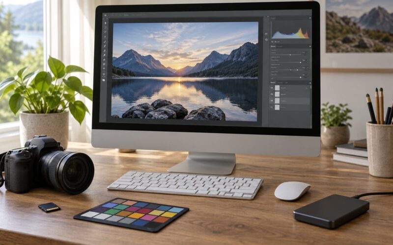
- Step 2: calibrate the monitor first
- Step 3: soft proof before you commit
- Step 4: export once per destination
- Step 5: check the file before it leaves
- Step 6: send a print file separately
- When to Use sRGB for Photography
- When to Use Adobe RGB for Photography
- How big is the difference, really?
- How to Convert Between sRGB and Adobe RGB Safely
- Converting sRGB to Adobe RGB in Photoshop
- Converting Adobe RGB to sRGB for the web
- Where color clips and why it looks wrong
- When not to convert at all
- Embedded versus assumed profiles
- sRGB vs Adobe RGB for Printing and Web Delivery
- What to ask a print lab
- Wide-gamut displays and Display P3
- Which Should You Choose?
- Frequently Asked Questions
- Is sRGB or Adobe RGB better for photography?
- What color space should I use for Instagram and social media?
- Why do my Adobe RGB photos look different online?
- Is Adobe RGB better for portraits and wedding photography?
- Can I convert an sRGB image to Adobe RGB?
- Should I edit and export in the same color space?
- Conclusion
How to Use sRGB vs Adobe RGB: At a Glance
Here is the short comparison, then we unpack it. sRGB is the narrow, universal standard. Adobe RGB is wider, newer and far less universally understood by the software and devices that will open your file.
| Criterion | sRGB | Adobe RGB |
|---|---|---|
| Developed by | Microsoft and HP, 1996 | Adobe, 1998 |
| Gamut size | Standard, small | Wider, especially in greens and cyans |
| Supported everywhere | Yes, browsers, phones, social apps, most software | No, needs colour-managed software and a wide-gamut display |
| Best for | Websites, Instagram, client proofs, email, mixed devices | Large prints, commercial print, wide-gamut editing and archiving |
| Monitor requirement | Any decent display, ideally 100% sRGB coverage | A wide-gamut display covering 98% or more of Adobe RGB |
| Conversion risk | Almost none going in | Cyan and green can clip or shift when narrowed |
| File handling | Simple, profile assumed | Profile must travel with the file or colours shift |
The practical reason to pick sRGB is predictability. The reason to pick Adobe RGB is reach: it holds colours that sRGB physically cannot represent, mostly deep greens and cyans.
That is why a wide shot of lush foliage or a product on a strong teal backdrop keeps its intensity in Adobe RGB instead of being squeezed flat.
What Is the Difference Between sRGB and Adobe RGB?
The two spaces share an RGB structure but not a size. Adobe RGB covers roughly 50% more colours than sRGB, and the extra room sits almost entirely in the green-to-cyan region of the spectrum.
Why colors can look different on different devices
An sRGB file opened in software with no colour management assumes sRGB, so it renders as intended. An Adobe RGB file carries a profile telling software what it really is, and colour-managed applications read that profile and shift the values into what your display can show. Software that ignores profiles does not shift anything, which is why the same file looks dull and lifeless on one screen and correct on another.
Gamma and tone, not just hue
sRGB and Adobe RGB also use slightly different tone curves, so shadows and highlights can shift a little on conversion, not only saturated colour. In practice this is subtle. The dramatic differences you see online come from gamut, not from the tone curve.
Compatibility is the real divide
sRGB is effectively built into the web. Adobe RGB is not: an old browser, a phone gallery app or a quick-look preview may ignore the profile and show dull colours. Forum consensus over the years is blunt about this: for web use, sRGB is the safest bet because it has the highest compatibility with everyone else’s devices.
RAW files and the camera setting
This is the biggest myth in the topic. The colour space setting in your camera menu does not touch your RAW files at all. RAW is a single set of sensor values with no assigned colour space, and your software picks one when it develops the file.
The camera setting changes the in-camera JPEG, the preview image and the histogram display, nothing more. One thread on dpreview.com’s forums put it plainly: shoot RAW, and export twice from the same file, sRGB for web and Adobe RGB for print.
How to Use sRGB vs Adobe RGB in Your Photography Workflow
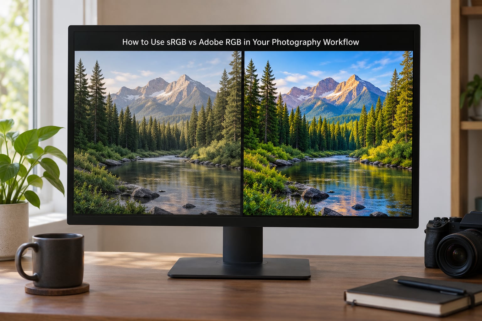
The reliable method is to keep your working file wide and convert once, at the moment of delivery. Working space choices change what you can recover later; output space choices change what your viewer sees. Keep them separate and the confusion largely disappears.
Step 1: set your working space once
In Lightroom Classic, go to Edit > Preferences > Working Space. ProPhoto RGB is the default and the most forgiving starting point for RAW work. Capture One uses a Large gamut working space by default. Adobe RGB is a reasonable middle ground if your monitor covers it. Whichever you pick, do not change it halfway through a project.
Step 2: calibrate the monitor first
An uncalibrated screen makes the whole choice meaningless. Use a hardware calibrator and profile the display to roughly 120 cd/m2 for editing, with a gamma of 2.2 and a white point near D65. If your screen covers only 100% of sRGB, editing in Adobe RGB means judging colours you cannot actually see, and that is how oversaturated, neon-looking edits happen.
Step 3: soft proof before you commit
In Lightroom Classic, open the Develop module and use View > Soft Proofing, then View > Soft Proof Setup. Set Proof Setup to sRGB and check Preserve Hue, which attempts to keep colours distinct by shifting them instead of clipping them. In Photoshop, enable View > Proof Setup > Working CMYK for print, or Custom for a specific lab profile.
Step 4: export once per destination
In Lightroom Classic, the path is File > Export > Export As, then in the Output section choose sRGB or Adobe RGB under Color Space. Keep the profile embedded. In Photoshop, use File > Export > Export As, set Convert to sRGB in the Convert to Color Space menu for web, and check Include Color Profile.
Step 5: check the file before it leaves
Open the exported JPEG on a device that does not do colour management, such as an older laptop or a phone, and look at it. If greens look like pea soup or a red dress turned orange, the conversion clipped and you need to soften that channel before exporting.
Step 6: send a print file separately
For a print job, keep the web export untouched and produce a second file in the space the lab asks for. Most labs report that the majority of their customers hand over sRGB, and the lab’s own workflow converts to whatever profile it works in. Sending an unexpected Adobe RGB file is the fastest way to get a muddy print back.
When to Use sRGB for Photography
Use sRGB for anything a stranger’s device will display. It is the space browsers assume, phones assume, and most client viewing and proofing software assume. The rule is simple: if you cannot control the display, you cannot control the colour, so choose the space everything understands.
The list of sRGB jobs is long and unglamorous, which is exactly why it should be your default:
- Portfolio websites and blog posts
- Instagram, Facebook, TikTok and every other social platform
- Client proofing galleries and download links
- Email attachments and messaging apps
- Slideshows and screen-shared galleries
- Any deliverable where you cannot control the viewing device
There is a second reason to choose sRGB: it removes variables. When a client says the colour looks off, sRGB files are far easier to trace, because you are not fighting an unknown profile on an unknown monitor.
For pure color work, sRGB is also perfectly good for printing. Plenty of professional labs print sRGB files every day without any loss, because most paper, most inkjets and most print workflows do not need more than sRGB offers.
When to Use Adobe RGB for Photography
Adobe RGB earns its keep in print production and in wide-gamut editing, and almost nowhere else.
It makes sense when your final output is a physical print at a substantial size, and the ink or the paper can actually render those extra greens and cyans. It also makes sense as a working space when you own a display that covers close to the full Adobe RGB gamut, which currently means a wide-gamut desktop panel rather than a laptop.
Commercial work is the other case. Catalogue photography, food and drink, cosmetics and textile shoots often feed into print production where a colourist or prepress operator works in Adobe RGB. Sending files that already live in the right space avoids a conversion step that someone else controls.
Archival editing benefits too. Working in a wide space such as ProPhoto RGB or Adobe RGB keeps more of the original colour information in your layered and retouched files, so you can decide later what to output.
ProPhoto RGB is worth mentioning here as a third option. It has an enormous gamut and a 16-bit-per-channel backbone, which makes it forgiving to edit in and hard to get wrong, but almost nothing outside a pro lab displays it. Treat it as a working space, never a delivery space.
One limitation is worth stating plainly. Sceptical veterans argue the real-world difference is small, because sensors capture far more colour than any monitor or consumer inkjet can render. They are not entirely wrong, and for most working photographers they are right most of the time.
How big is the difference, really?
On a saturated sunset or autumn foliage, Adobe RGB gives you a real difference you can see on a good display. On a studio product shot with controlled lighting and neutral colours, the two spaces will look nearly identical, because those colours sit well inside sRGB anyway. Judge the decision by what your subject actually contains, not by what the theory promises.
How to Convert Between sRGB and Adobe RGB Safely
Conversion is a translation, and translation costs something. The safe rule is that widening is nearly free, while narrowing gives colour back.
Converting sRGB to Adobe RGB in Photoshop
Open the image, then go to Edit > Convert to Profile. Choose RGB, then Adobe RGB (1998) as the destination and pick Relative Colorimetric. This will not add colour that was never in the file, it simply stops the software from flattening values, but it does make the file display correctly in colour-managed applications.
Converting Adobe RGB to sRGB for the web
Same menu: Edit > Convert to Profile, destination sRGB IEC61966-2.1. Switch Intent to Perceptual if you want the software to compress rather than clip. Perceptual rendering compresses out-of-gamut colours into the available range, which keeps more detail but shifts hue slightly. Relative Colorimetric is sharper and truer in the in-gamut areas but hard-clips everything outside.
Where color clips and why it looks wrong
Saturated greens go first on a down-conversion to sRGB, followed by cyans and blues. Clipping flattens those areas into a single flat value, which reads as a lifeless neon block. In smooth gradients such as skies or product backdrops, the same clipping shows up as banding and posterization, the visible steps you get when a smooth ramp is squeezed into too few values. If that happens, work in 16-bit, use Perceptual intent, and pull the saturation on that channel down slightly before exporting.
When not to convert at all
If your only destination is the web, keep the file in sRGB from the start of the export chain. Repeatedly converting back and forth, for example sRGB to Adobe RGB to sRGB, quietly degrades colour every time. Do not convert an sRGB JPEG to Adobe RGB to send to a client, because you will gain nothing and risk confusing their software.
Embedded versus assumed profiles
Embedding a profile means the file carries a small block of metadata saying exactly what space it lives in. Assuming one means the viewer just guesses sRGB because nobody told it otherwise. For JPEG and PNG delivery, embedding is almost always right. If a file size limit is tight, an sRGB JPEG can lose the profile with minor consequences, since sRGB is the guess anyway, but an Adobe RGB file stripped of its profile will be read as sRGB and look wrong.
sRGB vs Adobe RGB for Printing and Web Delivery
Match the space to the destination, and confirm the profile with the lab before you upload. This is the single most useful habit on this page.
| Destination | Use | Why |
|---|---|---|
| Portfolio website | sRGB | Browsers and every viewing device assume it |
| Social media | sRGB | Platforms re-compress and assume sRGB |
| Client gallery | sRGB | Clients use unknown phones and laptops |
| Standard lab print | sRGB | Most labs accept and print sRGB as standard |
| Fine art or large print | Ask the lab, then Adobe RGB | Wider gamut rewards ink and paper that can use it |
| Commercial print production | Adobe RGB | Matches prepress and colourist workflows |
What to ask a print lab
Before ordering, ask three things: what space do you want the file in, do you want the profile embedded, and do you do your own conversion or do you want ours untouched? A good lab will give you a straight answer and may ask for a specific ICC profile. If they say they expect sRGB, send sRGB, no matter how excited you are about the wider gamut.
Always embed the profile in delivered files. An unprofiled Adobe RGB image is an unprofiled sRGB image as far as most software is concerned, and your careful colour choices will be reinterpreted.
Wide-gamut displays and Display P3
Modern phones and many laptops use Display P3, a wide-gamut space that is not sRGB and not Adobe RGB. If your client views on one of those, an sRGB file still displays correctly, just without the extra punch. Adobe RGB files are the ones that break. HDR workflows using the Rec. 2020 space add another layer, and if you work in HDR regularly, calibrate your expectations accordingly and check what your delivery target supports.
Which Should You Choose?
Most photographers should pick sRGB as their delivery default and Adobe RGB as an occasional export for a specific print job. Here is how that maps to different kinds of work. Nobody regrets shipping a client an sRGB file, so if you are torn, that is the safe side.
- Beginners: sRGB everywhere. Do not let this decision slow you down while you are still learning exposure and light.
- Portrait and wedding photographers: sRGB for client delivery. Clients judge your work on phones, and the extra gamut buys you nothing there.
- Commercial product photographers: work wide, deliver per the buyer’s spec. Adobe RGB or ProPhoto RGB for editing, sRGB unless the printer asks otherwise.
- Nature and travel photographers: it depends on your prints. For gallery prints of greens and autumn colour, Adobe RGB into a lab that confirms support is worth it. For screen-first portfolios, stay in sRGB.
- Print-focused shooters: sRGB for everything under about 20 inches, Adobe RGB for large work and for clients who print, since it holds the saturated greens and cyans that make a wide print sing.
- Anyone with a wide-gamut monitor: edit in the space your display can actually show, then convert on export. A wide-gamut panel is wasted if your workflow still assumes sRGB.
Frequently Asked Questions
Is sRGB or Adobe RGB better for photography?
For most photographers, sRGB is better because it is what browsers, phones and client software assume. Choose Adobe RGB when the finished image is a large or commercial print and the lab confirms it prints Adobe RGB. The wider gamut holds saturated greens and cyans that sRGB cannot represent, so it only helps when the final output can actually display those colours.
What color space should I use for Instagram and social media?
sRGB, every time. Social platforms re-compress uploads and assume an sRGB profile, so anything wider loses saturation or shifts hue unpredictably. Export in sRGB, let the platform handle the rest, and keep your Adobe RGB version for print. This holds for Instagram, Facebook, TikTok and messaging apps alike.
Why do my Adobe RGB photos look different online?
Most software that opens images online ignores colour profiles, so it treats your Adobe RGB values as sRGB. Greens and cyans come out dull, and the file looks washed out. Embed the profile and you fix it in colour-managed viewers, but you cannot control every site your work reaches, which is why sRGB is the safer delivery format.
Is Adobe RGB better for portraits and wedding photography?
Rarely. Portraits are dominated by skin tones, which sit well inside sRGB, and clients view them on phones and laptops. Adobe RGB adds nothing there. The exception is a client ordering a large framed print from a lab that works in Adobe RGB, where a second export in Adobe RGB is worth making for that single file.
Can I convert an sRGB image to Adobe RGB?
You can, in Photoshop with Edit and Convert to Profile, choosing Adobe RGB (1998) as the destination and Relative Colorimetric as the intent. Nothing new is added, because the colour was not captured in the first place, so the result is normally slightly softer. It is fine for display purposes and pointless for rescuing lost colour.
Should I edit and export in the same color space?
Not necessarily. Editing wide, in ProPhoto RGB or Adobe RGB, keeps more information for later decisions, and then exporting to sRGB handles the conversion at the delivery step. Exporting into the same space you edit in is simpler and fine for most work. Just avoid converting back and forth repeatedly, since every round trip costs a little colour accuracy.
Conclusion
The sRGB vs Adobe RGB decision is smaller than the internet makes it sound. Set your working space once, calibrate your monitor, and export sRGB for anything that reaches a screen or an unknown lab. Produce a second Adobe RGB file only when a print lab confirms it wants one and the print is large enough to show the difference. That is the whole workflow, and it will serve almost every shoot you take this year.