Color grading a portrait means pushing the colors beyond accurate: warming the highlights, tinting the shadows, shifting individual hues, and building a mood. The whole thing takes about fifteen minutes per image once the sequence is familiar, and it runs in Lightroom or Photoshop without any special plugins.
The order matters more than the tools. Correct the image until skin looks right, and only then grade it. If you have never done it before, learning how to color grade portraits comes down mostly to this sequence. Skip the correction and every color you add later gets applied to a photo that was already wrong, which is how portraits end up green, orange, or plastic.
Table of Contents
- What You Need
- Step-by-Step
- 1. Set the White Balance Before You Color Grade a Portrait
- 2. Correct Exposure and Overall Contrast
- 3. Build a Clean Color Base
- 4. Shape the Portrait With a Split Tone
- 5. Protect Skin and Fine-Tune the Grade
- 6. Review the Grade at Different Sizes
- 7. Save and Export the Final Look
- Common Mistakes
- Frequently Asked Questions
- Is color grading the same as color correcting?
- Which software is best for color grading portraits?
- Why do my skin tones turn green after grading?
- How do I create a cinematic look in a portrait?
- Should beginners use presets or build their own look?
- What is the 20-60-20 rule in photography?
- Conclusion: Start With a Neutral Portrait
What You Need
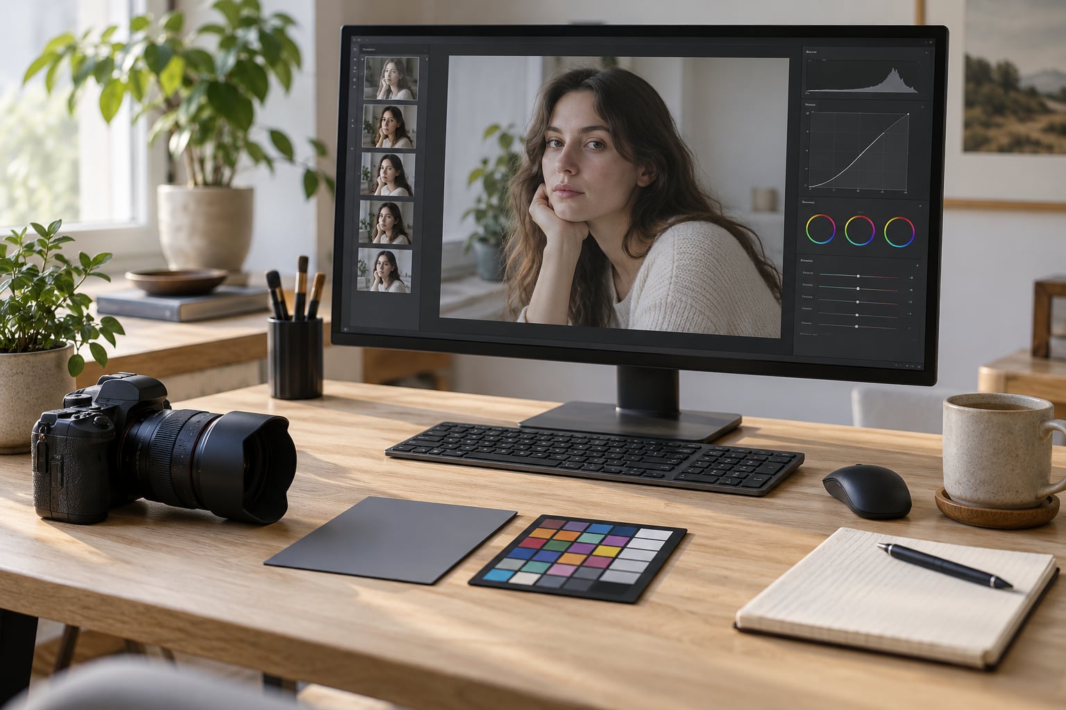
You need a color-managed display, and the honest truth is that an uncalibrated laptop screen makes subtle grading impossible to judge. Most portraits live between skin tone and background color, exactly the range where a bad display sends you chasing colors that were never there.
Beyond the screen, you need four things:
- RAW files. JPEG has no room for a real white balance adjustment. If you shoot JPEG, you can still grade, but you are working with about a third of the latitude.
- Lightroom, Capture One, or Photoshop. Lightroom handles a single image fastest. Photoshop handles layered work and heavier retouching. If you are on a phone, Lightroom Mobile and Snapseed do the same core steps with fewer panels.
- A neutral reference in the frame. A gray card, a white shirt, or even a plain wall gives you something to set white balance against.
- A clean starting point. Not a preset you downloaded. One image you already like tonally becomes the reference for the look you build.
Turn on clipping indicators before you start. They show blown highlights and crushed blacks as you move the sliders, which is faster than squinting at the histogram.
Step-by-Step
1. Set the White Balance Before You Color Grade a Portrait
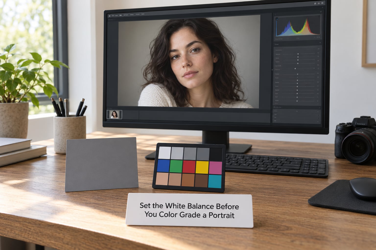
Start with the eyedropper in the white balance picker, click a neutral area, and let the temperature and tint sliders settle. That single click removes the cast that has been fooling you. You can see whether it worked by checking the vectorscope: skin should land along the diagonal skin tone line running from the shadow marker up toward the red-orange marker.
Adjust by eye in small moves afterward. Most indoor tungsten portraits want temperature pulled down and tint nudged toward magenta, while shade portraits usually want temperature up with a little green in the tint to kill the blue cast.
You know the white balance is right when no part of the frame looks obviously tinted, not when the numbers hit a particular value. Every RAW file has a different correct Kelvin.
2. Correct Exposure and Overall Contrast
Set exposure so the brightest area you care about sits just under the clipping point, then pull highlights down to recover detail in skin and clothing. Lift shadows until the darkest parts of the frame still hold information.
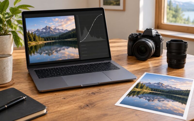
Place your black and white points with the tone curve rather than the Basic panel sliders when you want finer control. A gentle S-curve in the midtones gives contrast without the crunched, plasticky look that heavy contrast sliders produce.
The test is simple. Zoom to 100 percent and look at the transition between the cheek and the background. Smooth gradient, no banding, no visible edge.
3. Build a Clean Color Base
Before shaping a look, remove whatever is distracting. Use the HSL panel, called Color Mixer in some Lightroom versions, to pull specific hues toward neutral.
For outdoor portraits against greenery, nudge the hue and saturation of the greens and shift them toward yellow or orange. That move keeps foliage in the same family as skin instead of fighting it, which is why background-heavy portraits so often look uncomfortable when the greens stay cool and the skin stays warm.
Use vibrance first and saturation second. Vibrance protects already-saturated pixels, so skin shifts less than a bright jacket does. Textures and bright clothing are exactly what you want to move.
How do I know the base is clean? Turn the whole image to black and white temporarily with the saturation slider. If the frame still reads clearly in grayscale, the tonal structure is doing the work and color is only supporting it.
4. Shape the Portrait With a Split Tone
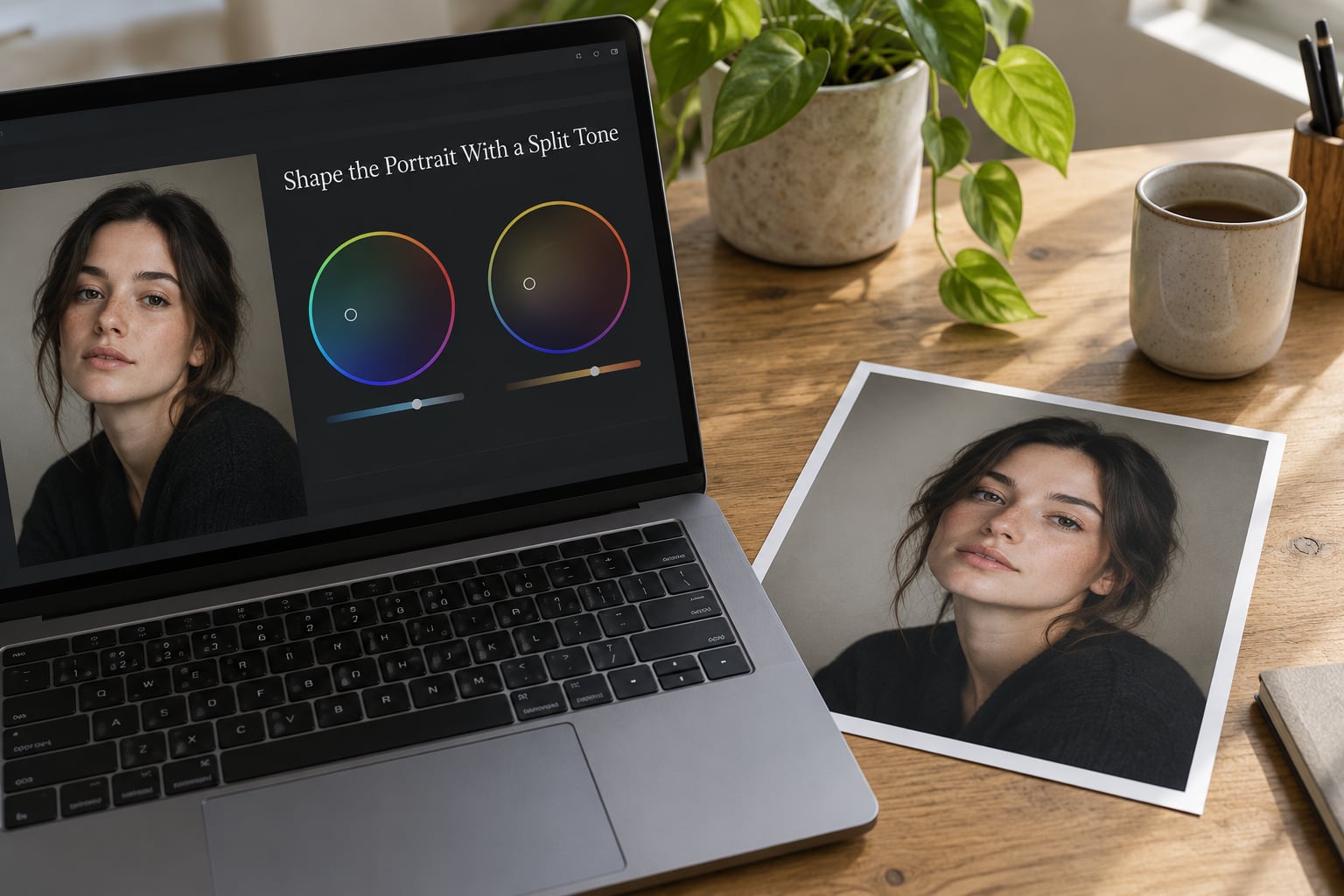
Split toning is the single most useful tool in portrait grading, and most beginners already use it without naming it. It treats the tone range rather than the object: shadows get one tint, midtones stay mostly neutral, highlights get another.
Two pairings cover most portrait work. Cool shadows with warm highlights reads as natural daylight and is the safest starting point. Warm shadows with cool highlights reads more cinematic and filmic, and works well for moodier work. Drag the shadow and highlight midpoint sliders toward the middle before you start, then pull the balance toward whichever tint you want more of.
Keep the tints light. If someone can spot the color shift with the image half-closed, it is too strong. The work should register as a mood, not as an effect.
5. Protect Skin and Fine-Tune the Grade
This is where most portrait grades go wrong. Global grading touches every pixel of the face, and human skin has a narrow range of hues that looks wrong the moment it is pushed.
Use a mask and pull skin back toward neutral. In Lightroom, Select Subject gives you a fast starting mask, then you refine it with the adjustment brush’s erase mode or a Color Range selection set to the reds and oranges. Set that masked area to roughly half the vibrance you applied globally, and lower saturation a touch further. Eyes, teeth, and lips often need a small boost inside the same mask so the face does not go flat.
In Photoshop, use a Color Balance adjustment layer set to blending mode Color. That applies the grade to color while leaving the underlying luminance alone, and a layer mask painted with the brush or the red channel keeps the effect off the brightest highlights.
For local contrast on the face, dodge and burn on a separate low-opacity Soft Light layer beats the clarity slider, which will happily texture the pores you were trying to smooth.
Check the vectorscope again when you are done. Skin that drifted off the skin tone line is the fastest way to spot a grade that is too aggressive.
6. Review the Grade at Different Sizes
Zoom to fit and look again. A grade that looks rich at 100 percent often turns into a colored fog at gallery size, and one that looks subtle at fit size can be strong on a phone. Both scales matter because both are where your work gets seen.
Check the eyes, the clothing, and the background colors specifically. If a shirt has gone magenta or a wall has gone green, that reads as an error even to viewers who cannot name what changed.
If you have a second display, look there too. Disagreeing screens are normal and small, but a large disagreement means the grade is riding on a narrow tonal range that will shift for whoever views it.
7. Save and Export the Final Look
Once you like the result, copy the settings and paste them onto the rest of the shoot, or select everything in the Develop module and use Sync Settings with the paste option. Expect to touch up exposure and white balance per frame, since those shift with the light. The grade itself should hold.
Turn the settings into a preset from the Preset panel so you can reuse it on future sessions. Name it after the look, not the file, so you know what you are pulling months later.
Export a master at full resolution in 16-bit TIFF or the highest-quality JPEG your delivery needs, then a smaller sRGB version for the web. If the client gallery is going online, match the color space it will be viewed in rather than assuming.
Common Mistakes
Most frustration with portrait grading comes from one of a handful of repeatable errors, and every one of them shows up while people are learning how to color grade portraits for the first time.
Grading before correcting. Adding color on top of a bad white balance compounds the problem instead of fixing it. Set the cast first, always.
Over-saturated skin. Global saturation is the number one offender. Drop saturation and vibrance, then protect skin with a mask instead of pulling the whole image down.
Split tones that are too saturated. Drag both midpoints toward the center and start with very little tint. Add more only if you can still see it at fit size.
Crushed shadows. Pushing shadows to black to add drama destroys skin and hair detail in the darker half of the face. Lift the shadows with the curve instead.
Heavy clarity and texture on faces. These sliders treat skin like rock. Use dodge and burn on a low-opacity layer when you want shaping without texture.
Running the same preset across a whole shoot with no check. Presets set the direction, not the exposure. Sync your settings, then walk through the gallery correcting white balance and exposure frame by frame. That pass is what makes a shoot look consistent rather than stamped.
Stuck when every change breaks something else. This oscillation is normal and it comes from moving one global slider when the issue lives in one part of the frame. Stop nudging globally and make a local adjustment instead.
Frequently Asked Questions
Is color grading the same as color correcting?
No, and mixing them up causes most beginner problems. Color correction makes the image accurate: exposure, white balance, and contrast match reality. Color grading is the creative step after that, where you push color for mood and consistency. Correction first, grading second, every time.
Which software is best for color grading portraits?
Lightroom is fastest for a single portrait because tone, HSL, Color Grading, and masking all live in one panel with sync for the rest of the shoot. Photoshop wins for layered control and heavier retouching. Capture One works well for tethered studio work. On a phone, Lightroom Mobile and Snapseed handle the same steps with fewer options.
Why do my skin tones turn green after grading?
Green usually comes from pulling the wrong channel or from split tones with too much saturation in the midtones. In HSL, raise the saturation of reds and oranges slightly, lower greens and yellows, and pull the split tone midpoints toward the center. Checking the vectorscope skin tone line confirms whether skin is actually off-hue or just looks green next to warm clothing.
How do I create a cinematic look in a portrait?
Build it in this order: recover highlights, set a gentle S-curve, then split tone with cool shadows and warm highlights using light tints. Add a subtle vignette or radial darkening to draw attention inward, and protect skin with a mask so the face stays believable. Cinematic comes from restraint and a slightly dark midtone, not from heavy saturation.
Should beginners use presets or build their own look?
Use presets as a reference, not a final answer. Apply one, then compare it against the original at fit size to see exactly which changes you like and which you would never make on your own work. Building your grade from scratch, even roughly, teaches you what each control does. Save your finished look as your own preset once you understand it.
What is the 20-60-20 rule in photography?
It is a composition guideline about color distribution: roughly 60 percent of the frame carries the dominant, true-to-life color, 20 percent supports it, and 20 percent provides an accent for contrast. For color grading it is a useful check. If more than about 20 percent of a portrait is saturated accent color, the grade starts to announce itself rather than support the subject.
Conclusion: Start With a Neutral Portrait
Grade a portrait by correcting it first, then layering color in the same order every time: white balance, exposure and contrast, a clean HSL base, split toning, and a skin-protection mask. That sequence is the whole method, and it works the same way whether you are in Lightroom, Capture One, or Photoshop.
Start on your next image by doing one thing only. Click a neutral area with the eyedropper, set the white balance, and stop there until skin looks right. Everything after that step gets easier, and the grades you save from that base will stay consistent across a whole gallery.