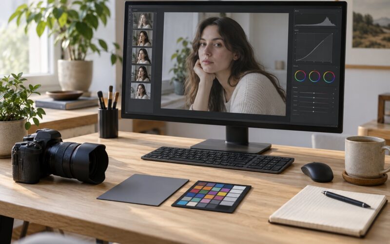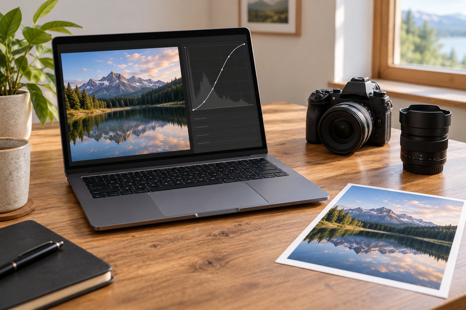
Curves in Photoshop is a graph where you drag points to change shadows, midtones and highlights independently, and switch to the Red, Green or Blue channel to fix a color cast. The whole edit takes about five minutes once you know where the tool lives: Layer > New Adjustment Layer > Curves. Everything happens on a layer you can mute, mask or throw away, so nothing you do is permanent.
Learning how to use curves in Photoshop for photos comes down to three things: reading the histogram, placing the black and white points without clipping, and shaping the curve gently enough that the picture still looks like the place you stood when you took it. This walkthrough covers all three, plus the mistakes that flatten a photo for most beginners.
I edit RAW files almost every day and the order is always the same: white balance, exposure, curves, then dodge and burn. Curves last because they solve what the first two steps cannot — uneven tonal range and a color cast left behind by mixed lighting.
Table of Contents
- What You Need
- Step-by-Step: How to Use Curves in Photoshop for Photos
- Step 1: Prepare the Photo Before Changing the Tones
- Step 2: Open the Curves Adjustment Layer
- Step 3: Understand the Main Tone Controls
- Step 4: Make a Simple Contrast Adjustment with Curves in Photoshop
- Step 5: Correct Exposure with the Gray Point
- Step 6: Refine Shadows and Highlights Separately
- Step 7: Make Color Corrections with Channel Curves
- Step 8: Check the Result and Fine-Tune
- Curves vs Levels, side by side
- Common Mistakes
- Frequently Asked Questions
- What does the Curves tool do in Photoshop?
- Should I use Curves or Levels for photo editing?
- How do I brighten a photo with Curves in Photoshop?
- Why does my Curves adjustment look too dark or too bright?
- How do I use Curves to correct a color cast?
- When should I use a Curves adjustment layer instead of editing the image directly?
- Conclusion
What You Need
Not much. The tool has been in Photoshop since the 1990s and behaves the same across current desktop versions on Windows and Mac, so a tutorial written today still matches what you see on screen.
- Photoshop, any current desktop subscription. The Properties panel layout applies here; Photoshop Elements has the tool too, though its panel is simpler and it lacks the curve presets menu.
- A photo open as a Smart Object or a duplicated layer, so your original pixels stay clean.
- One Curves adjustment layer, which the panel builds for you from the Layer menu.
- A rough idea of the histogram: the left edge is shadow, the middle is midtone, the right edge is highlight.
- Optional: the unedited original side by side, on a second monitor or a second tab, so you can compare honestly.
Step-by-Step: How to Use Curves in Photoshop for Photos
Step 1: Prepare the Photo Before Changing the Tones
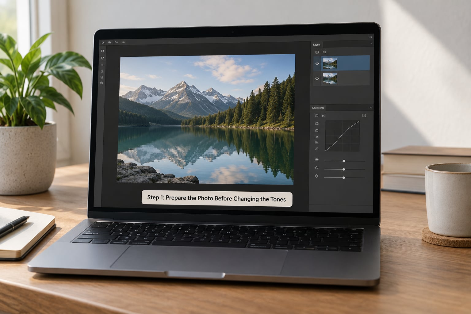
Duplicate your background layer first: right-click the layer in the Layers panel, choose Duplicate Layer, and confirm. On a RAW file opened through Camera Raw, return to Photoshop with the Edit button so the adjustments happen on top of the original 16-bit data rather than on an 8-bit JPEG.
Next, fix what curves are bad at. Correct the white balance with the eyedropper in the Camera Raw dialog, set the overall exposure and texture, and close that dialog.
How you know it worked: the photo looks plausible in its thumbnail without any tone editing. If it is still obviously too bright or color-skewed at this stage, a curve will only hide the problem.
Step 2: Open the Curves Adjustment Layer
Go to Layer > New Adjustment Layer > Curves. The Properties panel switches to show the Curves controls, with the histogram behind a square grid and a straight diagonal line running through it.
If you prefer a different route, Image > Adjustments > Curves opens the same graph as a dialog — but that version edits your pixels directly. There is no layer, so no opacity slider, no mask, and no undo that does not revert everything.
How you know it worked: a new layer called “Curves 1” appears above your photo with a layer mask attached. That mask thumbnail is what you will paint on later to restrict the effect.
Step 3: Understand the Main Tone Controls
The graph plots input brightness on the horizontal axis against output brightness on the vertical axis. The bottom-left corner is black, the top-right is white, and the diagonal in between is the 1:1 line that means no change at all.
The histogram behind the grid shows where your pixels actually sit. A tall cluster shoved against the right edge means a lot of your highlights are bunched up or clipping; an empty middle means the photo has a tonal gap you can open up with a curve.
The area left of center controls shadows, the center controls midtones, and the right controls highlights. Dragging any point up lightens that range, dragging it down darkens it, and the steepness of the line between two points is contrast.
Two small number boxes sit under the graph. Input takes the value you drag a point to, and Output is what that tone becomes — a black point at input 0 with output 12 means you lifted the darkest tone slightly instead of crushing it.
How you know it worked: hover over the line and the panel shows a live Input and Output readout. Read those numbers before you decide whether a change was too strong.
Step 4: Make a Simple Contrast Adjustment with Curves in Photoshop
A straight diagonal is flat. To add contrast, place one point in the lower third and one in the upper third, then push the lower one down a little and the upper one up a little. That produces the gentle S shape most photographers reach for.
Keep the drag small. For a normal contrast pass on a decent RAW file, moving the shadow point down to roughly 20 and the highlight point up to roughly 235 on the grid does plenty without touching clipping.
To go the other way, pull the shadow point up and the highlight point down. That fades the blacks and whites into a soft gray, which is the “matte” look — useful for travel and film-simulation styles, and easy to overdo.
How you know it worked: the histogram spreads out toward both edges instead of piling up in the middle, and the image looks deeper without anyone being able to say what you changed.
Step 5: Correct Exposure with the Gray Point
Dragging the middle point of the curve up or down moves overall brightness, because midtones carry most of what the eye reads as exposure. Move it up about 10 units for a photo shot slightly dark; move it down for one shot slightly bright.
The three eyedroppers under the graph do this automatically. The gray point eyedropper is the fastest one: click on something that is genuinely neutral gray in real life and Photoshop neutralizes that spot, removing the color cast around it.
Be careful with it. Click a warm wooden table and the whole photo swings blue, because you told Photoshop the wood was gray. Neutral gray in the scene is usually a piece of white or gray card, or a shaded white wall.
How you know it worked: the histogram shifts without new spikes forming at either end. If pixels start piling up at 0 or 255, you have gone too far.
Step 6: Refine Shadows and Highlights Separately
Once the overall brightness is right, work one region at a time. A small S-curve confined to the shadows recovers detail in a dark foreground without touching the sky. Pulling the highlight section down gently recovers a blown window without graying the whole frame.
Watch for hard kinks where you drag. A point that jumps far from its neighbor creates a visible band in the sky or skin. Move points in smaller increments and keep the line smooth.
How you know it worked: toggle the layer’s eye icon to compare against the unedited version. Details you could not see before should appear, and no area should look chalky.
Step 7: Make Color Corrections with Channel Curves
The dropdown above the graph switches between RGB and the individual channels. RGB changes brightness only. Red, Green and Blue each change the balance against their opposite: raising red lowers cyan, raising green lowers magenta, raising blue lowers yellow.
For a yellow cast, drop the blue channel a few units in the midtones. For a green cast, add a little magenta by nudging red and blue together. Work the midtone region rather than the ends, since a cast usually lives where most of the scene’s color does.
Watch the neutral areas while you drag. If white shirts and gray walls are going pink or teal, you have pushed the channel too far.
How you know it worked: skin tones look believable and the picture has one dominant color temperature instead of a mix.
Step 8: Check the Result and Fine-Tune
Zoom to 100 percent and look at the edges people judge photos by: eyes, teeth, the horizon, a white collar. These are the places an overdone curve shows first.
Compare against the original, then check the histogram once more. Touch the histogram display options — the little menu beside it — and switch the channel view to spot any single red, green or blue channel that has stacked up at the extremes, which means clipping.
If you need the effect in one area only, click the layer mask thumbnail, select the Brush tool, paint black over the areas you want to protect, and the curve fades out there. To dial the whole adjustment back, pull the layer opacity down rather than undoing the work.
Finally, save the settings as a preset from the panel menu when you like the result, so the same curve applies to the rest of the shoot in one click.
Curves vs Levels, side by side
| What it is | Curves | Levels |
|---|---|---|
| Control points | Unlimited | Five sliders |
| On-image adjustment tool | Yes, drag on the photo itself | No |
| Output levels | Yes, via the Output field | Yes, dedicated Output Levels bar |
| Eyedroppers | Black, white and gray | Black, white and gray |
| Best for | Color casts and precise tonal shaping | Quick exposure and range corrections |
Both tools set black, white and midtones. Curves simply gives you a draggable line instead of three sliders, plus the hand tool for working directly on the image.
Common Mistakes
Almost every bad curve edit comes from one of seven habits.
- Dragging the curve too far. Fix: halve the movement and look at the result again. If you cannot tell whether it improved, it was too much.
- Using curves before fixing exposure. Fix: correct white balance and exposure first, then return to the tone curve.
- Crushing the blacks. Fix: keep the black point above 0. Read the Input value and stop around 4 to 6.
- Blowing the highlights. Fix: cap the white point around 235 to 250 rather than pushing it to 255.
- Grabbing the default eyedropper targets. Fix: double-click the black point eyedropper and set the target to about 5 percent brightness; do the same for the white point at about 95 percent. Pure 0 and 255 clip detail.
- Over-correcting a color channel. Fix: make channel changes in the midtones only, then check white and gray areas.
- Editing pixels through Image > Adjustments. Fix: use an adjustment layer so you can lower opacity, mask it, or delete it later.
One more habit worth dropping: relying on the Auto button. It guesses a starting point that is occasionally useful, but it clips more often than not. Set the points yourself.
Frequently Asked Questions
What does the Curves tool do in Photoshop?
Curves plots input brightness against output brightness on a graph, letting you move shadows, midtones and highlights independently. Switching to the Red, Green or Blue channel lets you correct a color cast at the same time. It is more precise than Brightness and Contrast because each tonal range gets its own control point.
Should I use Curves or Levels for photo editing?
They overlap more than most tutorials admit. Both set a black point, white point and midtone. Curves wins when you need unlimited control points, color channel work, or the on-image hand tool. Levels wins for fast exposure corrections, since three sliders are quicker to set than a set of points.
How do I brighten a photo with Curves in Photoshop?
Add a Curves adjustment layer, then drag the center point of the diagonal up a few units. This lifts midtones, which is where most perceived brightness lives. If you are working on a RAW file, correct exposure in Camera Raw first and use Curves only for the final tone.
Why does my Curves adjustment look too dark or too bright?
Usually the midtone point has been dragged too far, or you adjusted before fixing exposure. Reset the layer with the panel menu and move the center point in increments of five. If pixels are stacking up at either end of the histogram, you are clipping shadows or highlights.
How do I use Curves to correct a color cast?
Switch the channel dropdown from RGB to Blue and lower it slightly in the midtones to remove a yellow cast. For green, nudge red and blue together toward magenta. Change the midtone region only, then check that white and gray surfaces in the photo are no longer tinted.
When should I use a Curves adjustment layer instead of editing the image directly?
Whenever you might want to change your mind. An adjustment layer keeps the original pixels untouched, gives you an opacity slider, and includes a mask so you can restrict the effect with a brush or gradient. Direct edits through Image and Adjustments overwrite pixels and cannot be undone selectively.
Conclusion
Start with the photo, not the tool. Duplicate your layer, correct white balance and exposure, add a Curves adjustment layer from the Layer menu, and make one small change to the midtone while watching the histogram and the picture side by side. Repeat that loop until the tones feel right, then save the curve as a preset for the rest of the shoot. Practise it on a few dozen frames and the whole pass takes minutes.