To print photos that match your screen, you need three things working together: a calibrated monitor, the correct ICC profile for your printer and paper, and a soft proof before you commit ink. Get those right and the gap between your screen and the print shrinks to something most people cannot see side by side.
It never closes completely, and I want to be upfront about that. Your monitor emits light; paper reflects it. Those are different physics, so paper white will never equal screen white. What you can achieve is a print whose colors, contrast and density read as the same photograph.
This guide takes about an hour of setup and fifteen minutes per image once the system is in place. If you have never profiled a monitor, budget a full afternoon the first time.
Table of Contents
- What You Need
- Hardware
- Software
- Print materials
- Step-by-Step
- 1. Calibrate the monitor
- 2. Choose the correct color space
- 3. Select a paper profile
- 4. Soft-proof before printing
- 5. Export the print file correctly
- 6. Print a test and compare the result
- Common Mistakes
- Double color management is the one to understand
- What to do without a colorimeter
- When to recalibrate
- Frequently Asked Questions
- Why do my print colors not match my screen?
- How do I calibrate my monitor for color accuracy?
- Which ICC profile should I use for printing?
- Do I need a colorimeter to print photos accurately?
- Should I turn off printer color management in Photoshop?
- Should I send RGB or CMYK files to an online print lab?
- Conclusion
What You Need
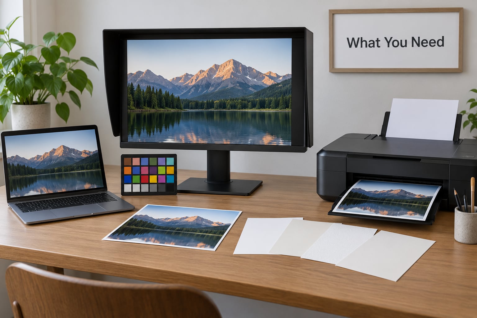
Here is the honest list. You can do most of this without buying anything, but one item makes a measurable difference.
Hardware
- A colorimeter or spectrophotometer. This is the one purchase worth making. A colorimeter reads light from your screen through a sensor and writes a profile from those readings. A spectrophotometer reads light through filters, which makes it more accurate on wide-gamut displays and blue-shifted wide-gamut channels.
- A control for ambient light. A dark room, or a hood over the screen. Not optional.
- A way to view the print later. A daylight-balanced viewing lamp or a light booth rated to ISO 3664 gives you roughly 80 lux of neutral surround when you judge the print.
- A gray card or color reference chart. Useful for building a print target if you have no colorimeter.
Software
- Calibration software. DisplayCAL is free and open source. Vendor tools from the screen manufacturer are often more capable if your display has hardware calibration built in.
- Your editing application. Photoshop and Lightroom both soft proof well. Capture One and Affinity Photo do too, with slightly different menus.
Print materials
- The paper, named exactly. You need the ICC profile that matches your printer, ink set, paper brand, paper surface and paper size. Glossy, matte and lustre are different papers with different profiles even from the same manufacturer.
- A test print target. Grayscale steps, skin tone patches and a few saturated color patches. Even a sheet printed on a home inkjet teaches you something.
If you have no colorimeter, skip to the fallback at the end of step one. It is slower and less precise, but it works.
Step-by-Step
1. Calibrate the monitor
Turn the display on and leave it for twenty minutes. Backlight brightness and panel temperature drift while it warms up, and calibrating a cold panel means your profile is wrong by the time you finish.
Reset the monitor to factory defaults first. Leave the on-screen brightness and contrast at their default positions, and change brightness in software, not through the on-screen display. Most quality monitors treat the hardware brightness control as an override that limits the range calibration software can work with.
Turn off anything that shifts color. On Windows, disable Night Light and Night Shift. On macOS, disable True Tone. These features sit above the color pipeline and adjust the signal before your ICC profile is applied, which means the profile you measured describes a display that no longer looks the way it did during calibration. The profile attached to the display in Color Management will still be listed correctly. The profile is not what is broken here, the filter underneath it is.
Run the calibration software with these targets.
| Setting | Print work target | Web and design target |
|---|---|---|
| White point | D50 (5000K) or D65 (6500K), pick one and stay consistent | D65 (6500K) |
| Luminance | 80 to 120 cd/m2 | 120 to 160 cd/m2 |
| Gamma | 2.2 | 2.2 |
| Black point | Native, or set to the lowest stable level | Native |
| Ambient light | Close to zero, use a hood | Dim, roughly 10 to 20 lux |
| Average delta E | Under 2 | Under 2 |
Which white point should you choose? Print viewing happens under D50 illumination, so D50 is the textbook answer and it is what fine art printers assume. D65 is more common in general editing workflows and matches most consumer displays out of the box. Either works for photographs. What does not work is switching between them every week, because each profile describes a slightly different display.
A note on hardware versus software calibration. Hardware calibration adjusts the display’s internal lookup tables, which preserves bit depth and leaves no banding. Software calibration applies a device profile on the computer side, which works on any display but reduces the tonal range slightly. Monitors with built-in sensors, like several Eizo ColorEdge and BenQ PhotoVue models, can self-calibrate. If yours can, use that path and keep the LUT approach for everything else.
How do you know it worked? Open a neutral gray ramp. The steps should be evenly spaced with no visible banding, and the darkest step should sit near black without being crushed. Then look at a photo you know well. Skin tones should look like skin tones, not orange or pink.
No colorimeter? Print a grayscale ramp and a set of color patches, then put the print under a daylight-balanced lamp and adjust your monitor brightness and color temperature until the two match. This is the poor man’s calibration that a lot of working photographers use as a starting point. It gets you maybe eighty percent there and it takes twenty minutes. Many labs also sell or include a calibration print, where the same image is shown on screen and on paper side by side so you can match them yourself.
2. Choose the correct color space
The wrong color space is the single most common cause of a bad print, and it usually costs you a wasted print to discover it.
Your monitor displays RGB. Most inkjet printers print with CMYK inks, and some photo printers also have gray, light gray and light inks on top of that. The conversion happens in color management using the profiles on both ends. Your job is to hand the system an RGB file and let it do the work.
| Color space | What it is | When to use it |
|---|---|---|
| sRGB | The near-universal standard | Files for online labs and general printing |
| Adobe RGB | Wider gamut, deeper cyans and greens | Editing for a wide-gamut printer you control |
| ProPhoto RGB | Very wide, 16-bit | Archival capture, convert before delivery |
| CMYK | Ink-subtractive, device dependent | Only when a commercial printer demands it |
Send an RGB file to an online lab, not a CMYK one. The lab’s RIP converts your file using their profile and their ink and paper combination, and your CMYK conversion was made on a different device and will fight theirs. Forum users on photography boards are consistent on this: if you profile correctly, the lab should not need to alter your file at all.
Convert Adobe RGB or ProPhoto files to sRGB only when you export for delivery, and check the converted file for gamut clipping first. Bright saturated blues and cyans are the first things to go.
3. Select a paper profile
This is where most home print mismatches happen, because most home printers ship with a generic profile or no usable profile at all.
Install the profile your printer manufacturer supplies for that exact combination: model, ink set, paper brand, surface and size. Epson, Canon and HP all publish downloadable printer and paper profiles. Fine art papers from Hahnemuhle, Canson and Ilford have profiles from the paper maker, and those are often better than the printer maker’s version because the paper maker tested on the actual stock. A decent photo lab publishes a profile per paper, usually as a download you can load into Photoshop or Lightroom.
Do not mix. A lustre profile applied to a matte print will look wrong in a way that is hard to diagnose, because everything is slightly off rather than obviously broken. If you switch paper, switch profiles.
When a lab offers both a profile and automatic color correction, decide which one you want. Automatic correction is a black box that shifts your file before printing, which is fine if you want a predictable snapshot look and frustrating if you have graded the image yourself. Profiling is the more predictable path because you control the result.
4. Soft-proof before printing
Soft proofing simulates the print on your screen using the printer profile. It is not perfect, and it cannot simulate paper texture or printer dot gain, but it will reliably catch gamut clipping and gross brightness errors.
In Photoshop, open the Proof Setup dialog under View, choose the Custom option, pick the printer profile, then choose a rendering intent. In Lightroom Classic, set the soft proof in the Proof panel before you export anything.
Use the Simulate Paper Color setting if you have the hardware to read it. Otherwise set paper brightness to match the paper, which is roughly a value of 40 to 60 on the sliders, and turn Simulate Paper Color off when you have not calibrated to paper brightness.
Rendering intent tells the system how to handle colors the destination cannot reproduce.
| Intent | What it does | Use it for |
|---|---|---|
| Perceptual | Compresses the whole range smoothly | Most photographic prints |
| Relative colorimetric | Preserves colors, clips only what is out of gamut | Images where you have graded the tones carefully |
| Absolute colorimetric | Reproduces the paper white exactly | Proofing against a known reference |
| Saturation | Maximizes colorfulness | Graphics, not photographs |
Turn on gamut warnings. Photoshop outlines colors the printer cannot produce, which tells you exactly where to adjust before the ink does it for you.
If your soft proof and your print disagree, the usual causes are a mismatched paper profile, a proofing luminance set far from your editing luminance, and expecting the proof to predict shadow density accurately. For most people, matching shadow density is the hardest thing to predict on screen, and accepting that is part of the deal.
5. Export the print file correctly
Use a 16-bit TIFF when the lab or your own printer allows it. It is a large file but it holds gradients without banding, which matters most in skies and skin.
JPEG at maximum quality is fine for most labs and for online delivery. Set the color space explicitly to sRGB rather than leaving it at whatever your last export used, and make sure the word does not appear in the file name. Lab systems have been known to misread those.
Resolution: for a print viewed at arm’s length, 300 pixels per inch is standard. A 10 by 10 inch print needs 3000 by 3000 pixels. In Photoshop, use Image, then Image Size, set the units to inches, set resolution to 300, and then change the width and height. Photoshop calculates the pixel dimensions for you.
On sharpening, apply output sharpening only. Sharpen for the paper you are printing on, not for a screen, and go gently on portraits because fine detail in skin is exactly what over-sharpening destroys. I have thrown away more prints for over-sharpened hair than for anything else.
Name the file with the paper you selected, so you remember which profile to proof against later.
6. Print a test and compare the result
Print a small crop or a target sheet first, not the final size. A borderless 8 by 10 test costs a fraction of a large print and tells you everything about color, density and sharpness.
Judge it under neutral light at roughly 80 lux, with the print brighter than your monitor. This is the step most people skip and the step that fixes most complaints. A print under a bright lamp appears darker and more contrasty than the same print under room light, and if you compare it against a dim screen you will conclude the print is wrong when the viewing conditions are the problem.
Adjust the output, not the image. If the test prints consistently one to two stops dark, use a brightening curve on a print-specific adjustment layer in Photoshop and leave your master file alone. Building the compensation into the master means the file looks wrong on every other output, including screens and other labs.
Then fix the workflow so you only do it once. Fix the paper profile, fix the brightness target, fix the viewing light. Only then are you ready for the final print.
Common Mistakes
Almost every mismatch comes from one of these. Work down the symptom list until you find yours.
| Symptom | Likely cause | Fix |
|---|---|---|
| Print looks one or two stops darker | Printing at paper brightness from a screen calibrated higher, or paper reflectance | Brighten in a print-only adjustment layer, or lower monitor luminance toward 80 to 100 cd/m2 |
| Overall warm or orange cast | Night Light, Night Shift or True Tone active | Disable the OS filter, recalibrate if needed |
| Overall blue or cool cast | Paper profile missing, so the driver guessed | Install the correct paper profile and choose it explicitly |
| Colors dull or desaturated | Photoshop and driver both converting | Set the driver to No Color Adjustment or Color Matching Off and let the app manage color |
| Pinkish or brownish neutral grays | Out-of-gamut colors clipped without warning | Soft proof with gamut warnings on and pull those hues back |
| Blacks look gray or milky | Black point compensation off, or paper cannot hold neutral black | Turn on black point compensation, then raise the black slider slightly |
| Print darker than the soft proof | Simulating Paper Color set to a fixed value that does not match | Set Simulate Paper Color off unless you are measuring |
| Fine detail looks crunchy | Output sharpening applied twice | Sharpen once, for the output, lightly |
| Colors fine on one paper, wrong on another | Same profile reused across papers | Install and select a profile per paper surface |
| Everything matched until the screen updated | OS update, new GPU driver, or a monitor on a different input | Recheck and re-profile |
Double color management is the one to understand
Your application converts the file using the printer profile. If the driver also converts it, the file gets converted twice, and the second conversion works from numbers that no longer describe the file. Colors come out dull or dark in ways nothing seems to fix.
Set the print dialog to let the application manage color. In Photoshop that is Color Handling, then Photoshop Manages Color, with Printer Selects the paper profile. Then open the printer driver on the same machine and turn off its own color management, which appears as Color Matching Off, No Color Adjustment or Printer Managed depending on the driver. Both settings are needed. Either one alone still converts twice.
What to do without a colorimeter
Disable the operating system’s built-in display calibration assistant. On Windows, Calibrate Display Color is a gamma-and-brightness slider walkthrough, not a measurement, and it leaves the display bright enough that prints come back dark. It does not produce a profile you can trust.
What you can do instead: print a grayscale ramp and a color chart, view it under a daylight-balanced lamp at about 80 lux, and tune your monitor by eye until the two agree. Build a reusable reference by writing your calibration target on a flash card and printing it once at good quality. This is a real technique that many photographers use before they buy hardware, and it is enough to fix most of the darkness complaint on its own.
When to recalibrate
Every four to six weeks for regular print work, monthly if you print occasionally, and always after these events: an operating system update, a new graphics card driver, moving the monitor to another computer or input, a change in room lighting, a year or so of panel aging, or any time you notice yourself adjusting your editing decisions because a photo suddenly looks wrong.
Frequently Asked Questions
Why do my print colors not match my screen?
Your monitor emits light through RGB pixels while your printer reflects it with CMYK inks, so the two are physically different devices with different gamuts and different black points. On top of that, an uncalibrated monitor, a missing paper profile, or an operating system color filter shifts the image before it ever reaches the printer. Calibrate the display, install the profile for your exact paper and printer, and soft proof before printing.
How do I calibrate my monitor for color accuracy?
Warm the display for twenty minutes, reset it to factory defaults, disable Night Light or True Tone, and close the room down so ambient light is near zero. Run calibration software such as DisplayCAL and target a white point of D50 or D65, a luminance of 80 to 120 cd/m2 for print work, and gamma 2.2. Save the profile and confirm an average delta E under 2 before you edit.
Which ICC profile should I use for printing?
Use the profile made for your exact printer model, ink set, paper brand, paper surface and paper size. The paper manufacturer often supplies the most accurate version, and a good photo lab publishes one profile per paper it offers. Load that profile into your editing application, select it in the soft proof, and confirm the lab prints with its color management off so the profile is honored.
Do I need a colorimeter to print photos accurately?
Not strictly. Printing a grayscale ramp and color patches, viewing them under a daylight-balanced lamp at about 80 lux, and adjusting your monitor until they match gets you most of the way and costs nothing. A colorimeter measures the display and writes a profile from real readings, which is faster and repeatable. Many photographers start with the by-eye method and add hardware once they are printing paid work regularly.
Should I turn off printer color management in Photoshop?
Do not turn off color management in Photoshop, because the application is where the conversion from RGB to the printer profile happens. Turn off the driver-level management instead. Set Photoshop or Lightroom to manage color with the printer profile, then open the driver and select No Color Adjustment, Color Matching Off or Printer Managed. Leaving both on converts the file twice, which flattens color and darkens shadows.
Should I send RGB or CMYK files to an online print lab?
Send RGB, ideally sRGB at 8 or 16 bit. The lab’s raster image processor converts your file using its own profile, ink set and paper, and your CMYK conversion was made on different hardware and will conflict with theirs. Export as TIFF when the lab accepts it for smoother gradients, or JPEG at maximum quality otherwise, and check the reprint policy before you order a large size.
Conclusion
If you do four things this week, do these. Profile your monitor at D50 or D65 with luminance between 80 and 120 cd/m2, in a dimmed room with Night Light and True Tone turned off. Download and install the paper profile for the exact paper you plan to print on, straight from the paper maker or the lab. Soft proof with that profile and gamut warnings enabled before you commit ink. Then print one small test, view it under daylight-balanced light at about 80 lux, and adjust the output rather than your original file.
That is the whole system. It is not complicated, but it does have to be set up properly once, because a screen-to-print workflow is only as good as the weakest link in the chain between your eyes and the paper.