Choosing the right paper for photo printing comes down to six decisions: where the print will live, what finish suits the image, how heavy the sheet should be, how bright the whites are, how long it needs to last, and whether your printer can feed it. Most disappointing prints are not bad photographs — they are good images printed onto the wrong surface with the wrong printer setting.
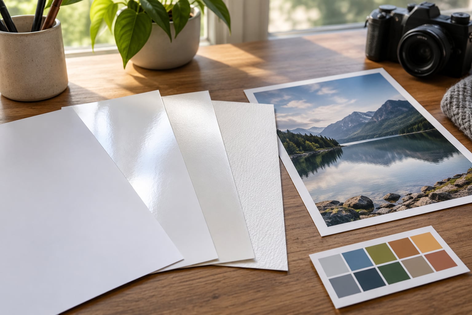
The finish matters more than any other single choice. Glossy and semi-gloss hold ink on the surface, so they look sharp and contrasty and they catch glare. Matte and cotton rag absorb ink into the surface, so they look softer, show no reflections, and handle fingerprints without flashing. If you remember nothing else from this guide, remember that: gloss for punch and punch-free for matte, and everything in between is a negotiation between the two.
This guide walks through that sequence in order, brand-neutral, so you can apply it to whatever paper your printer supports. It takes about fifteen minutes to read and one test print to apply. If you want to go straight to the test method, jump to Step 6 at the bottom of the step-by-step section.
Table of Contents
- What You Need
- Step-by-Step: How to Choose Paper for Photo Printing
- Step 1: Decide Where the Photo Will Be Displayed
- Step 2: Choose the Surface Finish
- Step 3: Select the Right Weight and Format
- Step 4: Check Brightness, Whiteness, and Color Performance
- Step 5: Consider Archival Quality and Intended Lifespan
- Step 6: Test Before Ordering a Large Batch
- Common Mistakes
- Frequently Asked Questions
- What is the best paper for photo printing?
- Should I choose matte or glossy paper for photos?
- Is photo paper better than regular printing paper?
- What paper should I use for portrait photos?
- How do I choose the right size for a photo print?
- Do I need to change printer settings when using photo paper?
- A Simple Paper-Choosing Recipe
What You Need
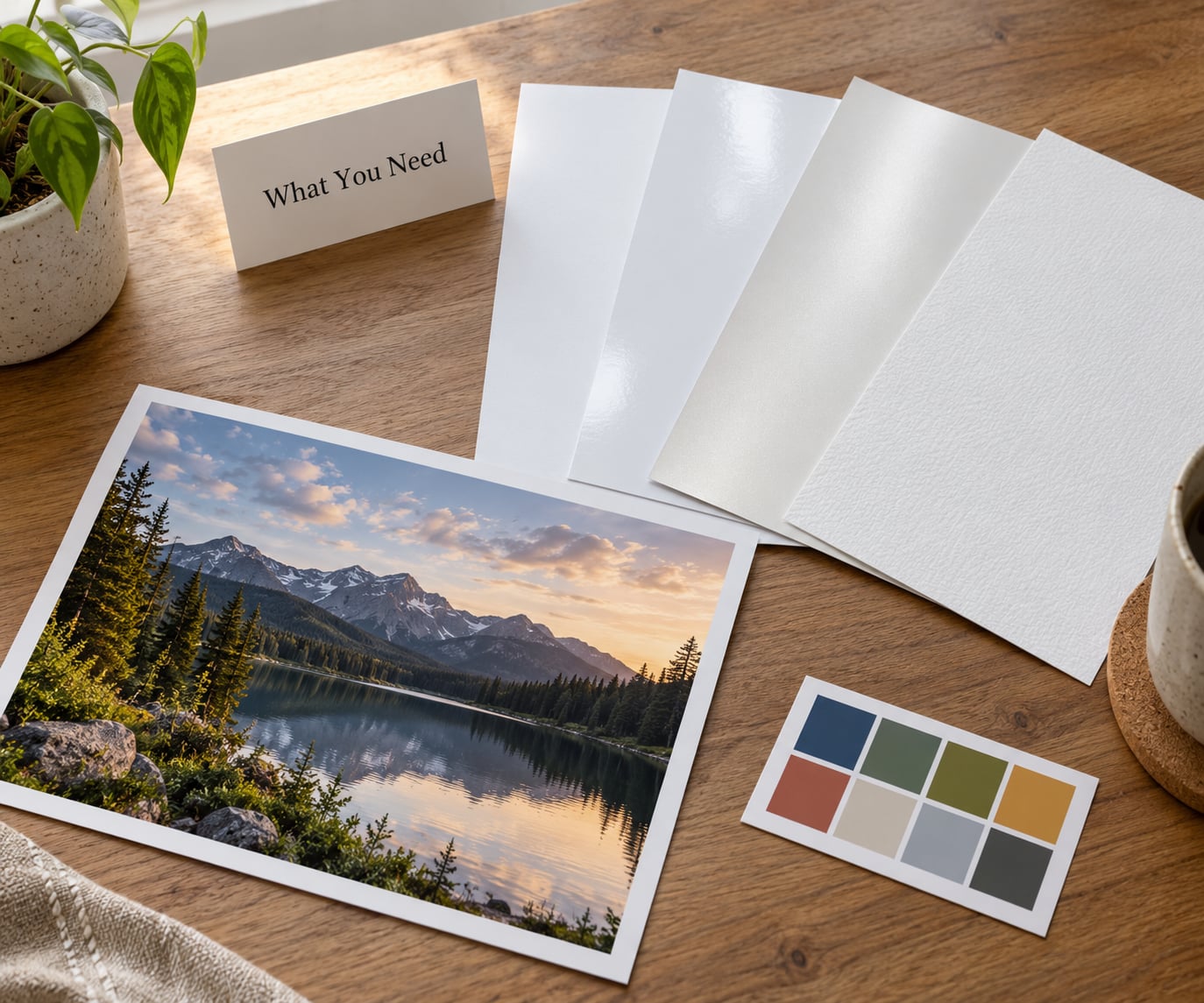
Before you shop, gather five pieces of information. The rest of the process falls out of them, and guessing at any one of them is what leads to a wasted ream of paper.
1. The final display. Where does the print go? A framed print on a wall opposite a window is a glare problem. A page in a photo album is a handling and longevity problem. A print handed to a client at a wedding is a first-impression problem. Each one points somewhere different.
2. Your printer’s supported media. Check the manual or the driver before you fall in love with a paper. Consumer inkjets typically handle 10-mil sheet-fed stock reliably and may fight with anything heavier. Wide-format and photo printers accept far more. Some desktop models simply cannot take canvas or thick cotton rag without a rear feed tray.
3. Print size. The dimensions decide both the sheet format and the weight, because small prints tolerate thin paper and large framed prints do not. A 4×6 print in a 170 gsm sheet is fine. The same image at 24×36 in that weight will droop away from the wall and buckle inside a frame.
4. Viewing distance and lighting. Gloss needs controlled light and close viewing. A poster read from across a room loses its fine detail no matter how expensive the paper is, so weight and scale matter more than surface there.
5. Tonal expectations. Look at your image honestly. High-contrast files with clipped blacks need a surface that holds deep blacks. Soft, low-contrast, foggy files need a surface that does not crush them further. Portrait skin tones are the most revealing test of any paper, and they are the first thing to look wrong on a bad glossy sheet.
Also decide whether archival life is a requirement or a nicety. That answer changes which category of paper you shop in, and it is the difference between a coated photo paper and a conservation-grade rag.
Step-by-Step: How to Choose Paper for Photo Printing
Work through these in order. Each step narrows the field, and each one is cheaper to get right before you buy than after.
Step 1: Decide Where the Photo Will Be Displayed
Start with the room, not the paper. Display conditions decide the finish more reliably than taste does, because a beautiful print that catches a window reflection all afternoon is a print people stop seeing.
Framed wall art. Choose matte, lustre, or a textured rag. Anything glossy opposite a window will fight you, and museum-grade glazing helps but costs as much as the print. Matte also disappears behind non-reflective glass without adding a grey haze, which is why galleries lean that way.
Albums and scrapbooks. Lustre or satin hits the sweet spot. Matte is fine but can look flat when the page sits under plastic; glossy shows every fingerprint the moment someone turns the page. Weight matters more here than gloss does, so go at least 200 gsm and check that the album’s pocket depth can take it.
Calendars, gifts, cards, and cards for clients. Lustre again, at 200 to 260 gsm, because it survives handling and reads well in a mail. If the print will be signed in ink on the back, leave a small uncoated margin.
Commercial display, menus, event signage. Gloss or a heavy matte with a coating, depending on whether it gets wiped down. Scrubbing destroys most fine art surfaces, so if anyone cleans it, buy a coated stock and accept the shorter life.
A useful rule: the more the print will be touched, the lower the gloss. The more it will be looked at across a room, the more the weight and scale matter than the surface.
Step 2: Choose the Surface Finish
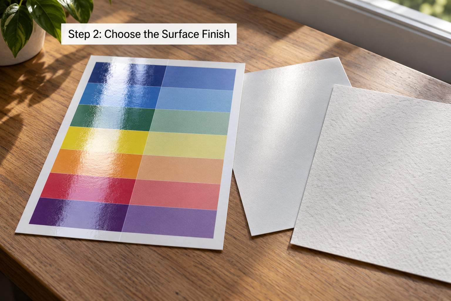
Finish is the single biggest visual difference between two prints of the identical file. Glossy gives the sharpest image and the most saturated colour but reflects light and shows handling. Matte gives no reflections and forgiving handling but softens fine detail and lowers contrast. Lustre and satin sit between them and are the most common professional choice.
| Finish | Reflection | Sharpness and contrast | Handling | Best for |
|---|---|---|---|---|
| Glossy (gloss) | High, shows light sources | Highest; deepest blacks | Shows fingerprints, scratches easily | Vivid colour, small prints, display cases |
| Semigloss / lustre | Low to moderate | High; strong black density | Handles well | Portraits, wedding and client prints, albums |
| Satin / pearl | Soft sheen, diffuse | High but slightly muted | Very forgiving | Everyday colour, gifts, high-volume runs |
| Matte | None | Softer; lower micro-contrast | Fingerprint-resistant | Framed wall art, black and white, skin tones |
| Textured rag / canvas | None, with visible tooth | Texture fills fine detail | Very forgiving | Exhibition prints, large wall pieces, art prints |
Four practical notes on finish. Glossy renders skin tones with a waxy, plasticky look on cheap coatings, which is why portrait work usually sits on lustre or matte. Matte loses the fine detail in foliage and fabric texture, so heavily detailed subjects benefit from lustre. Black and white work splits: matte gives the flattest, most archival-looking tonal ramp, while lustre gives more punch. And any textured surface swallows detail, so only use texture when the image is large enough that the tooth reads as intentional.
If you are still torn, buy a semi-gloss sheet. It keeps most of the sharpness of gloss without the mirror problem, and it is the finish most working photographers land on.
Step 3: Select the Right Weight and Format
Weight is expressed in gsm, the grams of paper in a square meter. For photo printing, 180 to 310 gsm covers almost everything, and the practical bands are these.
150 to 190 gsm is everyday and semi-gloss territory. It is fine for 4×6 and 5×7 prints, for drafts, and for anything going straight into an album. It curls slightly in humid conditions and looks thin under glass.
200 to 260 gsm is the standard professional photo range. It holds a flat sheet, feeds reliably, and frames well. If you are buying one weight for general studio work, this is it.
270 to 310 gsm is fine art and archival territory: cotton rag, baryta, and heavier fiber papers. These feel substantial in the hand and take a pencil note on the back without feathering through. Check your printer’s maximum sheet thickness first, usually quoted in mil (a thousandth of an inch); many consumer units accept 10 mil, which is roughly 250 gsm of coated stock, and reject much beyond it. Too thick a sheet either will not feed or strikes the print head when it does, and that error is expensive.
Formats are the second half of this decision. Standard sheet sizes such as 4×6, 5×7, 8×10, 11×14, 13×19, and 17×25 line up with common frame and album sizes, so you waste nothing. Borderless sizes need a printer that can do borderless printing; if yours cannot, leave a small white margin and trim it yourself. Rolls are the answer for large work and for panoramic formats, and they also give you control over the grain direction. Wide-format printers take rolls, and desktop inkjets almost always take sheets only.
Match the size to the final image, not the other way round. If your print will be framed, pick the opening size first and cut the paper to fit, or print borderless only if the printer supports it.
Step 4: Check Brightness, Whiteness, and Color Performance
Brightness is a number from roughly 92 to 100 that describes how much light the paper reflects. Higher numbers read as whiter and make a print look brighter in a room, which is the direction people usually get backwards — a 94-brightness sheet is not a duller sheet than a 92-brightness one. The real difference between two points is barely visible in isolation, so treat brightness as a tiebreaker rather than a decider.
The thing that actually changes your print is the paper’s white point, which is the color of the paper itself. Most bright office and photo papers use optical brightening agents, or OBA, which fluoresce blue under ultraviolet light to make the sheet look whiter than it really is. It looks great under daylight and shifts warm under warm indoor bulbs or behind UV-filtering glass, and it can push a whole print yellow over years. That yellowing is the single biggest reason a print that looked perfect on the desk looks tired in a frame five years later.
So judge tone, not brightness numbers. Look for neutral whites, clean blacks, and skin tones that do not go orange or chalky. Ask whether the paper is OBA-free, which matters for anything you intend to keep or sell. Baryta and many cotton rag papers are naturally bright without optical brighteners, which is part of why fine art printers use them.
Two practical tests: view a sheet under the same lighting the print will live in, and look at a mid-gray patch rather than the white border. Blacks are where cheap gloss fails; if shadow detail disappears into a flat block, the black density is too low for that image and you want a different surface.
Step 5: Consider Archival Quality and Intended Lifespan
Ordinary copy paper, photo paper, and archival paper are three different products, and only one of them is designed to survive a wall. Copy paper is uncoated and uncalibrated; it exists to carry text. Photo paper is coated or treated to hold ink, with a coating that reacts with light and moisture. Archival paper is made to specific conservation standards, usually acid-free and lignin-free, with pigments chosen for stability.
Expect realistic lifespans rather than marketing ones. A good coated photo print in a frame behind UV glazing, away from direct sun, commonly outlasts a lifetime. The same print in a south-facing window without glazing will visibly fade in a few years. Archival rag and baryta prints are the right choice for originals you intend to sell, exhibit, or hand to a client as a keepsake, and for anything under glass where you cannot control the light.
Worth paying for conservation-grade material when the print is a sale, an exhibition piece, or a family photograph that will outlast the person hanging it. Not worth it for test prints, contact sheets, or a birthday card.
Storage and framing count as much as the paper. Ask for UV-filtering glazing, keep prints out of attics and basements where humidity swings, and never use tape or ordinary adhesive on the front of a photograph.
Step 6: Test Before Ordering a Large Batch
This is the step that separates a print you like from one you can sell. Test on the paper you actually intend to use, in the conditions you actually intend to display.
Check compatibility first. Look up the paper in your printer’s supported media list, confirm the maximum sheet thickness, and check whether your model needs a rear or manual feed for anything heavy. Never feed unknown coated or sticker stock through a printer you care about; a misfed sheet can cost far more than the paper.
Request a sample. Most paper sellers will send a swatch pack, and mills often ship samples directly. Ask for two: one gloss and one matte or lustre in the same weight. Judge them in daylight and in the room where the print will hang.
Load the correct profile. Install the ICC profile that ships with the paper, and select it in your print application’s paper or media setting. Choosing the paper by name in the printer driver is not optional; the driver sets ink limits, drying behavior, and how much ink the coating can hold, and printing photo paper on a plain-paper setting is the most common reason colors look muddy or blacks look flat.
Print one test with the final image. A single sheet at final size tells you more than a grid of patches. Use the file you care about, including skin tones and deep shadows.
Judge it where it will live. Look at it under the same lighting, at the same distance, and after handling it once with your fingers. If the glare moves across the image as you shift position, go lower gloss. If the image looks soft at arm’s length, go higher gloss or use a heavier sheet.
Then scale up. Ordering 25 sheets of a paper you have never printed is how people end up with a beautiful stack of prints they cannot use.
Common Mistakes
Choosing paper by cost per sheet. Cost per print is the only number that matters, and a heavier sheet that prints cleanly is often cheaper per usable image than a cheap sheet you reprint. Correct it by judging the finished print, not the invoice.
Using gloss where there is glare. A glossy print facing a window is unreadable at certain times of day. Correct it by moving to lustre or matte, or by specifying UV-filtering anti-reflective glazing.
Printing an important image on ordinary paper. Copy paper absorbs ink differently and cannot hold saturation or black density. If a print looks dull, check the sheet before you blame your editing.
Ignoring the media type setting. The wrong setting floods the coating and produces muddy color, blocked blacks, or slow drying and smudging. Correct it by setting the paper by name in the driver before every new paper you introduce.
Judging a print without judging the file. Viewing a print through a cheap monitor or comparing it to an over-sharpened screen tells you nothing. Correct it by calibrating your display, or by comparing two prints of the same file side by side under the same light.
Buying the wrong sheet size. Ordering 13×19 when you framed a 11×14 means trimming or reprinting. Correct it by measuring the finished opening and the frame’s rebate, not the image, then buying a sheet that fits with a few millimetres to spare.
One more that costs beginners real money: leaving paper in the printer tray for weeks. Inkjet dye ink on an uncapped sheet dries onto the coating and you will find out at the worst moment. Store sheets flat, in the original sleeve, away from heat.
Frequently Asked Questions
What is the best paper for photo printing?
For most people, a 200 to 260 gsm semi-gloss or lustre inkjet photo paper is the best balance of sharpness, colour and handling. Choose matte or a cotton rag for framed wall art and portraits where reflections are a problem, and glossy for vivid colour at small sizes. Match your printer’s supported media list before deciding.
Should I choose matte or glossy paper for photos?
Choose matte when the print will hang in glare, be handled often, or show skin tones, because it reflects no light and resists fingerprints. Choose glossy for vivid colour, deep blacks and fine detail in small prints viewed close up, and accept that it will show every reflection and fingerprint. Lustre is the safe middle ground most professionals choose.
Is photo paper better than regular printing paper?
Yes, and the difference is obvious on any image with colour or tone. Regular copy paper is uncoated and absorbs ink into the fibres, so colours look washed out, blacks look grey and skin tones go flat. Photo paper has a coating or treatment that holds ink on the surface, which is what produces contrast, saturation and detail.
What paper should I use for portrait photos?
Use lustre or semi-gloss photo paper at 200 to 260 gsm for most portrait work. It keeps skin tones smooth without the mirror effect of gloss, and it shows more micro-contrast than matte, which matters for hair and fabric detail. For large framed portraits in controlled light, a matte cotton rag gives the most flattering skin rendering.
How do I choose the right size for a photo print?
Work backwards from the frame or album. Measure the visible opening, add the overlap your frame needs on the back, and buy a sheet that matches a standard size so you waste nothing. Common sizes are 4×6, 5×7, 8×10, 11×14, 13×19 and 17×25. Check your printer supports borderless printing before committing to full-bleed sheets.
Do I need to change printer settings when using photo paper?
Yes. Select the paper by name in the printer driver and load the ICC profile that ships with it. The media type setting controls ink limits, drying time and how much ink the coating can hold, and leaving it on plain paper is the most common reason photos look muddy or blocked. Change it every time you switch paper types.
A Simple Paper-Choosing Recipe
Do this first: print one test sheet on a 200 to 260 gsm semi-gloss paper, with the paper selected by name in your printer driver and its ICC profile loaded. Hang it in the room where the print will go, at the size you plan to print, and look at it tomorrow in both daylight and evening light.
If it looks too flat, move to gloss. If it flashes with reflections, move to matte or a lustre cotton rag. Once that sheet is right, order your weight, and only then decide whether the job needs archival material. Choosing paper for photo printing is not about finding the best paper in the world — it is about matching the surface, the weight, and the printer settings to the room the image ends up in. Print one sheet, judge it there, and the choice makes itself.