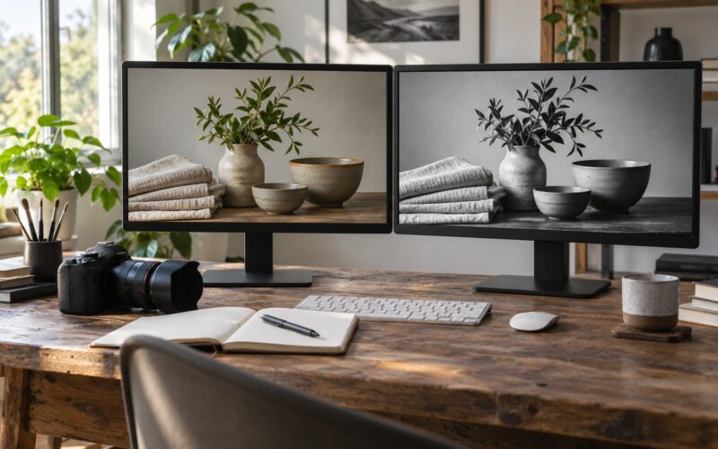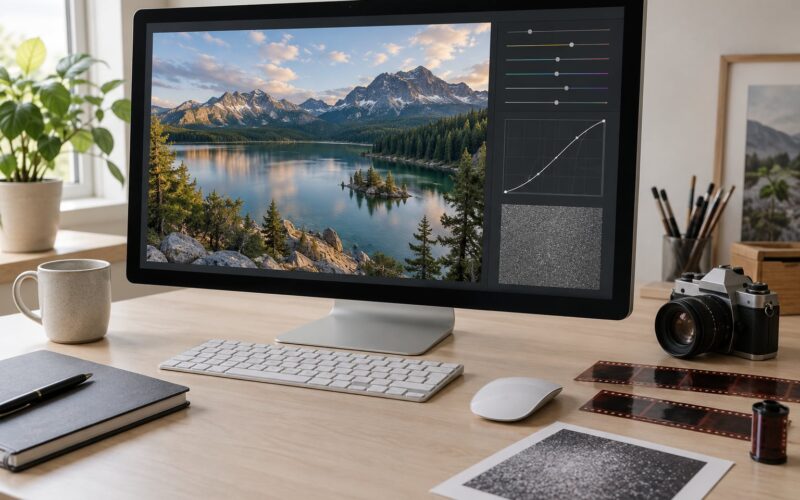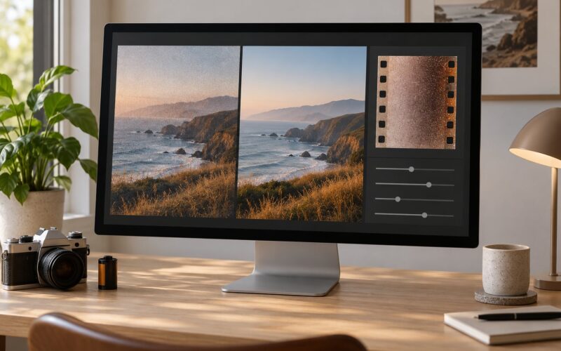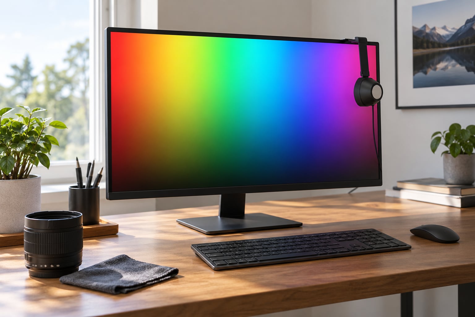
Choosing a monitor for photo editing comes down to four things you can actually verify: accurate color, a panel that holds that color steady, enough resolution to judge detail, and controls that let you lock the result in with a colorimeter. Ignore the headline brightness number and the fancy word for any monitor can sell you.
The good news is that you do not need a spec sheet background to do this well. About an hour of reading and a short checklist will tell you more than an afternoon of comparing marketing pages, and most of the expensive mistakes people make happen in the first five minutes of shopping.
Below is the process I use when someone asks me what to buy for their editing desk. It runs in order because each step narrows the field for the next one. Skip to the section that matters most for your work if you already know your subjects.
Table of Contents
- What You Need
- Step-by-Step
- 1. Set Your Editing Priorities
- 2. Choose the Right Panel Type
- 3. Look for Accurate Color Before Maximum Brightness
- 4. Match Resolution and Screen Size to Your Images
- 5. Check Brightness, Contrast, and HDR
- 6. Evaluate Viewing Angles and Glare
- 7. Confirm Calibration and Adjustment Options
- 8. Test the Monitor in Person
- 9. Set Up and Validate Your New Monitor
- Common Mistakes
- Frequently Asked Questions
- Is a 4K monitor necessary for photo editing?
- Do I need a colorimeter to choose or calibrate a monitor?
- Is IPS the best panel type for editing photos?
- Is HDR important for photo editing?
- What resolution should I choose for photo editing?
- Can a laptop screen replace a dedicated photo-editing monitor?
- Conclusion
What You Need
Before you compare anything, gather four things. Without them, every monitor will look plausible and you’ll be guessing.
- A colorimeter. This is the small clamp-on sensor that measures a screen patch and writes a profile for your operating system. Datacolor SpyderX models cover the affordable end, X-Rite i1Display is the accuracy-first option, and Calibrite ColorChecker products sit in between. You do not need to own one to shop, but knowing which one you will buy changes which monitor makes sense.
- A reference image set. A grayscale ramp, a skin-tone chart, a saturated red-green-blue patch sheet, and two or three photos you have printed before. Files you know the correct appearance of are worth more than any specification number.
- Your editing application. Lightroom, Capture One, Photoshop, Affinity, and the free options all manage color differently. Knowing which one you will spend eight hours a day inside tells you how much screen workspace you need.
- A clear look at your room. Where the monitor sits matters as much as which monitor it is. Note the direction windows face, whether you can turn off the overhead light, and how far back from the screen you normally sit.
Also decide now whether this is a one-monitor desk or a second display beside a laptop. That choice changes the port requirements in a way that is annoying to fix later.
Step-by-Step
There are nine steps, and they run in this order: priorities, panel, color accuracy, resolution and size, brightness and contrast, viewing angles and glare, calibration support, an in-person test, and finally first-use setup. The best monitor for photo editing is whichever one survives all nine for your particular subjects and your particular room.
1. Set Your Editing Priorities
Start by writing down what you actually shoot and deliver. Portrait work lives and dies by skin tone accuracy and fine gradation in the cheeks. Product and e-commerce work needs neutral whites and a clean matte surface. Landscape photographers chase highlight recovery and want a wide gamut plus real headroom for bright skies.
Then note your output. Images headed for Instagram or a client PDF live in sRGB. Images headed to a lab print may need Adobe RGB, which is a wider space covering deeper cyans and greens. If you print regularly, put Adobe RGB coverage high on your list. If you deliver everything to screens, sRGB accuracy matters more than anything else you could buy.
Video changes the answer again. Grading work pulls toward DCI-P3 and HDR, which is a different set of requirements from a stills-only workflow. Mixed media is the hardest case, and it is the one that argues for a monitor with hardware calibration support so you can move between spaces without guessing.
2. Choose the Right Panel Type
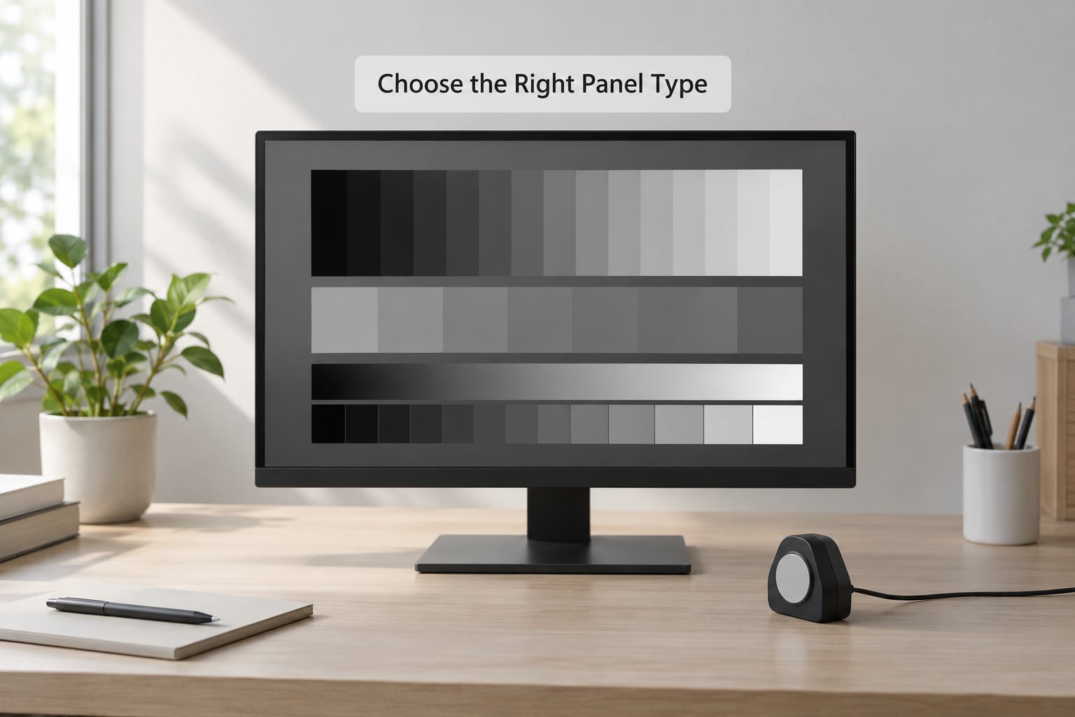
IPS is the sensible default for photo editing. Color shifts stay small when you lean back or glance sideways, whites stay neutral, and matte or semi-matte coatings handle a lit room without turning the screen into a mirror.
Glossy screens look spectacular in a dim room and punish you in a bright one. Every light source in the room becomes a reflection sitting on top of your image, and you end up dimming the screen to hide them, which throws off your brightness match to print. Glossy only makes sense in a deliberately dark editing suite.
TN panels are cheap and fast, but their color shifts with viewing angle are severe. Editing on one means your image changes as you shift in your chair, which destroys the whole point. VA panels sit between IPS and TN with deeper blacks, but slow response times make them a poor match for anything involving a cursor or a brush stroke.
OLED deserves its own paragraph because it is genuinely different. You get perfect blacks, essentially infinite contrast, and no blooming around highlights. Editors who work in dim rooms report the difference as startling on the first day. The catch is that OLED panels can burn in from static interface elements, and an editing application is nothing but static panels and toolbars sitting on screen for hours.
Modern OLED editing monitors ship with pixel shift, logo dimming, and panel refresh cycles that mitigate this. If you go OLED, run all three on a schedule. If you are nervous about it, IPS Black panels now deliver blacks close to older OLEDs with none of that risk.
3. Look for Accurate Color Before Maximum Brightness
Color accuracy is measured as Delta E, where a lower number means the displayed color is closer to the reference. Under 2 is fine for most work. Under 1 is professional territory. These figures should be measured after calibration, not in a marketing PDF, because factory sheets measure the same unit under lab conditions that rarely match your desk.
Gamut coverage is the second number. You want close to full sRGB coverage as the baseline, plus Adobe RGB coverage if you print, plus DCI-P3 if you touch video. Watch out for inflated Adobe RGB claims. People routinely test monitors advertised at wide Adobe RGB coverage and find real-world coverage sitting noticeably lower, so look for independent measurements rather than the box.
Color depth matters more than most buyers realize. An 8-bit panel steps each channel through 256 values, and a smooth sky gradient can show visible banding. 10-bit panels give 1024 values per channel. Plenty of 8-bit monitors simulate this with FRC, which dithers between adjacent values and looks convincing in motion but can shimmer on large flat areas.
Ask one more question: does the monitor ship with a calibration report, and can it be recalibrated by the owner? A monitor with an internal LUT that accepts custom profiles beats one that only offers a fixed factory profile, every time. Factory calibration drifts within months, which is the single most common complaint I hear from people who trusted a spec sheet.
4. Match Resolution and Screen Size to Your Images
Resolution determines how much detail you can actually judge, and pixel density determines how comfortable that is to look at all day. Here are the common combinations:
- 24 inch at 1920×1080 sits around 92 pixels per inch. Fine for framing and culling, soft for pixel-level work.
- 27 inch at 2560×1440 lands near 109 PPI. Sharp, but 8-bit panels at this size show gradients more readily.
- 27 inch at 3840×2160 hits roughly 163 PPI, which is the sweet spot most editors land on. Text is crisp, and you get enough width for a histogram and panels beside your image.
- 32 inch at 3840×2160 drops to about 138 PPI. More room, slightly softer, and you sit a bit further back.
- 27 inch at 5120×2880 gives 218 PPI, effectively Retina-class detail. Excellent, and you will want to move windows rather than read text all day.
Matching matters. A high-resolution panel at 24 inches makes text uncomfortably small, and a low-resolution panel at 32 inches makes everything soft. If you also do video, an ultrawide gives you a timeline and viewer side by side without a second screen.
One more consideration: scaling. On Windows, a 27-inch 4K panel usually runs at 150 percent scaling, which is the sweet spot editors mention most often for text comfort plus workspace. On macOS, check that the monitor has a proper scaling mode rather than running at native resolution with tiny interface elements.
5. Check Brightness, Contrast, and HDR
Brightness matters less than people assume. What matters is that you can dial it to match your output. For print work, aim for roughly 120 cd/m². For screen delivery such as social media or client web galleries, a somewhat brighter target of 140 to 160 cd/m² usually matches how the image will be viewed. Set brightness to match the brightest thing you will regularly look at beside the screen.
Contrast ratio specifications are usually measured in a dark room under controlled conditions, which is not your room. Use the number as a rough guide between models rather than a promise. What you can verify is whether blacks look gray when you view a dark image in a normally lit room.
HDR is a bonus for photographers who shoot into high dynamic range and edit for displays that can show it. It is not a substitute for accurate SDR color, and it does not help prints. Treat it as a nice extra, not a buying criterion, unless your work is specifically graded for HDR delivery.
6. Evaluate Viewing Angles and Glare
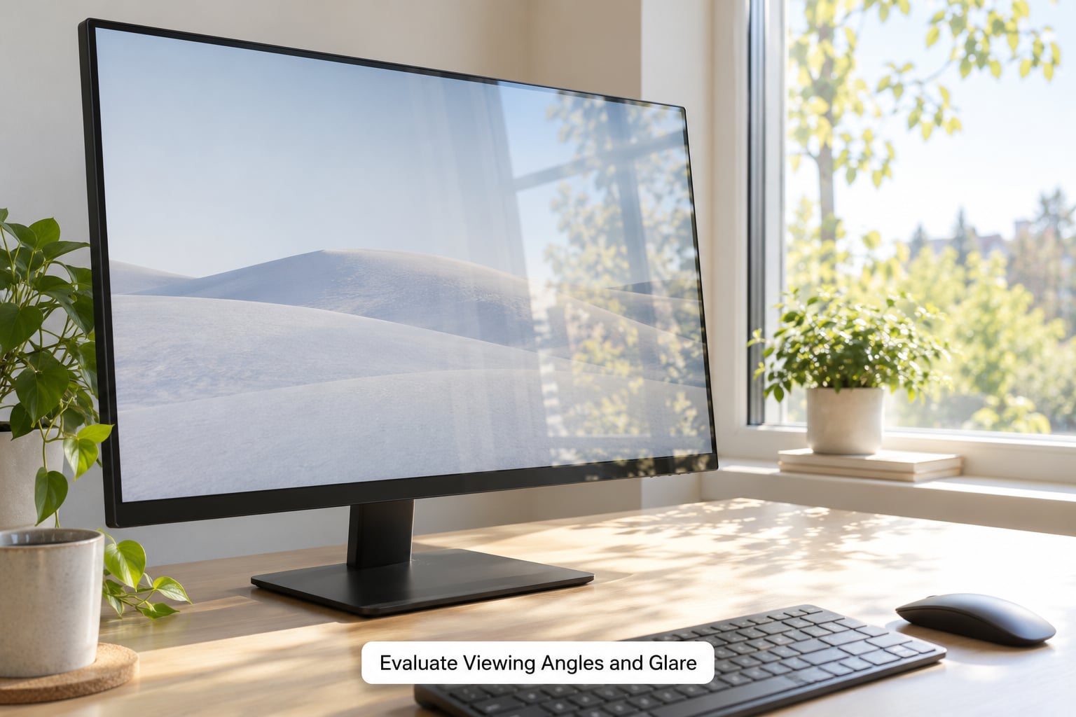
Every monitor is calibrated for a straight-on view. The question is how fast it degrades. IPS and OLED panels hold color well off-axis, which means you can shift position without your image changing appearance. TN panels do not, which is why they fall out of consideration for editing.
Glare depends on the coating. Matte or anti-glare finishes scatter reflections and are the right choice in a bright room. Semi-matte is the compromise most photo editors settle on. Glossy shows the deepest blacks and the least sparkle, but only in a dim space with controlled lighting.
Position matters as much as the panel. A monitor facing a window will fight you all day no matter how good it is. Turning the screen 90 degrees to the window, using a monitor hood, or hanging a blind removes more reflected light than any spec improvement. If your room allows it, aim for neutral daylight at a comfortable level rather than darkness, because working in a dark room on a bright screen tires your eyes and skews your brightness perception.
7. Confirm Calibration and Adjustment Options
Check that the monitor accepts a hardware calibration profile and has controls fine enough to reach that profile. Basic brightness, contrast, and color temperature sliders are enough for most profiles. Gamut-adjustment controls and a direct white point setting make life easier for anyone doing serious color work.
On-screen menu quality matters more than people expect. Nested menus you navigate with a five-button stick are frustrating every single time you need a setting. Monitors with a joystick, a good rotary dial, or a proper on-screen menu save you real time over a year.
Look for a monitor that ships with an ICC profile, supports custom profiles through a built-in LUT, and works with the colorimeter you plan to buy. Some brands also bundle calibration software with paper presets that generate a profile for a specific paper stock, which shortens the print matching loop considerably.
Finally, confirm the ports fit your desk. USB-C with power delivery lets one cable carry video, data, and laptop charging, and the wattage matters. Check whether your laptop needs 60W, 65W, 90W, or more. A built-in USB hub and a KVM switch save cable clutter if you regularly move between a laptop and a desktop.
8. Test the Monitor in Person
If you can get in front of the actual unit, this step pays for itself in ten minutes. Bring a USB drive with your reference images and a laptop that outputs at full resolution.
Open a grayscale gradient and look for banding or uneven steps. Open a skin-tone photograph and check for any green or magenta cast. Open a black-and-white image and look at whether the blacks hold detail or crush to nothing. Rotate a saturated image and watch for hue shift.
Then check the boring things that ruin daily work. Read small text at your normal viewing distance and sit at that distance for two minutes to check for eye strain. Look at the corners of a flat gray field for uneven tint or backlight bleed. Adjust the stand through its full range to confirm it reaches eye level. Confirm the ports are on the side you want them, not hidden underneath.
Turn the brightness all the way down and check whether the screen goes properly dark or fades to gray. Turn it up and check for a bright patch in any corner. Those two checks tell you more about uniformity than any specification, and uniformity is what determines whether a large part of your image matches.
9. Set Up and Validate Your New Monitor
Let the display run at a moderate brightness for 20 to 30 minutes before calibrating. Cold panels settle, and calibrating a warm-up monitor gives you a profile that will not hold.
Set your ambient light first, then hang the colorimeter over a blank white screen in an app that displays pure white and lets you set the backlight. Match brightness to your target: about 120 cd/m² for print, 140 to 160 cd/m² for screen work. Run the calibration, save the profile, and confirm the operating system loaded it rather than silently falling back to a generic profile.
On Windows, open Color Management and check that your profile is attached to the display. Windows color management is the most common source of frustration for new editors, and usually the cause is a profile that exists but is not assigned. On macOS, the profile should appear in the Displays color settings without extra work.
Then open your editing application, load your reference files, and compare against what you remember. Expect your images to look duller for a few days, which is normal and usually means the monitor is showing you the truth rather than oversaturating. Schedule a recalibration every four to six weeks, and immediately if you notice a shift, a room lighting change, or a Windows update.
Common Mistakes
Choosing by screen size first. A big screen with mediocre color is worse than a smaller accurate one, because size is immediately visible while accuracy only shows up after calibration. Set color accuracy as your filter, then size and resolution.
Treating brightness as quality. The brightest monitor on the shelf is usually just the least well-controlled one. Ignore maximum nits. What you want is control at a low, matched brightness level.
Ignoring reflections. A glossy screen facing a window is unusable regardless of its color specs. Rotate the screen, add a hood, or hang a shade before you decide the monitor is at fault.
Buying on factory calibration alone. The unit you receive may not be the unit that was measured, and it will drift. Only buy if the monitor supports owner calibration.
Skipping the colorimeter and adjusting by eye. Eyeball calibration feels convincing and is reliably wrong. Software-only visual estimates can set the white point, but they cannot correct gamut or tone curve accuracy.
Never testing against a specific workflow. Someone who prints large fine-art landscapes needs uniformity and shadow detail. Someone who edits social content every day needs speed and a bright screen. Check the monitor against the output you actually produce.
Forgetting ergonomics. A stand that will not reach eye level leaves you hunched, and a screen you have to lean forward to read causes eye strain within a week. Confirm the stand range and check that your desk height works with it before the box is opened.
Frequently Asked Questions
Is a 4K monitor necessary for photo editing?
Not necessary, but it is the most practical step up. At 27 inches, 3840×2160 gives roughly 163 pixels per inch, which is sharp enough to inspect skin texture and edge detail without scaling software fighting you. A 27-inch 2560×1440 panel is perfectly workable for framing, culling, and most corrections, and it costs less. Choose 4K if you judge detail or retouch at high magnification. Choose QHD if your budget goes further toward a better panel or a colorimeter instead.
Do I need a colorimeter to choose or calibrate a monitor?
You do not need one to choose, but you will need one to get repeatable color. A colorimeter measures actual screen output and writes an ICC profile your system applies automatically, which corrects the white point and gray balance far better than eyeballing menu settings. Software-only visual estimates can set brightness and roughly set white point, but they cannot fix gamut accuracy. If you print, work in Adobe RGB, or deliver to clients, a colorimeter is the single highest-value accessory after the monitor itself.
Is IPS the best panel type for editing photos?
IPS remains the safest general answer. It holds color steady off-axis, resists glare with matte or semi-matte coatings, and has no burn-in risk from static editing panels and toolbars. OLED gives you perfect blacks and far higher contrast, which many editors prefer in a dim room, but it costs more and needs pixel shift and panel refresh enabled to protect against burn-in. For most photographers, IPS Black is the strongest compromise on both fronts.
Is HDR important for photo editing?
Only for a specific kind of work. HDR matters if you deliver images to HDR displays, grade video, or shoot and edit high dynamic range scenes for modern screens. It does not improve prints and it does not make SDR colors more accurate. Treat HDR capability as a secondary feature unless HDR output is part of your actual deliverable list. When you do calibrate for HDR, you calibrate separately, because HDR and SDR use different tone curves and brightness targets.
What resolution should I choose for photo editing?
Match resolution to physical size, because the combination determines pixel density. Good options are 27 inch at 3840×2160 for about 163 PPI, 24 inch at 1920×1080 for a tight budget, and 27 inch at 5120×2880 for Retina-class sharpness. Avoid pairing 4K with a 24-inch panel, which makes interface text uncomfortably small, or 1080p with a 32-inch panel, which looks soft. On Windows, 27-inch 4K at 150 percent scaling is the most commonly recommended setup.
Can a laptop screen replace a dedicated photo-editing monitor?
It can handle light editing, but it is a poor substitute for serious color work. Laptop panels are typically glossy or semi-matte, brighter than most editing targets, and uncalibrated out of the box, which means every photo looks different from what you intended. Editing software also runs its own display transformations that make a built-in screen difficult to profile accurately. If you travel, pair a portable colorimeter and a good ICC profile workflow with the laptop. For client work, use a dedicated display.
Conclusion
Start by writing down what you shoot and where the files end up, because that single page of decisions removes most of the wrong options before you open a single product page.
Then buy on color accuracy first, panel second, resolution third. Look for low Delta E after calibration, wide enough gamut for your output space, hardware calibration support, and a matte or semi-matte finish that suits your room. Add a colorimeter before you upgrade anything else, set your brightness target, and recalibrate on a schedule.
Knowing how to choose a monitor for photo editing is not about finding one perfect display. It is about picking the one that stays accurate in your space, at your desk, for the kind of work you actually deliver.