Most photography sites slow down for one reason: the browser is being asked to download full-resolution camera files just to fill a phone screen. Speeding up a photography website with large images means cutting the number of bytes each photo costs the visitor, resizing every file to the size it is actually displayed at, and serving a modern format with caching turned on. Do that and the gallery paints in a fraction of the time without the photographs looking soft or flat.
This takes about an afternoon for a portfolio of a few hundred images, and most of the work is a one-time batch job rather than a per-image chore. The seven steps below go in order, because measuring first is what tells you which fix mattered.
Table of Contents
- What You Need
- Step-by-Step
- 1. Measure the Problem With a Real-World Page Test
- 2. Resize Large Images to the Size Readers Actually Need
- 3. Compress JPEGs Without Obvious Quality Loss
- 4. Use Modern Formats and Responsive Markup
- 5. Separate Full-Size Images from Lightweight Previews
- 6. Enable Browser and CDN Caching
- 7. Retest the Gallery and Protect Image Quality
- Common Mistakes
- Frequently Asked Questions
- How much should I compress photos for a photography website?
- Is WebP better than JPEG for a photography portfolio?
- Which images should I lazy-load on a photography website?
- Do I need larger images for Retina or high-resolution displays?
- How can I keep full-resolution photos available without slowing down galleries?
- Why is my photography website still slow after image compression?
- Conclusion
What You Need
You need access to the place where your images live: the site dashboard if you run WordPress, the media library or folder structure if you built the site yourself. Without that access, nothing else here is possible.
You also need the original camera files, or at least the largest export you have. Compression cannot invent detail that was never uploaded, so starting from the full-size master gives you room to work downward rather than upward.
Next, a free page-speed test. PageSpeed Insights runs a Lighthouse audit on any public URL and needs no account. Search Console gives you the same Core Web Vitals numbers from real visitors once your site has enough traffic.
Finally, something to process the files with. That can be a free desktop tool, a free web tool like Squoosh, or a WordPress plugin that compresses on upload so you never have to remember again. A backup or staging copy is worth having before a bulk resize.
Step-by-Step
1. Measure the Problem With a Real-World Page Test
Open PageSpeed Insights, paste the URL of your heaviest gallery page, and run the test twice: once on mobile, once on desktop. Mobile is the number that matters, because Google evaluates the mobile experience and most portfolio traffic arrives on a phone.
Write down three numbers before you change anything. You want a baseline you can compare against later, and a screenshot of the report is faster evidence than your memory.
| Metric | What it measures | Good | Poor |
|---|---|---|---|
| LCP (Largest Contentful Paint) | Time until the largest visible element renders | Under 2.5s | Over 4.0s |
| INP (Interaction to Next Paint) | Responsiveness when someone taps or scrolls | Under 200ms | Over 500ms |
| CLS (Cumulative Layout Shift) | How much the layout jumps while loading | Under 0.1 | Over 0.25 |
On a photography page the largest contentful paint element is nearly always a photo, so a slow LCP is an image-weight problem before it is a hosting problem. How you tell the difference is easy: check the total transfer size in the report. If images are 80 percent or more of it, the fix is upstream in your files.
2. Resize Large Images to the Size Readers Actually Need
Resizing is the single biggest saving and the step people skip. A 6000-pixel original displayed in a 320-pixel-wide grid cell wastes roughly 97 percent of every byte it carries.
Work out the real column widths first, then export each image to the size that column needs. Multiply by two for Retina and HiDPI screens, and only for the images people actually look at closely.
| Image role | Export width | Retina width | Target file size |
|---|---|---|---|
| Grid thumbnail or gallery tile | 400-600px | 800-1200px | 40-80KB |
| Gallery preview or lightbox | 1600px | 2400px | 150-300KB |
| Full-width or hero image | 2000px | 2800px | 200-400KB |
| Client print download | Full resolution | n/a | Delivered separately |
Keep the untouched originals offline or in a private folder. The web versions are derivatives; the masters stay full size for print, licensing and client hand-off.
3. Compress JPEGs Without Obvious Quality Loss
Lossless compression rewrites the file without discarding any pixel data, so quality is identical and savings are modest, often 10 to 20 percent after stripping metadata. Lossy compression throws away detail the eye is least likely to notice, and gets you 60 to 80 percent savings.
For photographs, use lossy and stop at a quality setting between 70 and 80. Lower than 65 and you will start to see banding in skies, gradients and skin tones, which is the failure photographers notice first. Export as progressive JPEG so the browser renders a blurry version immediately and sharpens it as more data arrives.
Strip the embedded metadata too, with one exception worth keeping. Camera settings can go; a copyright field is a few bytes and worth leaving in.
In Lightroom this is an export preset: set the long edge, choose JPEG, quality around 75, sRGB, and turn metadata off except copyright. Set it once and every future upload inherits the fix. In Photoshop, File then Export then Save for Web gives you the same control with a side-by-side preview of file size and quality.
4. Use Modern Formats and Responsive Markup
WebP and AVIF carry the same picture in a fraction of the bytes, and every current browser reads them. Keep a JPEG fallback inside a picture element for anything older, and the browser picks the best file it can handle.
| Format | Typical saving vs JPEG | Best used for | Watch for |
|---|---|---|---|
| JPEG | Baseline | Fallback, printers, email | No transparency |
| PNG | Larger than JPEG for photos | Graphics, logos, screenshots | Huge files if used for photos |
| WebP | 25-35% smaller | Everyday photo delivery | Very old client software |
| AVIF | 50% or more smaller | Modern browsers, hero images | Slow to encode on export |
Then let the browser choose the size. srcset and sizes send a small file to a phone and a larger one to a desktop, instead of everyone downloading the biggest version you have.
<picture>
  <source srcset="photo-800.avif" media="(min-width: 800px)" type="image/avif">
  <source srcset="photo-800.webp" media="(min-width: 800px)" type="image/webp">
  <img src="photo-800.jpg"
       srcset="photo-400.jpg 400w, photo-800.jpg 800w, photo-1600.jpg 1600w"
       sizes="(min-width: 900px) 800px, 100vw"
       width="1600" height="1067"
       loading="lazy" decoding="async" alt="Bride and groom walking through tall grass at golden hour">
</picture>
Two attributes above are doing quiet work. The width and height numbers let the browser reserve space, which is what keeps layout shift near zero. The alt text is not optional; it describes the picture for search engines and screen readers, and this article’s images follow the same rule.
Now the part that gets advice backwards. Do not add loading=”lazy” to your hero image. Lazy loading defers the download until the element nears the viewport, so the largest contentful paint waits longer and your LCP score gets worse. Instead, tell the browser to fetch that one image early and give it top priority.
<link rel="preload" as="image" href="hero-2000.webp" fetchpriority="high">
<img src="hero-2000.webp" width="2000" height="1333" fetchpriority="high" alt="Wide landscape portfolio hero photograph">
Lazy loading belongs below the fold: the second and third rows of a grid, images in a blog post, anything a reader has to scroll to reach. That single switch is what keeps a fifty-image gallery page usable on a weak mobile connection.
5. Separate Full-Size Images from Lightweight Previews
A portfolio gallery should open with a preview sized for the screen, then swap in the high-resolution version only when someone clicks to view it. The lightbox loads on demand, so a visitor who never opens an image never downloads it.
Client delivery works the same way. Proofing galleries run at screen resolution, and full-resolution files sit behind a download link or a private gallery page on its own URL, delivered with a longer cache lifetime so repeat downloads are instant. Nobody browsing your work should pay for pixels they cannot see.
State the delivered size in the caption or lightbox interface. When a client knows they are looking at a 1600-pixel preview and can request the 6000-pixel original, the quality conversation stops being an argument.
6. Enable Browser and CDN Caching
Caching means the browser or a nearby server keeps a copy of an image so nobody downloads the same file twice. For photos, set a long lifetime such as one year, but only when filenames are versioned or content-hashed, so an updated photograph gets a new URL instead of serving the stale copy.
A content delivery network extends that idea geographically. Your images are cached at edge locations around the world, so a visitor in another country downloads from a server near them rather than from your host across an ocean. Most hosting providers include basic CDN caching in the plan you already pay for, and the free tiers of the major image CDNs handle a photography portfolio without a dedicated subscription.
When you replace a photo, change its filename or purge the cache for that path. Doing it any other way leaves visitors looking at the old frame.
7. Retest the Gallery and Protect Image Quality
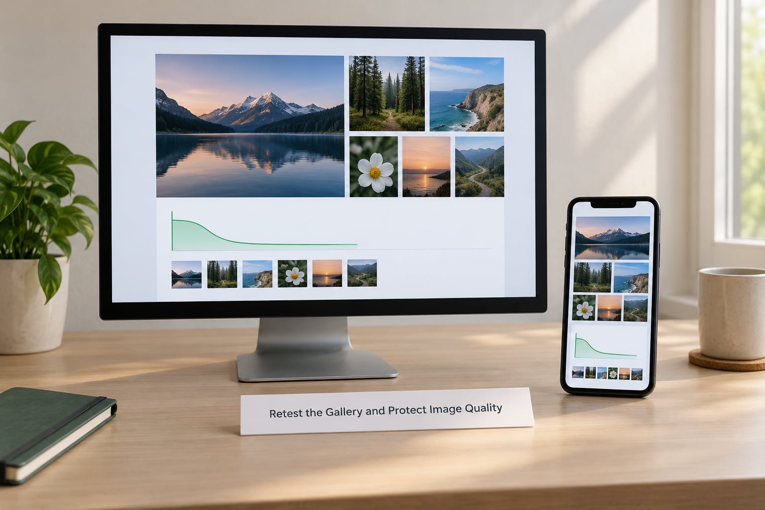
Run PageSpeed Insights again on the same gallery URL, mobile first, and compare against the numbers you saved. A typical portrait gallery page drops from around 12MB to under 2MB, and LCP moves from well past four seconds into the good range.
| Stage | 30-image gallery page weight | LCP (mobile) | Quality notes |
|---|---|---|---|
| Camera originals uploaded | About 145MB | Over 6s | Full detail, unusable page weight |
| Resized to display width | About 21MB | About 3.4s | No visible difference in the grid |
| Compressed at quality 75 | About 6MB | About 2.3s | Clean in shadows and skin |
| WebP plus CDN caching | About 4MB | About 1.8s | Indistinguishable at screen size |
Then check the quality yourself, at full size, on your biggest screen. Zoom into a gradient sky, a face in shadow, and fine detail like hair or fabric. Look for banding, posterisation and mushy edges, and re-export anything that fails at a higher quality setting.
Write down the settings you settled on: export width, quality number, format, metadata rule. Put that in a note next to your upload workflow so the next batch of photographs inherits it instead of starting from zero. Then repeat the whole cycle whenever you publish a large new gallery.
Common Mistakes
- Uploading camera originals unchanged. A 24-megapixel RAW export straight from Lightroom is a 5MB file filling a 400-pixel slot. Export through a preset instead.
- Oversized thumbnails. Grid tiles should be 400 to 600 pixels wide, not the full width of the original.
- Saving lossy files repeatedly. Each lossy export discards more detail. Compress once, from the master, and keep the compressed copies as your new source.
- Lazy loading the hero image. It delays the largest contentful paint and makes your score worse. Preload it with fetchpriority=”high” instead.
- Missing width and height attributes. Without them the browser cannot reserve space, so the grid jumps around while loading.
- Optimising away your masters. Compressed web versions replace the web copies, not the originals. Keep full-resolution files somewhere safe for print and client delivery.
- Serving the same file to every device. No srcset means a phone downloads the desktop file. Set responsive sizes and let the browser choose.
- Long cache lifetimes on unversioned filenames. Visitors keep seeing the photograph you replaced. Version the filename or purge the cache.
Frequently Asked Questions
How much should I compress photos for a photography website?
Aim for a JPEG quality setting between 70 and 80, which typically cuts file size by 60 to 80 percent with no visible loss at screen size. Below 65, banding shows up in skies, gradients and skin tones. As a size guide, keep grid thumbnails under 80KB, gallery previews under 300KB and hero images under 400KB.
Is WebP better than JPEG for a photography portfolio?
WebP usually looks identical to JPEG at the same perceived quality and runs 25 to 35 percent smaller. AVIF goes further, often 50 percent or more, at the cost of slower encoding. Serve them inside a picture element with a JPEG fallback, so browsers that support the modern formats get the smaller file and everything else still works.
Which images should I lazy-load on a photography website?
Lazy-load everything a visitor has to scroll to reach: rows two and three of a grid, images inside blog posts, and lightbox content. Never lazy-load your hero or first above-the-fold image, because deferring the largest contentful paint delays it and hurts your LCP score. Preload that image with fetchpriority high instead.
Do I need larger images for Retina or high-resolution displays?
Yes, but only where detail is actually visible. Serve roughly twice the pixel width of the display size through srcset, so a 400-pixel grid tile also offers an 800-pixel version. A phone screen at typical viewing distance cannot resolve the difference on a small thumbnail, so retina variants there add page weight for no visible gain.
How can I keep full-resolution photos available without slowing down galleries?
Split delivery in two. Gallery pages serve screen-sized previews, and full-resolution files sit behind a download link or a separate private gallery URL with its own long cache lifetime. Tell clients in the lightbox or caption that they are viewing a preview and can request the original, so quality never depends on the page they are browsing.
Why is my photography website still slow after image compression?
Check three things in order: whether compression actually applied to your live files, whether originals are still being served to mobile browsers, and whether page weight includes scripts, fonts and embeds. Run PageSpeed Insights and read the breakdown by resource type. Also confirm your hero image is preloaded rather than lazy-loaded, since that single mistake can hold LCP back on its own.
Conclusion
Start with the slowest gallery page on your site and test it on mobile in PageSpeed Insights. Resize its previews to the width the grid actually uses, compress the masters at a quality setting around 75, then retest the same URL and compare. Once you see that number move, the rest of the workflow above becomes much easier to justify.