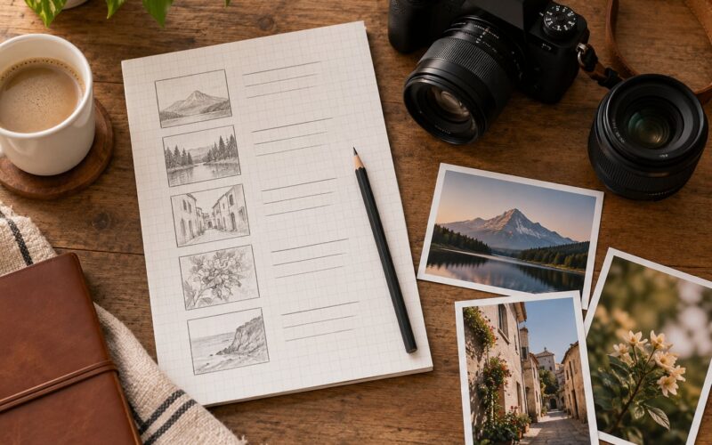
Most disappointing shoots are not lighting failures. They are direction failures: the right location, the wrong feeling, and four people on set guessing at the same time. To create a mood board for a shoot, you collect references for location, wardrobe, color, lighting and pose, cull them to 20 to 30 images, add a 3 to 5 color palette and practical notes, then share the board so the decisions are already made when you arrive.
Give yourself 60 to 90 minutes the first time. Assembling the board is quick; the thinking is the actual work.
This guide covers both sides of a shoot. If you are the photographer, the board is your pre-production document and your argument for why a certain setup will work. If you are a client, it is how you hand over a vision your photographer can act on instead of a folder of saved posts with no through-line.
Table of Contents
- What You Need
- Step-by-Step: How to Create a Mood Board for a Shoot
- Define the Shoot’s Central Idea
- Gather Visual References
- Choose a Cohesive Visual Direction
- Add Practical Shoot Notes
- Review and Simplify the Board
- Common Mistakes
- Frequently Asked Questions
- What should I include in a mood board for a photography shoot?
- Do I need a special app to create a mood board for a shoot?
- How many images should a photography mood board contain?
- How can I use a mood board when working with a client?
- Should a mood board include camera settings and lighting diagrams?
- How do I adapt a mood board to my actual location or available wardrobe?
What You Need
A mood board needs almost nothing, and the kit most photographers already own is enough. The difference between a board that works and a board that collects dust is doing the steps in order rather than saving inspiration for six months.
- A surface to collect on. A phone, tablet or laptop, or one large sheet of paper and masking tape if you prefer working by hand.
- A dedicated place to gather references. A fresh Pinterest board or a single album on your phone. Fresh matters. A folder called Inspiration that already holds 400 images is a museum, not a board.
- A place to compose the board. Canva, Milanote, Miro, Google Slides, or paper and a pen.
- A palette. Three to five colors pulled straight from your references with a color picker, then written down.
- A note-taking habit. Every image gets one line saying what it is for: hair, pose, wall color, shadow direction, background material.
- Optional extras. A mood board template, a PureRef folder for on-set reference, or an AI generator for filling gaps in the wardrobe or location.
The tool matters far less than the sequence. Collect in one place, compose in another, and the finished board takes about 20 minutes to assemble once the thinking is done.
Here is how the common options compare, including what each one is genuinely bad at:
| Tool | Cost | Collaboration | Best for | Watch out for |
|---|---|---|---|---|
| Canva | Free tier, paid Pro option | Shareable link plus comments | Composing a client-ready board fast | Template-heavy, so boards can look identical |
| Free | Basic board sharing | Collecting and sorting raw references | Weak for a finished board, no layout control | |
| Milanote | Free tier, paid plans | Built-in comments and invites | Mixed media, video and link embeds | Busier interface than a simple canvas |
| Miro | Free tier, paid plans | Real-time multi-user editing | Collecting input from a whole crew in one session | Overkill for a solo portrait session |
| Adobe Firefly Boards and Adobe Express | Subscription | Shareable link | Generating reference images inside an Adobe workflow | Costs money and needs an Adobe account |
| Google Slides or Docs | Free | Standard sharing and comments | Zero learning curve, works anywhere | No real layout control, looks plain |
| PureRef | Free desktop app | None | Full-screen reference on a laptop or tablet on set | Single user, no presentation mode for clients |
The fastest free workflow is the one most working photographers land on: start a clean Pinterest board, pin roughly 30 images, screenshot the favorites, then upload them into Canva to compose. Collecting is deliberately sloppy, composing is deliberate.
On AI tools, because readers ask about them constantly. ChatGPT will not hand you a laid-out board, but it is good at drafting the creative brief, naming the aesthetic, suggesting a palette, and writing the one-line caption for each reference. Image generators such as Adobe Firefly Boards, Canva Magic Media or Midjourney are useful for the gaps you cannot photograph yet: a specific coat, a room that does not exist, a hairstyle you cannot describe in words. Treat generated frames as rough reference, never as the final look, and tell your client which images are generated.
Step-by-Step: How to Create a Mood Board for a Shoot
Seven steps, in this order. Skipping ahead to the collecting stage is the most common mistake, because references chosen without a direction in mind are just preferences.
Define the Shoot’s Central Idea
Before opening Pinterest, write three sentences: what the shoot is about, who it is for, and where the images will be used. A golden-hour engagement session in a coastal hotel room for a couple who travels on trains is a direction. Cool tones, relaxed posture, tall windows is a direction. Make a hundred images with no brief underneath them and you end up with a box of Crayola crayons.
Test: if two people read your brief and picked completely different colors, poses and locations, the idea is not specific enough yet. Add one concrete detail, usually a feeling word turned into a visual cue.
Gather Visual References
Collect at least 30 images before culling anything, and search by category rather than by vibe. For a shoot with a model you do not know well, the order that works is outfit and location first, then hair, makeup, nails, accessories and jewelry, then pose references. That order is not arbitrary: clothing and location constrain everything else, while posing can be adapted later.
Sources worth more than scrolling: fashion editorial spreads, film and television stills for tone, museum or interiors references for palette, and one or two photographers whose entire body of work already matches the mood. Search by describing the light, not the subject. A query built around a hard shadow and a warm wall will outperform a generic search term every time.
Choose a Cohesive Visual Direction
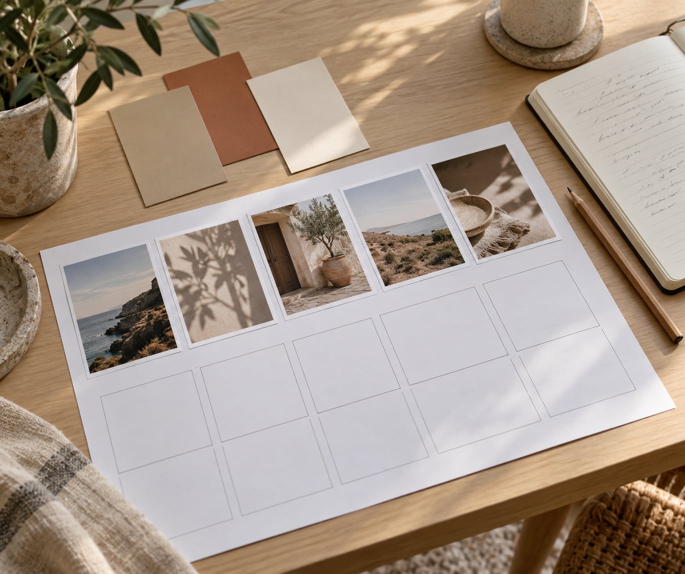
Look at your 30 images and pull the three to five colors that repeat. Use a color picker on two or three of the strongest frames and you will usually land on a palette of muted neutrals plus one accent. Write those colors down and check every remaining image against them. This is the single easiest way to make a set of photographs look expensive and intentional.
On the 60-30-10 rule: it describes how to weight color in a single frame, roughly 60 percent dominant, 30 percent secondary, 10 percent accent. It is useful as a check on your palette, not as the palette itself. Most working boards start with three to five colors and let the ratio fall out of the location on the day.
Arrange the board in visual hierarchy, not random collage. One large anchor image that defines the mood, a row of supporting frames that show composition, then the smaller practical items grouped by category. If your eye does not know where to start, the board is not finished.
Add Practical Shoot Notes
Inspiration without detail is decoration. This step is what turns a board into something a photographer can actually shoot from and a client can actually approve. Annotate every element with one line, and include the unglamorous things: which wall is the warm one, whether the location allows flash, which frames are must-haves, and the time of day the reference light belongs to.
For a model you have not worked with before, be specific about the shots and loose about the performance. Pin three to five poses or framings that must happen, then leave how they are achieved to the model. Clients who send 40 pose references and no location lock usually get a set that matches none of them.
How to create a mood board for a shoot that actually happens comes down to this translation step. Add a second page with a short shot list in priority order and a time-of-day plan tied to the light in your references. Fifteen minutes here saves an hour of on-set deliberation.
Review and Simplify the Board
Final pass takes five minutes. Read the brief, then look only at the board. If an image does not support the brief, cut it even if you love it. Aim for 20 to 30 images total, and check that your three to five colors are visible somewhere in every corner of the board.
Then run the practicality test: could another photographer, given only this board, set up your first frame at this location tomorrow? If yes, send it. If not, the missing detail is almost always lighting direction, wardrobe specificity or a time-of-day note. The advice beginners hear most often is the right one: lock the palette, the setting, the clothing and the lighting before the board leaves your hands.
One last thing for anything shared publicly: credit the photographers whose images you used. A board posted publicly without credit is the one place this practice reliably causes friction.
Common Mistakes
- Too many unrelated references. Fix: cap the board at 20 to 30 images. If you cannot choose, your central idea is still fuzzy, so go back to the brief.
- Chasing a trend instead of the intended mood. Fix: test every new reference against the three-line brief. Something that is current but off-brief still gets cut.
- Ignoring practicality. Fix: ask whether the location permits the light, movement, or gear shown in the references. Adapt the reference rather than booking a shoot you cannot deliver.
- An unclear or sprawling palette. Fix: commit to three to five colors and apply them across location, wardrobe and props.
- Never connecting the board to specific shots. Fix: add a short priority shot list. A board with no shot list produces beautiful frames that miss the brief.
- Building it after the date is booked. Fix: build the board before you confirm wardrobe, location or crew. It is pre-production, not post-production.
- Sharing it publicly without credit. Fix: caption or log the original creators before the board leaves your hands.
A few habits that pay off: share the board as soon as the direction is rough, since comments take time to come back, and use a shared board when a team is involved so questions get ironed out before anyone sets up a light. Nobody needs a beautiful board. A free Google Doc that everyone actually reads beats a polished board nobody opens.
Frequently Asked Questions
What should I include in a mood board for a photography shoot?
Include one reference for each decision you will face on the day: location and background, wardrobe, hair and makeup, poses and expressions, lighting and time of day, props, and a 3 to 5 color palette. Add a line of text to each item explaining what it is for, and finish with a priority shot list. Without those notes it is inspiration, not a plan.
Do I need a special app to create a mood board for a shoot?
No. A Google Doc, a slide deck, or paper and tape all work. Free tools worth knowing: Pinterest for collecting references, Canva for composing, PureRef for on-set viewing. Paid options such as Milanote, Miro or Adobe Firefly Boards add collaboration and AI generation, but they are conveniences rather than requirements for a single shoot.
How many images should a photography mood board contain?
Collect around 30, then cull to 20 or fewer for the finished board. The collection stage should be generous because you are searching, while the board itself should be tight because it is a decision document. More than 30 images on the final board usually means the palette and the brief are both still unresolved.
How can I use a mood board when working with a client?
Send a first rough version early, before details are locked, and ask for comments inside the board rather than general approval. Put one or two written questions next to the images you are unsure about, such as whether the darker palette works with their wardrobe. Then lock it, state that revisions to the locked direction are limited, and print or share it for the day.
Should a mood board include camera settings and lighting diagrams?
Only partly. Add the light you want, for example hard side light at golden hour, plus a time-of-day plan and the three to five frames that must happen. Full settings and lighting diagrams belong in the shooting notes, not the mood board. Mixing the two makes the board harder to read and blurs the difference between look and logistics.
How do I adapt a mood board to my actual location or available wardrobe?
Keep the palette and the mood, then swap the specific items. Match your colors to what the location already provides: if the room is warm wood and cream, replace cool-toned wardrobe references rather than fighting the room. Photograph the location on a scouting visit and add those frames to the board so the crew sees exactly what you saw.
Start tonight, not tomorrow. Write the three-sentence brief, pick three to five colors, and collect 30 references around them. Everything else on the board follows from those two decisions, and the shoot will run on a version of the plan you already agreed on.