Learning how to choose colors for a portrait wardrobe comes down to one decision: pick two or three colors from a single warm or cool family, anchor them with a neutral, then add one accent. That takes about ten minutes once you know the subject’s undertone and where the session is happening.
Wardrobe color is also the only major variable you cannot rescue in editing. Exposure, crop and skin retouching all get fixed after the fact. A neon shirt reflected onto someone’s jaw or a cream top disappearing into a pale wall does not.
Most of the uncertainty people bring to a session is really decision fatigue, not a lack of taste. Give yourself a palette before anyone opens a closet and the whole planning conversation gets shorter.
Table of Contents
- What You Need Before You Pick Portrait Wardrobe Colors
- Step-by-Step: How to Choose Colors for a Portrait Wardrobe
- 1. Start with the subject’s coloring
- 2. Identify the portrait’s location and background
- 3. Consider the lighting and color temperature
- 4. Build a palette around one main color
- 5. Test the outfit before the portrait session
- Common Mistakes That Flatten a Portrait Palette
- Frequently Asked Questions
- What colors not to wear for a photo shoot?
- What is the three-color rule in photography?
- What is the 3-3-3 rule for clothes?
- What is the 20/60/20 rule in photography?
- Should everyone wear the same color for family photos?
- Do colors matter in black and white portraits?
- Conclusion
What You Need Before You Pick Portrait Wardrobe Colors
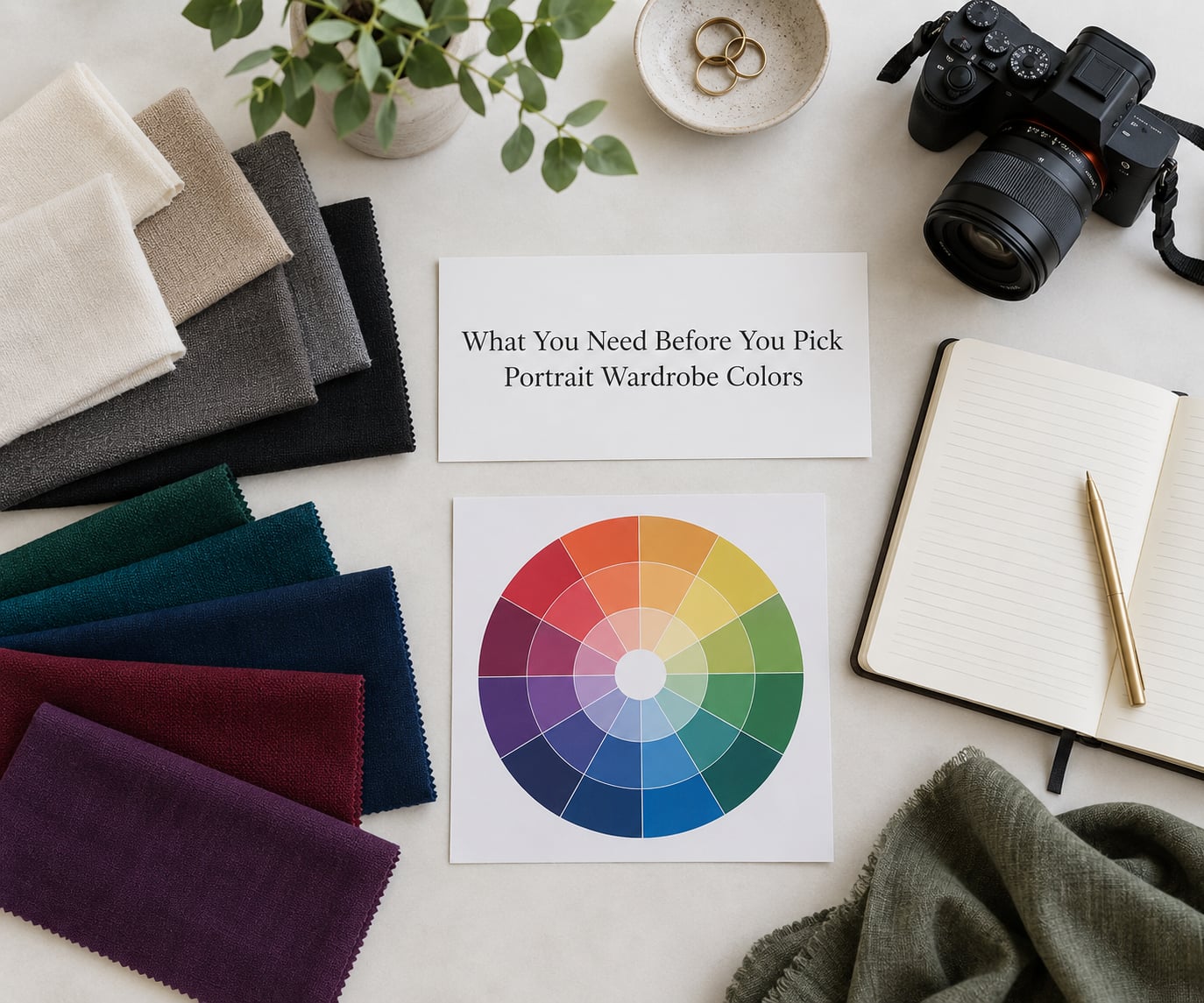
Five things, and you can gather all of them in one evening.
- The subject’s coloring. Untone and overtone, hair color, and how much natural contrast they already carry.
- The location’s dominant hues. Sand, grass, brick, foliage, snow, or a painted backdrop.
- The light. Daylight, open shade, tungsten, fluorescent, LED panels, or bounced flash.
- How the image will be used. Color or black and white, framed at home or delivered to a gallery.
- The mood. Calm and timeless, or bright and playful.
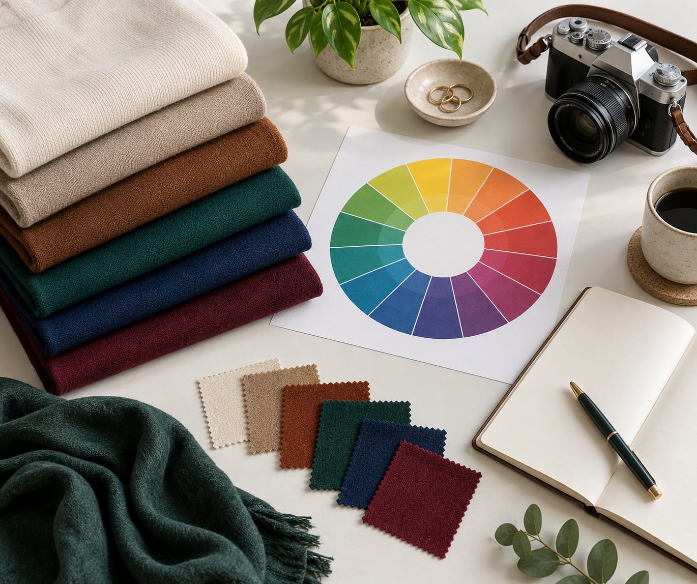
A color wheel chart and your phone are the only tools you genuinely need. The wheel tells you which colors sit together; the phone lets you check a candidate garment under the real light before anyone commits to a purchase.
Step-by-Step: How to Choose Colors for a Portrait Wardrobe
1. Start with the subject’s coloring
Undertone is the color underneath the skin, and it stays constant no matter how the skin looks that day. Warm undertones lean gold, peach, olive and yellow. Cool undertones lean pink, red, blue and grey. A quick check: hold a piece of yellow gold and a piece of silver near the face in daylight and notice which one makes skin look awake.
Overtone is the lightness or depth on top of that. Some people are bright and clear, some are soft and muted, some sit somewhere between. Together, the two give you the four broad families that most color analysis systems subdivide into seasons.
Here is the bridge from color analysis to photography: a garment in the same temperature family as the subject’s undertone keeps skin looking even. A garment in the opposite family puts a cool cast on warm skin, and the camera records that cast honestly.
Warm undertones generally photograph well in olive, rust, mustard, terracotta, warm cream and camel. Cool undertones usually prefer navy, plum, burgundy, forest, soft blue and cool grey. Both handle a true black or a deep charcoal well, though pure white is a different story, which I will come back to.
You will know the step worked when you can look at a garment and the face together and nothing looks mismatched.
2. Identify the portrait’s location and background
Two choices sit with a location. You can coordinate with it, which suits calm, timeless images, or contrast against it, which adds energy and makes the subject pop. Both work. Mixing the two randomly is what looks accidental.
The useful move is to write down the two or three colors that dominate the background. Sand, water and sky for a beach. Green and brown for a park. Red brick and grey concrete for a city block. Then pick wardrobe colors that either live in that family or sit opposite it on the wheel.
| Location | Palette 1 | Palette 2 | Palette 3 |
|---|---|---|---|
| Beach or water | Sand, white, denim | Coral, teal, cream | Mustard, olive, navy |
| Park or open field | Olive, tan, denim | Blush, dove grey, ivory | Rust, cream, deep green |
| Forest or trail | Forest green, tan, oatmeal | Burgundy, cream, brown | Navy, moss, grey |
| Snow or winter | Camel, burgundy, cream | Navy, ice blue, white | Charcoal, dusty rose, oatmeal |
| Urban brick or concrete | Navy, rust, denim | Cream, olive, grey | Plum, camel, off-white |
| Studio backdrop | Any palette, controlled by the backdrop | Monochrome in one hue | Neutral plus one accent |
| Home interior | Warm cream, camel, soft grey | Deep green, rust, tan | Navy, ivory, blush |
Watch the value relationship, not just the hue. A light garment against a bright field washes out; a dark garment against a dark tree line loses its edges. If the background is high-key, add something darker somewhere in the frame.
3. Consider the lighting and color temperature
Light has its own color, and it will bend your palette whether you planned for it or not. Warm bulbs push yellows and reds and drain blues. Fluorescent fixtures add a green spike that makes skin look grey. Open shade at midday is genuinely blue, which will cool a warm outfit that looked perfect at home.
Test in the actual conditions. Have the person stand in the same spot at the same hour in a plain room and take a phone photo against a white wall. If the wall reads warm yellow, your cool palette will look muddy; if it reads blue-green, warm colors will pop harder than expected.
Open shade and a golden-hour edge are the two friendliest conditions for a wardrobe. Harsh midday sun is the least forgiving because it exaggerates whatever color sits closest to the subject’s face.
That last point is also the physical reason saturated colors cause trouble. A bright garment reflects its own hue onto skin at close range, and there is no editing control that removes a color cast without also shifting skin tone. This is why neon reads as a problem on camera and almost never as one in a shop mirror.
4. Build a palette around one main color
Pick one main color, then support it with neutrals, then add a single accent. Neutrals carry the scheme, the main color carries the mood, and the accent gives the eye somewhere to land. More than one accent in a small group and the eye has nowhere to settle.
Color wheel relationships give you four reliable ways to combine colors.
- Monochromatic means one hue in several values, such as navy, mid blue and pale blue. It is the most forgiving combination and the safest default for a large group.
- Analogous means neighbors on the wheel, such as olive, mustard and rust. It reads warm and calm and suits autumn and earth-toned locations.
- Complementary means opposites, such as rust and teal, or mustard and plum. It adds energy and creates a focal point, so use it once, on a smaller garment.
- Triadic means three colors spaced evenly, such as red, yellow and blue. It is vivid and only works when all three are muted.
Seasons offer a shortcut when you already know your color season. If you know your undertone and have done a 12-season analysis, start from that list and remove anything that fights your backdrop.
| Season | Reliable colors |
|---|---|
| Spring | Coral, peach, mint, sky blue, warm cream, clear cherry |
| Summer | Dusty rose, soft blue, sage, lavender, cool grey, powder |
| Autumn | Burnt orange, mustard, olive, teal, deep green, warm tan |
| Winter | Navy, emerald, burgundy, black, icy blue, true white |
Scale the palette to the group. Two people can carry three distinct colors easily. Five or more, stay with neutrals plus one accent, and repeat that accent at least twice so it reads as intentional rather than accidental.
Coordinate, never match. Identical outfits on every person look dated in print and merge faces into a single shape. Repeating one color across different shades or fabrics gives cohesion without the uniform effect. One pattern in the group is plenty, and it should sit with two solid colors at a different scale.
5. Test the outfit before the portrait session
Wear the candidate outfit for a full day before the shoot. New garments photograph differently after they have been sat in, and a fabric with a strong sheen can flare under a hard light where it looked matte in the shop.
Run four checks. Look at the outfit in a full-length mirror from ten feet away to judge the overall shape. Sit down, stand up and walk, watching for rides, gaping buttons and a hem that swings oddly. Check the face against skin rather than against a wall, in daylight and again under the shoot’s light. Then take a phone photo at the real location, at the real time of day, and review it at actual size rather than zoomed in.
If you can only do one check, do the last one. A test frame at the location tells you more than an hour of mirror time.
Timeline-wise, shop two weeks out, wear the outfit once, and stop making changes forty-eight hours before. Trend-led choices date quickly, so favour colors you still like when you imagine the print on a wall in five years.
Common Mistakes That Flatten a Portrait Palette
Matching outfits on everyone. It removes individual shape from the frame and photographs like a uniform. Fix: repeat one color across different shades instead.
Too many colors in a large group. Every person adds a hue and the frame turns to noise. Fix: neutrals plus one accent, repeated.
Choosing color before checking the location. A palette that looks beautiful in a boutique can vanish against sand, snow or a white wall. Fix: name the background colors first.
Buying bright white. It blows out under any direct light and pulls the eye off the face. Fix: ivory, cream or off-white, which hold detail and warm the skin.
Ignoring undertones inside a family. A palette that flatters the parent washes out the grandparent. Fix: anchor in a neutral most undertones accept, and let one accent do the work per person.
Testing clothes new on shoot day. Nobody wants to think about a collar while a photographer is waiting. Fix: wear everything once before.
Saturated color next to the face. It bounces hue onto skin and shows up in every frame. Fix: keep saturated colors to accessories, lower garments or layers.
| Color or item | Why it fails on camera | Wear this instead |
|---|---|---|
| Neon shades | Bounces its hue onto skin and clips in the highlights | Muted jewel tones like teal or berry |
| Pure white | Blows out under direct light and creates harsh glare | Ivory, cream or light grey |
| Saturated red | Dominates a wide frame and pulls focus from the face | Brick, burgundy or rust |
| Dark shirt on dark background | Silhouette edges disappear against brick, foliage or shade | Cream, camel or denim as a separator |
| Logos and large text | Pull the eye and date the image | Plain garments, texture instead |
| Tiny plaid or micro-print | Shimmers and moires once the camera resolves it | One larger-scale pattern or a solid |
| Holiday-specific prints | Photos become unusable outside the season | Seasonal colors in plain fabrics |
One more worth naming: the palette that only works in color. If the image might end up black and white, judge contrast by value rather than hue. Dark navy next to mid grey can collapse into one tone, while navy against cream separates cleanly.
Frequently Asked Questions
What colors not to wear for a photo shoot?
Skip neon shades, pure white, saturated red, large logos, and tiny plaid or micro-prints. Neon and red bounce their hue onto skin and dominate the frame, pure white blows out under direct light, and busy prints shimmer once the camera resolves them. Substitutes that behave well: ivory instead of white, brick or burgundy instead of red, muted teal or berry instead of neon.
What is the three-color rule in photography?
The three-color rule says the wardrobe for a portrait session should draw from no more than three colors, usually two neutrals and one accent. The limit is what keeps a group from turning into visual noise. With three colors you can repeat one across family members in different shades, so the frame reads as coordinated rather than matched.
What is the 3-3-3 rule for clothes?
The 3-3-3 rule is a styling rule, not a photography rule: three pieces of clothing, each in one of three colors. Portrait photographers borrow the idea loosely, since a subject usually wears two or three garments at most. Treat it as a ceiling rather than a target, and spend your three slots on a neutral base plus one deliberate accent.
What is the 20/60/20 rule in photography?
The 20/60/20 rule is an interior design formula that splits a space into 20 percent dominant color, 60 percent supporting color and 20 percent accent. Photographers use the same split on wardrobe: a dominant garment color, a supporting mid layer, and a small accent such as a scarf, shoe or accessory. It keeps the face as the focal point.
Should everyone wear the same color for family photos?
No. Identical outfits merge people into one shape and look dated in print. Coordinate instead: pick a shared palette of two or three colors, then give each person a different shade, fabric or garment that sits inside it. Repeating one accent color across two or more people creates cohesion without the uniform effect.
Do colors matter in black and white portraits?
They matter, but hue becomes value. The camera records brightness, so what matters is how light or dark each garment sits next to skin and background. A navy top against a pale wall separates well; the same navy against mid grey can merge into a single shape. If black and white is possible, check the outfit by value.
Conclusion
Start by putting the subject, the location and the light in the same conversation. Decide what colors the background already owns, what temperature the skin favors, and how many people need to fit inside one scheme.
Then pick three colors, write them down, and test them on a phone at the location before the session. That single test frame resolves almost every question clients normally email about.