Knowing how to analyze a photograph you admire means working through it in a fixed order: first impression, subject and visual hierarchy, composition, light and color, technical choices, then meaning and intent. Six passes, maybe twenty minutes on the first one and two minutes on the next. No camera and no photography experience required — just the ability to describe what you see before you explain what you think it means.
Most people stop at I like this photo and move on. That reaction is useful, but it doesn’t travel. When you can name the specific decision that made you stop — the crop, the direction of the light, the amount of empty sky — you can borrow that decision in your own work tomorrow morning.
Table of Contents
- What You Need
- Step-by-Step: How to Analyze a Photograph You Admire
- Step 1: Begin with Your First Impression
- Step 2: Identify the Subject and Visual Hierarchy
- Step 3: Examine Composition and Framing
- Step 4: Study Light, Color, and Texture
- Step 5: Assess Technical and Editorial Choices
- Step 6: Write Your Own Interpretation and Recreate the Idea
- Common Mistakes
- Frequently Asked Questions
- What should I look for when analyzing a photograph?
- How do I visually analyze a photograph step by step?
- How long should it take to analyze a photograph?
- Do I need to know photography terms to analyze a photo?
- Can ChatGPT critique photos?
- What is the 20/60/20 rule in photography?
- Conclusion: Start With One Photograph and One Choice
What You Need

You need four things, and none of them are expensive.
- A high-resolution image. Open it on the largest screen you have. Small thumbnails hide exactly the details you want to study, which is why so many people conclude a photo has no texture when it simply has fine grain.
- A quiet viewing space and about twenty uninterrupted minutes. Analysis is a slow task the first few times.
- A notebook or any annotation tool. Paper works well. Writing forces you to convert a feeling into a sentence, which is the whole point.
- Optional: a zoom tool or editing app. Anything that lets you drop brightness to zero and look at shapes in grayscale will sharpen your read of composition.
That’s it. You do not need to know aperture from focal length to do this — you learn those as you go, and the vocabulary arrives in step five.
Step-by-Step: How to Analyze a Photograph You Admire
Six steps, always in the same order. The order matters because each pass depends on the one before it, and because front-loading your emotional response keeps you honest about whether the later analysis is real or just rationalizing.
Step 1: Begin with Your First Impression
Look at the image for five seconds without taking notes. Then write down three things: what you felt, where your eye landed first, and what single detail you noticed last.
Those three lines are the most valuable part of the whole exercise. Compare your first impression with what you find in steps two through six. When the analysis explains the feeling, you’ve read the photograph correctly. When it doesn’t, you’ve found the gap where your taste is ahead of your understanding — which is the most useful thing that can happen here.
Step 2: Identify the Subject and Visual Hierarchy
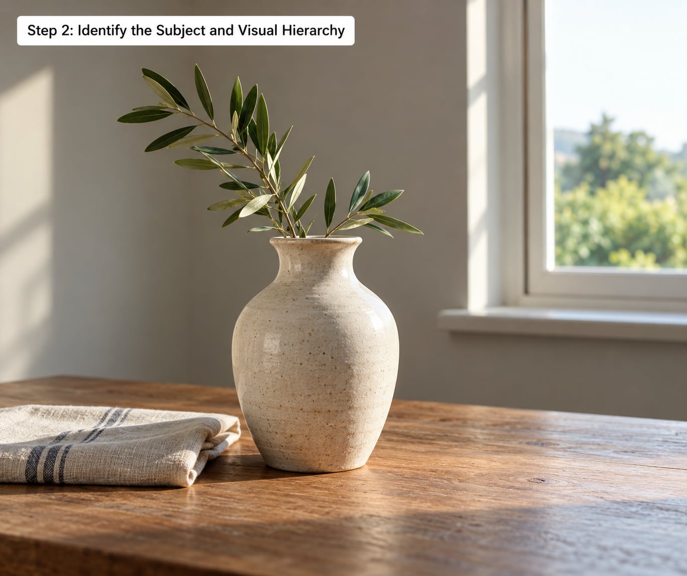
The subject is the thing the photograph is about. Finding it takes about ten seconds, and everything else in the frame is either supporting it or competing with it.
List the elements in order of visual weight: what reads loudest, then next, then next. Then ask what each one does. A second object at half the weight adds context. A second object at equal weight splits your attention and weakens the read — which is a problem unless splitting was the point.
Look at the figure-ground relationship too. Which shapes are solid and which are empty? That boundary between positive and negative space is what your eye actually follows, and it is often more decisive than where the subject is placed.
Step 3: Examine Composition and Framing
Now ask where things sit and why. Work through these in order:
- Crop. What got cut, and what the cut implies. Cropping at a joint is a statement; cropping through a hand is an accident.
- Balance. Symmetrical or asymmetrical, and how the weight is distributed to hold the frame together.
- Negative space. The empty area around the subject. It gives it room to breathe, or it isolates it completely.
- Leading lines. Roads, railings, shadows, fences. Does the eye get pushed toward the subject, or dragged out of the frame?
- Perspective and depth. Foreground, middle ground, background. Three layers give depth; one flat plane gives none.
- Placement. Rule of thirds puts the subject off-center at an intersection of imaginary lines. Centered composition is deliberate, not lazy — but only when the symmetry is doing work.
For every choice you name, finish the sentence: this reinforces the message that… If you can’t finish it, you’ve spotted a decision without analyzing it.
Two quick tests help here. The squint test: blur your vision until only large shapes and values remain, and notice what survives — whatever survives is your hierarchy. The thumbnail test: shrink the image to about 3 percent of screen width and check whether the subject still reads. Most badly composed photographs collapse at thumbnail size.
Step 4: Study Light, Color, and Texture
Light has direction, quality, and contrast, and each one does something specific.
Direction tells you about the hour and the weather. Light coming from behind the subject is backlighting and gives a rim of separation. Light from the side builds texture and reveals form. Light from the front flattens everything and makes skin look pleasant.
Quality is hard or soft. Hard light comes from a small, close source — midday sun, a bare flash — and throws sharp-edged shadows with strong contrast. Soft light from a large source like overcast sky or a window gives gradual transitions and open shadows. Golden hour sits between them, with warm low-angle light and long shadows.
Color deserves its own note. Name the dominant hue and where the accents sit. Complementary colors (blue and orange, red and green) create tension; analogous colors create calm. Ask what the white balance does to the mood — a cool cast reads clinical, a warm cast reads intimate.
Texture is the surface quality: skin, gravel, fabric, rust. A photograph with one dominant texture and everything else smooth gives the eye somewhere to rest. Note which texture wins.
Step 5: Assess Technical and Editorial Choices
This is where you start naming settings. You will not always know them, and guessing wrong is fine as long you mark it as a guess.
- Focal length. Wide lenses exaggerate the near and shrink the far, which adds drama and depth. Longer lenses compress layers and isolate the subject from a crowded background.
- Depth of field. Shallow and blurred backgrounds put all the attention on the subject. Deep focus says the relationship between near and far matters.
- Shutter speed. Frozen motion reads as deliberate. Motion blur reads as passing time, energy, or accident.
- Exposure. Where do the highlights fall — in detail or clipped? How much shadow detail survives? A backlit silhouette and a blown-out mistake look similar until you check whether the subject holds any tone.
- Focus placement. Sharp on the eyes, the hands, or the near edge, depending on what the photograph is about.
- Editing. Has it been converted to black and white? Dodged and burned? A crop applied in post still counts as a compositional choice.
Then the important caveat: technical execution is not quality. A perfectly exposed, tack-sharp frame with a cluttered subject is a worse photograph than a slightly soft one with a single clear idea. Ask what the technical decisions were for. Fast shutter for the dog’s jump, or fast shutter to hide a missed focus?
Step 6: Write Your Own Interpretation and Recreate the Idea
Close with four sentences, no more:
- What is this photograph trying to do?
- What is its single strongest choice, and what does that choice produce?
- What is the riskiest or weakest choice?
- What one thing will you practice because of it?
Then rebuild the idea instead of copying the shot. Pick one variable — the light direction, the crop ratio, the amount of negative space — and shoot five versions of your own subject holding only that variable constant. Comparing your results against the original is where the learning actually lands. On forums like photo.net, photographers make this point constantly: the fastest way to improve is to put your own frame next to the master’s and see what’s different.
Write the comparison down too. Your intention versus what actually happened is the sentence that teaches the most, and it’s the one almost nobody records.
Common Mistakes
Copying a style without learning the decision. You end up with the same crop, the same faded colors, and none of the understanding. Fix: name the decision before you imitate anything.
Fixating on gear or settings. They must have an 85mm is not analysis. Fix: ask what problem that lens solved in this frame.
Ignoring context. A documentary photograph of a protest carries meaning from the date and place that has nothing to do with exposure. Fix: spend two minutes on who, when, and why before you write.
Treating technical correctness as the ceiling. Sharp, well-exposed, badly composed is still badly composed. Fix: put your sharpness note last, after subject, composition, and light.
Listing observations without explaining effect. Here is the difference in practice:
- Nice composition becomes: the subject sits on the right third and the road leads the eye straight to it.
- Good lighting becomes: low side light rakes across the wall, so the texture reads even in shadow.
- Sharp photo becomes: shallow focus keeps the child’s face sharp and dissolves the crowd behind her.
- Great mood becomes: overcast light and muted color leave no hard shadows, which makes the scene feel quiet.
One more practical habit: analyze the same photograph twice, a week apart. The second read is always faster and always different, and that difference tells you how much of your first response was habit.
Frequently Asked Questions
What should I look for when analyzing a photograph?
Look at seven things in order: the subject, the visual hierarchy around it, composition and framing, the direction and quality of light, color palette and temperature, technical settings such as focal length and depth of field, and the meaning the image carries. Finish by writing one sentence explaining what each choice produces, rather than naming the element alone.
How do I visually analyze a photograph step by step?
Use the six-pass order: log your first impression, identify the subject and what competes with it, examine crop, balance, negative space and leading lines, then study light, color and texture, then the technical and editorial choices, and finally write your interpretation. Working in the same sequence every time keeps your analysis comparable across photographs and stops you from skipping straight to taste.
How long should it take to analyze a photograph?
Give the first one twenty minutes and resist the urge to hurry. After that, a good frame takes two or three minutes once the sequence is automatic. If you cannot fill a page with specific observations, you have not looked closely enough yet, regardless of how much time has passed.
Do I need to know photography terms to analyze a photo?
No. Plain description works fine: light comes from the left, the sky fills the top half, the background is blurred. Technical vocabulary simply makes your notes faster to write and easier for other photographers to read. Learn terms as they come up, and use the ordinary words until you are confident with the short ones.
Can ChatGPT critique photos?
It can give you a first pass on composition and light, and it will never run out of patience, so it is useful for turning a vague reaction into a written question. It cannot judge intention or context, and it tends to produce generic praise. Treat its output as a prompt for your own eye, never as a verdict.
What is the 20/60/20 rule in photography?
It is a loose guideline about composition: place roughly 20 percent of the frame’s interest in the foreground, 60 percent in the middle ground where the main action sits, and 20 percent in the background for context and depth. It is a starting point for checking whether you have three readable layers, not a law. Many great frames deliberately break it.
Conclusion: Start With One Photograph and One Choice
Pick one photograph tonight — ideally one you can name the photographer of — and run all six steps. Write down the single strongest choice you found, then go shoot five frames of your own subject that copy only that one variable.
That is the whole practice. The framework takes twenty minutes; the payoff is that next month your first impression starts arriving with explanations attached, and your own photographs get closer to the ones you admire for reasons you can finally say out loud.