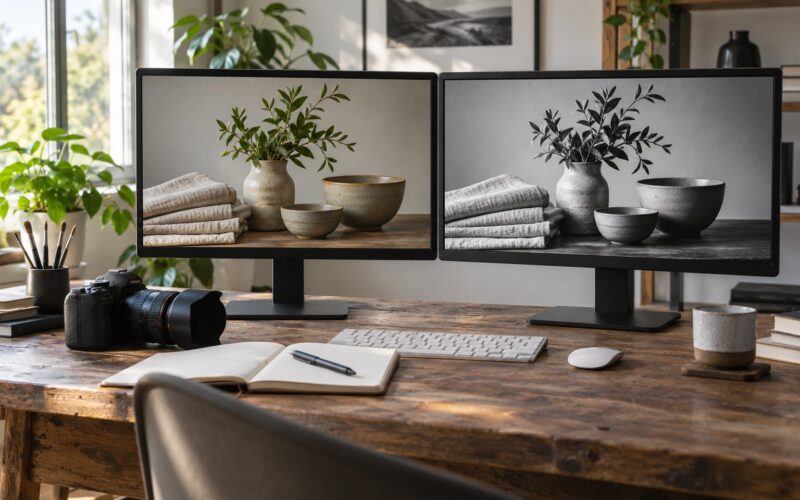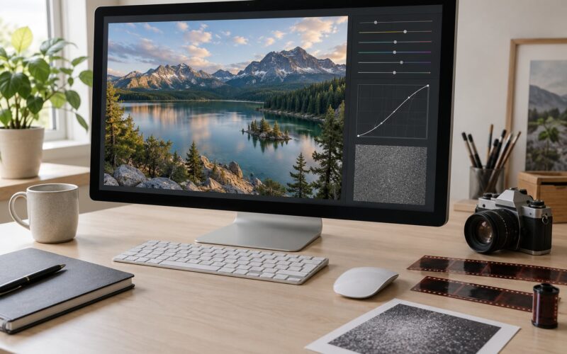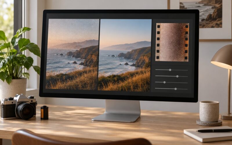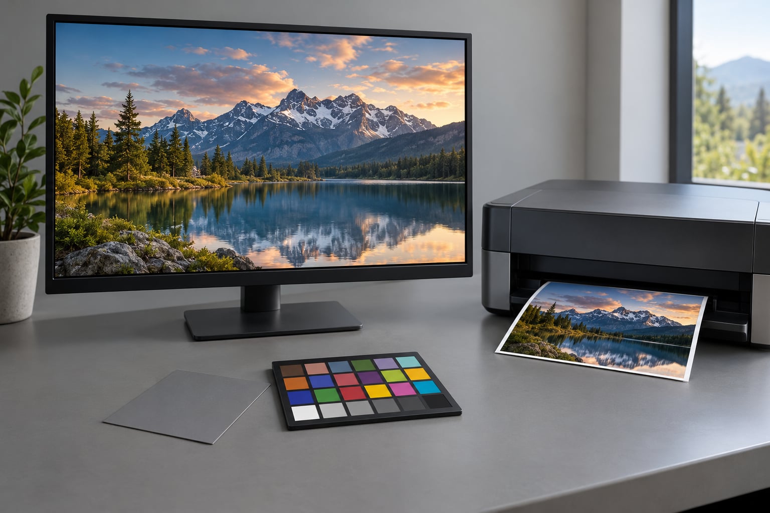
Soft proofing is how you preview a print on your screen before the ink exists. Your editing software applies the ICC profile of the exact printer and paper combination to the image, so the backlit monitor shows you a simulation of the finished print instead of the bright, oversaturated version the screen normally gives you. The whole workflow takes about ten minutes once the pieces are in place, and it is the difference between a print you love and one you paid for anyway.
Knowing how to soft proof a photo before printing matters most for fine art prints, large formats, canvas, metallic stocks and any paid lab work. It matters less for a quick inkjet copy, though the habit still pays off. The catch, and the reason this topic generates so much forum argument, is that a soft proof is an approximation. Paper reflectances, ink limits and the lighting in the room where the print ends up all move the result a little further.
Below is the workflow I use, in Lightroom and in Photoshop, with the exact menu paths so you can follow along in either app.
Table of Contents
- What You Need
- Step-by-Step: How to Soft Proof a Photo Before Printing
- 1. Prepare the Photograph for the Intended Print
- 2. Choose the Correct Printer and Paper Profile
- 3. Create a Simulated Soft Proof
- 4. Check Color, Contrast, and Detail
- 5. Compare the Soft Proof With a Physical Print
- 6. Export the Final Print File
- Common Mistakes
- Frequently Asked Questions
- Is soft proofing really necessary before printing?
- How accurate is a soft proof, really?
- Do I need to calibrate my monitor to soft proof?
- Which software can I soft proof in?
- How do I choose the right paper profile?
- What if my print lab gives specific instructions?
What You Need
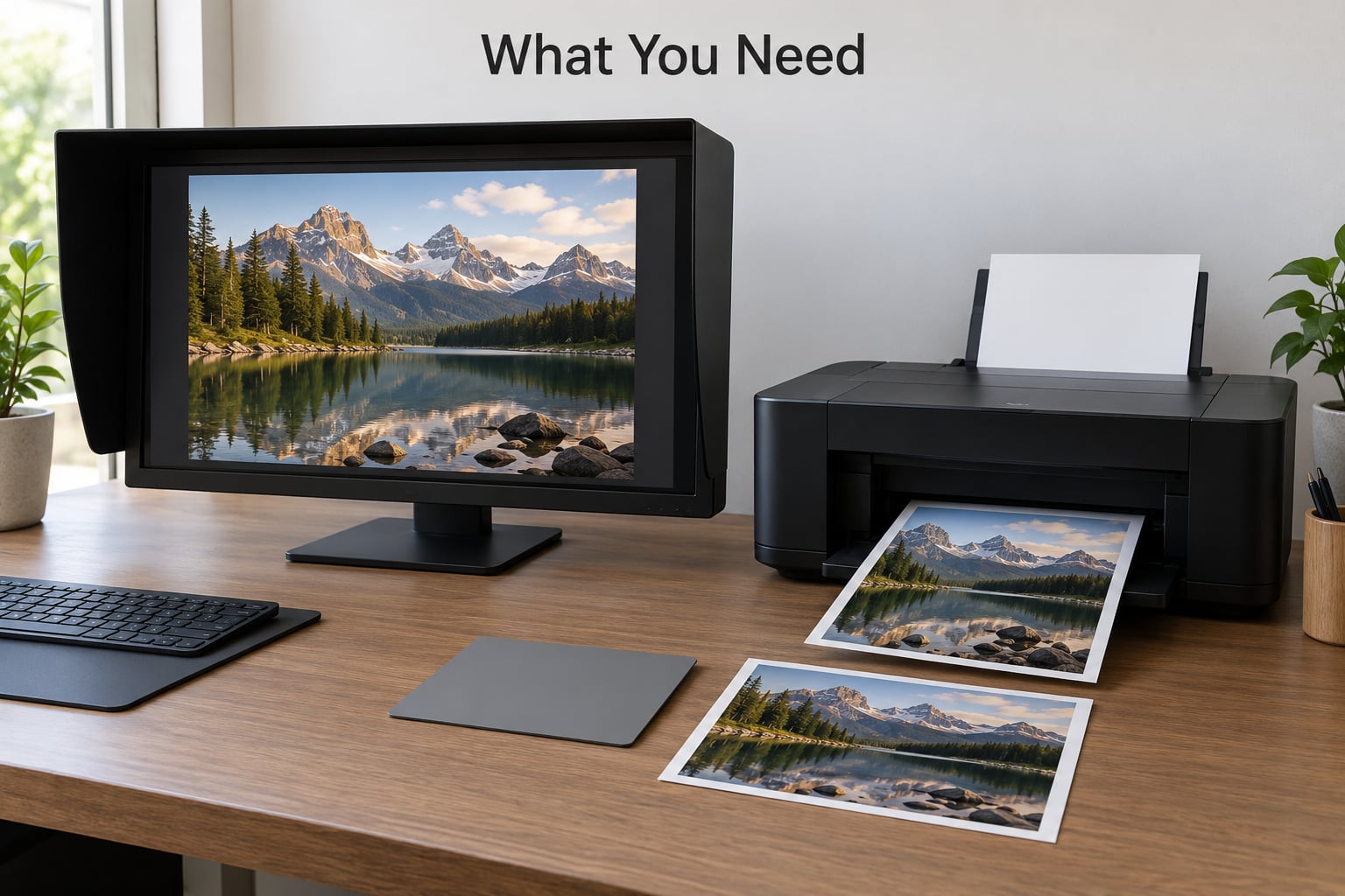
A soft proof is only as good as the four things behind it. Get these right and the rest is clicking through dialog boxes.
- A calibrated monitor. Not a factory profile from the shop, not the vivid picture mode. An uncalibrated screen makes the entire exercise guesswork. Windows has Calibrate Colour Display built in; macOS has Display Calibrator Assistant. Both get you a reasonable profile for free. A hardware colorimeter such as a Calibrite or X-Rite model gives you a repeatable one, and it is worth the money once you are printing regularly.
- The exact ICC printer profile. One profile per printer, ink set and paper combination. A matte cotton rag profile tells you nothing about a glossy photo paper print.
- Color-managed editing software. Lightroom, Photoshop, Capture One and Affinity Photo all handle soft proofing natively.
- A controlled viewing environment. Neutral gray walls, no colored light, moderate ambient brightness. Ambient light roughly equal to the screen brightness is the classic target.
- Optionally, a small reference print. Four by six inches costs very little and tells you far more than any dialog box.
Install profiles where your operating system expects them. On Windows, right click the profile and choose Install for All Users, or drop it into C:WindowsSystem32spooldriverscolor. On macOS, open the profile and use View Profile, which installs it into /Library/ColorSync/Profiles or your user folder. If the paper is not in the list, ask the lab for its profile before you do anything else.
Step-by-Step: How to Soft Proof a Photo Before Printing
Six steps, in this order. Preparing the file first means the proof shows you the real problem instead of a problem you are about to fix anyway.
1. Prepare the Photograph for the Intended Print
Finish the edit in your working space before you convert anything. Screen brightness does not survive a print, so contrast decisions made on a bright monitor land heavier on paper than you expect.
- Crop first. Print proportions differ from screen ones, so decide the final ratio before resizing.
- Resize to the output size. For a print 10 inches on the long edge, the image needs to be about 3000 pixels long for 300 ppi. At 240 ppi, 2400 pixels is fine and the file is lighter.
- Sharpen for output. Apply output sharpening with the amount matched to the medium. Low is safe for glossy photo and metallic papers, Standard for luster and fine art matte, High for canvas, which absorbs far more detail.
- Check white balance and skin tones. Fixing these after the proof conversion means fighting the profile instead of working with it.
2. Choose the Correct Printer and Paper Profile
Pick the profile your lab publishes for your exact output. Most quality labs ship downloadable ICC profiles for their own paper stocks, and those are the ones to use. If you print at home, use the profile that came with your printer driver, installed through the driver rather than a generic download.
Profiles combine a device profile and a paper simulation. A paper-specific profile models the paper white, the ink limit and the surface texture of that stock. A device-only profile with a separate paper file gives a slightly different, more adjustable result. Either works; just be consistent, because switching between them changes the rendered colors.
When you have no profile at all, you have three honest choices. Proof against the closest general paper profile available to catch gross gamut problems, switch papers to one you can proof, or accept that you are working blind on color and be conservative with saturation. You cannot invent accuracy you have no data for.
3. Create a Simulated Soft Proof
In Lightroom, open the image in the Develop module and press S, or tick Soft Proofing at the bottom of the right-hand panel. A Proofing panel appears. Set Profile to Paper, choose your printer and paper from the dropdown, then pick a rendering intent. Perceptual gives the most natural overall look and is the right default for most prints. Relative Colormetric keeps colors more literal and slightly clips out-of-gamut colors instead of compressing them. Black Point Compensation shifts the black point to match the device, which generally improves shadow tone and keeps the proof from looking heavy. Turn on Show Destination Gamut Warnings and mark Create Proof Copy if you want a virtual copy of the converted image alongside your original.
In Photoshop, duplicate the image first with Image > Duplicate, then open View > Proof Setup > Custom. Pick the same printer and paper profile, choose the rendering intent, tick Black Point Compensation and check Simulate Paper Color. With both documents open, use Window > Arrange > 2 Up Vertical to see the original and the proof side by side, then toggle View > Proof Colors with Cmd+Y to flip between them.
Simulate Paper and Ink stays greyed out for many profiles. That option is reserved for profiles authored with enough paper and ink data, typically the manufacturer files bundled with the software. Switch to a profile that supports it or carry on without it; the simulation is still valid, just less textured.
In Capture One, open the Color tool from the right-hand panels, enter proofing mode and select the output profile the same way. Affinity Photo behaves almost identically to Photoshop, with its proofing controls under View, which is what Affinity users on the Affinity forum report when they compare the two apps.
4. Check Color, Contrast, and Detail
Now judge the simulated image against a neutral surround. Start with white point and highlight detail, then black point and shadow detail, then saturation and skin tone. Move your head between the proof and something known to be neutral. The eye adapts, and small differences become obvious when the frame of reference keeps changing.
Where gamut warnings flag out-of-gamut colors, decide deliberately rather than letting the flag sit there. Three options work in practice: leave the color alone and accept the clipping, since a tiny oversaturated sky nobody will notice is usually harmless; desaturate the specific color with a targeted adjustment; or change the paper to one with a wider gamut. Bringing every color into gamut by desaturating the whole image is the option that ruins files, and it is the one the forums warn against most.
Matte papers look flatter and slightly less saturated in the proof than on screen. That is accurate, not a fault in the simulation. If you decide the flatness is genuinely too much, add contrast and recover a little saturation as a deliberate choice, then check it again in the proof.
5. Compare the Soft Proof With a Physical Print
Order one small print on the same paper, or use the proof your lab sends as a sample. View both under the same lighting, ideally daylight at about 5000K, never under warm household bulbs that tint everything orange. Lay them flat side by side and squint.
A soft proof plus a reference print is a hard proof, and it is far more reliable than the screen alone. Use it to catch printer-specific shifts the profile cannot model, then apply restrained corrections rather than rebuilding the look. Photography StackExchange is blunt about the limit here: no simulation fully models paper, ink and viewing conditions at once.
6. Export the Final Print File
Save a corrected master in your working space, because you will need it the moment you change paper or printer. Then export the delivery file from that master, not from the proof, so no conversion is applied twice.
- Use 16-bit TIFF for fine art and commercial lab work. JPEG is acceptable for small online prints.
- Keep the working space profile embedded, usually ProPhoto RGB, Adobe RGB or sRGB, and tell the lab not to convert. Labs render from the embedded profile. Several photographers work in Adobe RGB end to end for consistency.
- Do not ask for the lab’s automatic color correction on a file you have soft proofed. Forum reports are consistent that it makes results worse, because it corrects a file you already corrected.
- Name the file clearly with size, paper and profile in the filename, so a mislabelled order is easy to catch.
Common Mistakes
Soft proofing in the wrong color space. If your document profile does not match the profile you are proofing into, the conversion happens twice and the result drifts. Match them first.
Skipping monitor calibration. This is the one that quietly ruins everything else. A factory monitor profile leaves brightness and gamma unknown, so you end up correcting toward a target you cannot actually see.
Using a general paper profile for a specific stock. Proofing matte on a glossy profile overstates contrast and saturation. Match the paper.
Overcorrecting the proof instead of the file. Adjustments made while soft proofing are harder to see and easier to overdo. Fix the underlying image with the proof on, then toggle it off to confirm the correction holds both ways.
Judging the proof in bad light. A proof viewed next to a bright window, under tungsten bulbs, or against a colored wall reads completely differently. Gray surround, consistent light, no colored reflections.
Leaving the gamut warning on permanently. The overlay makes the image unreadable. Turn it off after you have handled the flagged colors.
The print still comes back darker than the proof. This is the most repeated complaint in the forums, and it usually comes down to one of four things: the lab applied its own color correction, the wrong paper profile was used, the print is a different stock than the one proofed, or the print is being viewed under dim light. Confirm the paper first, since that explains most cases.
Frequently Asked Questions
Is soft proofing really necessary before printing?
For fine art, large prints, canvas and paid lab work, yes. A soft proof catches gamut clipping, paper white shifts and contrast surprises before the money is spent. For a cheap home inkjet copy it matters less, but the same ten minutes will keep surprises down there too. The honest rule is that the cost of the proof is always lower than the cost of the print.
How accurate is a soft proof, really?
Accurate enough to catch most errors, never a guarantee. The simulation models the profile, not the physical paper, the ink behavior and the lighting in the room where the print hangs. Expect saturation, contrast and small hue differences between proof and print. If you need certainty before a large run, order a small physical proof on the same stock and compare it side by side.
Do I need to calibrate my monitor to soft proof?
Yes. Every other part of the workflow depends on the screen showing a known brightness, gamma and white point. Windows Calibrate Colour Display and the macOS Display Calibrator Assistant will improve an uncalibrated monitor noticeably and cost nothing. A hardware colorimeter makes the result repeatable rather than approximate, which matters once you print regularly.
Which software can I soft proof in?
Lightroom, Photoshop, Capture One and Affinity Photo all support soft proofing with destination ICC profiles. Lightroom is quickest, with a checkbox and an S shortcut in the Develop module. Photoshop offers the most control through View Proof Setup Custom, including Simulate Paper Color. Affinity Photo behaves almost identically to Photoshop and users report the same results on both.
How do I choose the right paper profile?
Use the ICC profile published by the lab or paper manufacturer for your exact stock, since those are built from measured values for that paper and ink set. A generic glossy or matte profile will overstate contrast and saturation. If your lab does not publish profiles, email them and ask, or pick a stock from a supplier that does. You cannot proof a paper you have no profile for.
What if my print lab gives specific instructions?
Follow them, and tell the lab what you have already done. If they ask for sRGB or Adobe RGB with the profile embedded, give them exactly that. If they offer automatic color correction on a file you have soft proofed, decline it, because it will correct a file you already corrected and shift the result. If their instructions contradict your profile choice, ask which paper and profile their driver uses.
Start with one thing this week: calibrate your monitor, then soft proof a single image against a matte profile you already know. Once that habit is in place, the rest is choosing the right profile and trusting the numbers a little more than your bright screen instincts.