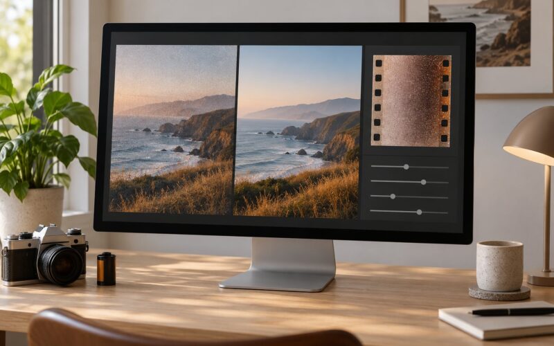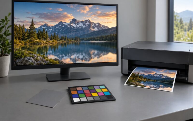
A photo works in black and white when taking the color away leaves more structure behind than it removes. Judge a candidate frame before you convert it: duplicate the file, apply a neutral grayscale conversion, and look at the whole image small. If the subject, the sense of depth and the path the eye takes all survive that preview, the frame is worth converting.
The decision runs in one direction. Most good color photos will still be good in black and white, but the reverse is far less often true. Plenty of frames turn flat or confusing once hue disappears, and by then the fix costs more than a change of light or camera angle would have.
Here is the physical reason. A color file holds three channels, red, green and blue, and a conversion collapses all three into one brightness value per pixel. Two different colors can land on almost the same gray, which is why red flowers in front of green leaves lose their punch in monochrome. The shooting-side version of the same rule is simple: high-contrast subjects that are already close to black and white convert best.
Table of Contents
- What You Need
- Step-by-Step: How to Choose Which Photos Work in Black and White
- 1. Start With a Full-Frame Black-and-White Preview
- 2. Check Whether the Image Has Tonal Structure
- 3. Look for a Subject That Stands Out in Grayscale
- 4. Notice Texture, Shape, and Lighting
- 5. Test Whether the Composition Still Guides the Eye
- 6. Refine the Conversion and Judge the Result Small
- Common Mistakes
- Frequently Asked Questions
- Can any photo be made to work in black and white?
- Should I use an automatic black-and-white conversion preset?
- How do photographers match the black-and-white look of a famous image?
- What can I do if a black-and-white photo looks flat?
- How do I decide between a color version and a black-and-white version?
- Your First Black-and-White Test
What You Need
You need four things, and three of them are free.
- The image file. A RAW file gives you the most room to adjust tones after conversion, since it carries the full color data.
- A reasonably accurate display. Brightness and contrast on a washed-out laptop panel will lie to you about midtones. A monitor in a dim room is fine; a phone in direct sun is not.
- Software with a real conversion control. That means a Black and White Mixer or equivalent, not just a saturation slider. Lightroom Classic has it under Develop, Lightroom under Color, Capture One has a Black and White Styles tool, and free phone apps offer varying amounts of the same.
- A duplicate or a version. Keep the color original intact. If your software works non-destructively, a soft-proof layer works just as well.
A histogram readout is worth turning on. It costs nothing and it turns a vague feeling about tone into something you can read.
Step-by-Step: How to Choose Which Photos Work in Black and White
1. Start With a Full-Frame Black-and-White Preview
Open the image, duplicate it, and apply a neutral conversion with every mixer slider at its default. Then zoom out until the whole frame fits on screen and look at it the way you would look at a contact sheet.
This is the step that answers how to choose which photos work in black and white for one specific frame, because a full-frame preview exposes the whole tonal picture at once. Frames that read fine up close often collapse here, and frames that look ordinary on the back-of-camera screen can surprise you when the room and the moment line up.
Two quick variations are worth trying. Squash your eyes until you are looking at blurred shapes only, which is the squint test photographers use to check subject separation. And check a thumbnail or a small print size, since detail that holds at full size can turn to mush once the frame is small.
A word on method here, because it is the most common mistake in the whole workflow. Dragging saturation to zero is desaturating, not converting. It leaves three channels of near-identical data blended together, so reds and greens still muddy into the same value and skin tones sit strangely flat. That conversion-versus-desaturation confusion comes up over and over in beginner threads; the fix is always the Black and White Mixer, or its equivalent, never the saturation slider.
2. Check Whether the Image Has Tonal Structure
A frame converts well when it has distinct highlights, midtones and shadows that stay distinct after conversion, rather than simply being bright somewhere and dark somewhere.
Look at the darkest region, the middle band and the brightest region in turn and ask whether you can tell them apart with your eyes half closed. Three readable groups means shapes have volume and depth. One merged gray mass means the frame has no depth to lose, and no amount of curve work will invent it.
The histogram tells you the same thing numerically. A healthy black and white conversion spreads across the full width of the histogram, with data reaching toward both ends. Data bunched into the middle third means a flat, low-contrast original. Data jammed hard against both ends means clipped highlights or blocked shadows, and that is where detail disappears permanently. Checking those three zones before you touch a slider is most of the work anyway.
3. Look for a Subject That Stands Out in Grayscale
Compare the subject against its background using brightness alone. If the edge still reads, the subject still holds, and you have color independence, which is the single most reliable selection test there is.
Failure is obvious once you know it. Red poppies against green foliage, a yellow coat against wet gray pavement, an orange jacket on a green hillside: all of these rely on hue contrast, and hue contrast does not survive conversion. Either the subject merges into the background or it becomes a vague gray lump floating in a similar gray.
The table below gives you the same read by genre.
| Subject | Converts well when | Watch out for |
|---|---|---|
| Portraits | Skin and background sit in different tonal zones | Bright clothing against a bright wall |
| Street | Silhouettes, gestures and cast shadows carry the frame | Neon signage doing the storytelling |
| Nature and seascapes | Cloud structure, mist layers and backlit haze | Autumn foliage and wildflower fields |
| Architecture | Graphic shapes, repeating windows, hard shadow lines | Sunset color on a painted facade |
| Wildlife | Fur, feather and eye detail against blur | A bright green field behind a brown subject |
| Night | Point lights and deep shadow | A scene that is already one gray tone |
| Food and product | Texture, gloss and shaped shadow | A dish whose appeal is the color itself |
The short list most experienced monochrome shooters give is short on purpose: texture, contrast and lines. That is not a vague aesthetic preference, it is a description of tonal separation in ordinary words.
4. Notice Texture, Shape, and Lighting
Texture is what carries a monochrome frame once color is gone. Directional side light rakes across a surface and turns every bump, weave and stone edge into tone. Overhead light flattens exactly those same surfaces into a single gray plane.
Concrete cases: raking evening light on an old stone wall, hard midday sun throwing a long shadow across sand ripples, a still life of folded linen and a glazed bowl lit from one side, a bare branch against a bright sky. Each has shape or texture doing work that color was only decorating. The priority most people settle on is simple: subject texture first, higher contrast next, then a bit of punch.
Watch also for silhouettes and reflections. A subject that reads as a clean dark shape needs nothing from color at all, and wet pavement, glass or water gives you the same tonal mirror effect in monochrome.
5. Test Whether the Composition Still Guides the Eye
Check whether leading lines, balance, negative space, scale and emphasis still pull the viewer through the frame once the color cues are gone.
Color is often doing the pointing for you. A red door at the center of a muted wall tells the eye exactly where to land. Remove the red and the door becomes one more gray rectangle among six others. Conversion rarely rescues a weak composition; more often it makes the weakness obvious, because nothing is competing with it any more.
The practical test is to name the focal point out loud from the converted version. If you cannot say which object holds the frame, the composition is not carrying the image and no tonal edit will change that.
6. Refine the Conversion and Judge the Result Small

Once a frame passes, refine it with the conversion controls and nothing else until it is close, then pull back.
- Set the Black and White Mixer sliders so the important tones separate. Orange and yellow usually lighten skin and skies; red and green often darken or flatten foliage and clothing. Move one slider at a time and watch the histogram.
- Recover highlights and shadows gently, holding Alt while you adjust in Lightroom. Leave a little air on both ends rather than pushing to pure white and pure black.
- Add a slight S-curve for punch, a touch of clarity for local contrast, and dodge and burn to guide the eye to the subject.
- Finish with a modest grain amount. Grain suits a monochrome frame and helps a clean conversion stop looking like a desaturated color file.
Then judge the result three ways: at full size on your display, as a thumbnail, and at the size you will actually output or print. A frame that reads at full size and dies at thumbnail size is usually carrying detail, not structure, and structure is what a monochrome image needs most.
Common Mistakes
Choosing a photo because the color is beautiful. If you would not hang the color version on a wall but you love the green in it, the color is doing the work. Keep it in color.
Sliding contrast to the maximum. The single most common complaint in beginner threads is a dull, lifeless result, and the second most common is shadows crushed to solid black in an attempt to fix it. Push until it looks wrong, then back off until the shadow detail is readable again.
Applying every preset in turn. Each preset assumes a different image. Applying six in a row gives you six compromises rather than one decision. Convert, then adjust.
Ignoring the background. Converted frames expose clutter that color was hiding. Before the slider work, look at everything outside the subject and decide what stays.
Editing long past the point of useful return. If you are still adjusting after a dozen passes, the problem is usually tonal structure at the shooting stage, not the last slider. Go back to the light.
Assuming every photo must be converted. The honest advice from most experienced shooters is to keep the habit of shooting both and choosing later. You cannot recover the color data from a camera’s monochrome JPEG mode, which records a single channel, so keep the color original and decide in software.
Frequently Asked Questions
Can any photo be made to work in black and white?
Almost any frame can be made usable, but not every frame can be made good. Color-coded scenes, flat light and frames with no tonal separation will stay weak no matter how much contrast you add, because the missing ingredient is structural, not tonal. Some can be rescued by returning to the scene and changing the light direction, the angle or the position of the subject.
Should I use an automatic black-and-white conversion preset?
Use presets to get a fast starting point, not as a finished look. Each preset assumes a particular image, and stacking several gives you several compromises. Convert once with defaults, then work with the Black and White Mixer and a curves adjustment. That way every change you make is a decision you can explain rather than a random result.
How do photographers match the black-and-white look of a famous image?
Start with tonal separation, not with a filter. Look at where the brightest and darkest areas fall in the frame, then reproduce that structure with curves and a restrained S-curve. Traditional filters work on the same principle: a red or orange filter darkens skies and lifts contrast, a yellow filter softens the effect. Match the structure first, the grain second.
What can I do if a black-and-white photo looks flat?
Check three things in order. First, the histogram: flat images often bunch in the middle third, which means the original lacked tonal range. Second, the mixer sliders: reds and greens frequently land on the same gray, and moving them apart often restores an entire subject. Third, local adjustments, a gentle S-curve and a light grain pass add bite without touching shadow detail.
How do I decide between a color version and a black-and-white version?
Convert both and compare them at thumbnail size, away from the monitor you edited on. Choose color when hue carries meaning, such as autumn foliage, a neon sign or food. Choose monochrome when shape, texture, tone or mood can carry the frame on its own, and especially when a distracting color was competing with the subject.
Your First Black-and-White Test
Pick three candidates from the same shoot: one with strong light, one flat, one that leans on color. Duplicate each, convert each with no adjustments at all, and view them at thumbnail size.
Then choose the frame whose subject, depth and composition stay clearest with no color left to help. That is the one to develop properly, with the mixer and curves, and the other two you learn from.