A magazine-style cover portrait is a vertical photograph built around deliberate empty space: the subject sits low in the frame, the light is soft but clearly directional, and the top third stays clean so a masthead and cover lines can sit over it. Learning how to shoot a magazine style cover portrait takes about two hours of setup and a twenty-minute shoot, and most of that work happens before your subject walks in. You plan the concept, build the light, set the camera, direct the pose, then grade for contrast and skin tone.
You also do not need the gear the word “magazine” implies. A window, a white sheet of foam board and one off-camera flash will get you most of the way there. What you cannot skip is the framing: that reserved space above the head is the single reason a beautiful portrait fails as a cover, and no amount of retouching puts it back.
Table of Contents
- What You Need
- Step-by-Step
- 1. Plan the Cover Concept
- 2. Choose the Pose and Expression
- 3. Set Up the Lighting
- 4. Use the Right Camera Settings
- 5. Direct the Subject
- 6. Capture a Complete Set
- 7. Retouch and Prepare the Cover
- Common Mistakes
- Frequently Asked Questions
- What lighting is best for a magazine-style cover portrait?
- Do I need a studio to create an editorial cover look?
- How should I pose for a magazine cover portrait?
- What lens should I use for a magazine-style portrait?
- How do I leave space for text on a cover portrait?
- How much retouching is appropriate for an editorial portrait?
What You Need
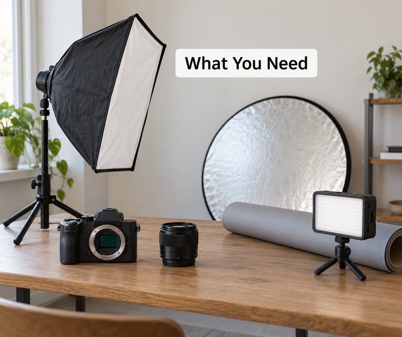
The core kit is a camera, one lens between 85mm and 135mm, a light you can shape, and something to control the background. Everything else is styling and post-production, and both are cheaper to fix than the lighting is.
Start with the camera you already own. Any interchangeable-lens camera or a recent phone with a portrait mode will produce a usable cover frame; the difference between phone and DSLR here is mostly how quickly you can pull focus while the subject moves, not the final print.
- Lens: an 85mm or 135mm prime. 50mm works for a tight head-and-shoulders crop but you have to stand further back, which changes the light-to-subject distance and flattens facial features less comfortably. Zoom lenses are fine for the frame variations in step six.
- Light: one continuous LED or speedlight with a modifier, or one strobe with a softbox. A beauty dish gives a harder catchlight and a more sculpted look, which suits beauty and cosmetics covers.
- Modifier: a softbox or diffusion dome for soft light, a grid or snoot for directional light, and a flag or black foam board for negative fill.
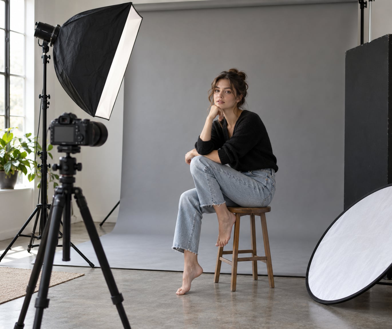
- Reflector: a white or silver 5-in-1 disc. This is your fill control and the cheapest way to lift a shadow side.
- Background: roll paper, painted wall, or a fabric backdrop with no visible seams or wrinkles. Clip-on studio clamps beat gaffer tape for holding paper flat.
- Support: a tripod. You will be shooting vertical and moving around the light, not the other way round.
- Styling: wardrobe chosen against the background, a hair and makeup brief, and a tape mark for where the subject’s feet go.
- Post: a raw converter with a curve tool and a grain slider. That is genuinely all the grade needs.
Two substitutions worth knowing. If you have no strobe, put your subject a metre from a north-facing window, stand a reflector camera-right and shoot into the open shade. If you have no softbox, bounce a bare speedlight off a white ceiling and put a diffusion sock between the flash and the subject.
Step-by-Step
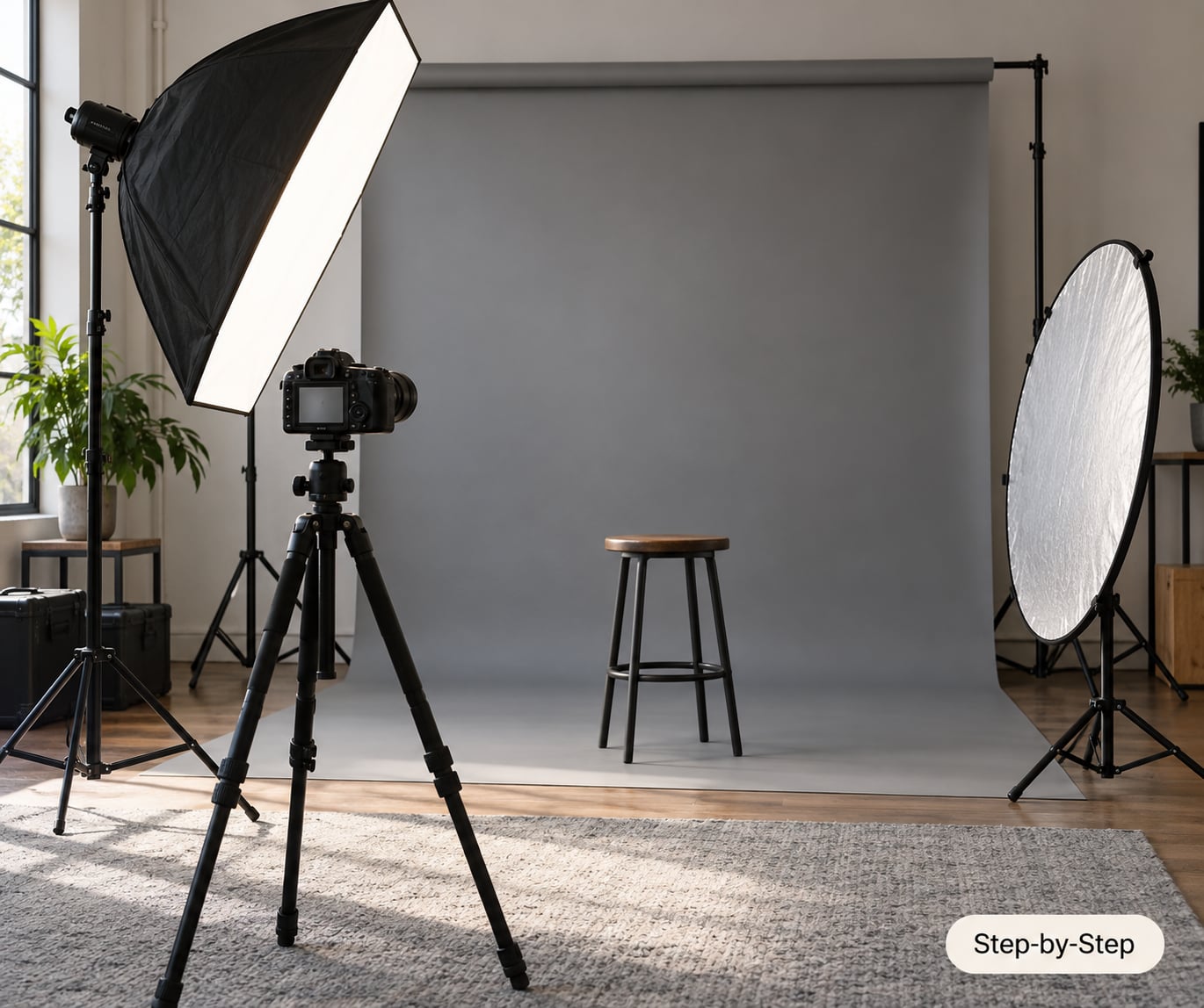
Here is the working order I use for a cover-style session: brief, pose, light, settings, direction, shot list, grade. Reordering these wastes time, because every later step depends on the frame you decided on in step one.
1. Plan the Cover Concept
A cover portrait is decided on paper before anyone picks up a camera. Write one page: who the cover is for, the mood in three words, the two or three cover lines that will sit in the negative space, and the wardrobe palette.
The cover lines are the useful part. A line like “The Quiet Rise of Independent Publishing” is 45 characters and needs roughly the top third of a 2:3 vertical frame. If your subject’s head sits at the top of that frame, you will end up shrinking them or moving type over their hair, and both look amateur.
Collect six to ten reference frames into a tearsheet or mood board. Pick three you can actually recreate in your space. The goal of the brief is to end it with one hero frame you could describe to a stranger in a sentence, so they would build roughly the same picture. That single page is what turns knowing how to shoot a magazine style cover portrait in theory into a repeatable session you can hand to an assistant.
2. Choose the Pose and Expression
Cover poses are built from four moves: chin down and slightly forward, shoulders angled away from camera, weight on the back leg, eyes into the lens. That combination narrows the face slightly, lengthens the neck and creates the S-curve through the torso that reads as editorial rather than passport photo.
Chin down does two jobs at once. It lifts the jawline without changing the shape of the eyes, and it drops the eye line lower in the frame, which buys you more headroom. That second effect is the whole trick, and it is why models who lift their chins so they can “look taller” end up unusable for a cover.
Hands are where covers fall apart. Give fingers a job: thumb and index lightly joined, other fingers extended and separated, wrist soft and dropped below the shoulder line. If a hand is not adding anything to the silhouette, take it out of frame rather than leaving it limp.
Build three poses before you start shooting: the hero pose with the strongest silhouette, one three-quarter turn that shows depth, and one with the arms down and shoulders relaxed that gives you a safe fallback. Rotate them at the end of the session too, in case the subject warms up and delivers better than the first ten minutes allowed.
3. Set Up the Lighting
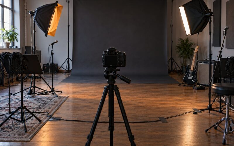
A cover look comes from one soft directional key placed about 30 to 45 degrees off axis and slightly above the subject’s eye line, angled down, plus separation from behind. That is the whole recipe. The complexity in magazine images is a set of variations on it, not a bigger lighting rig.
| Setup | Key position | Separation | Result |
|---|---|---|---|
| One light | 45 degrees off axis, above eye line, 1 to 1.5 m from subject | None, separate with distance and background choice | Soft, clean, commercial. Easiest to get right. |
| Key plus rim | Same as above | Second light behind at 45 degrees, above and behind the shoulder, aimed at the head | Subject lifts off the background. The most common editorial look. |
| Key, rim and background | Same as above | Third light or gel aimed at the backdrop only | Controlled colour separation, coloured or graded cover. |
| Window | Subject 1 m from a north-facing window, standing | Black board camera-left for negative fill | No strobes needed. Softest and least controllable. |
Control contrast with what you put opposite the key, not with what you add to the shadow side. A reflector on the shadow side halves the contrast and opens the eye on the darker side. Black foam board on the same side creates negative fill, deepens the shadow and gives you the sculpted look used on beauty and high-fashion covers.
Handle the background separately from the face. Either light it on its own, usually a stop or two under the key so the exposure favours skin, or flag the light so it falls off before it reaches the paper. A background brighter than the face is the fastest way to make a cover look like a snapshot.
Tape the camera position and the light feet to the floor before the subject arrives, and work from those marks for the rest of the session. The key creeps, shadows shift a few degrees, and a set that hangs together stops being consistent by frame forty.
4. Use the Right Camera Settings
Shoot vertical at 2:3, stop down enough to keep the eyes sharp, and never let the shutter drop below what motion demands. These are the settings I start every cover session on.
| Setting | Starting value | Why |
|---|---|---|
| Focal length | 85mm or 135mm | Flattering compression, working distance for control |
| Aperture | f/2.8 to f/4 | f/2.8 isolates, f/4 keeps both eyes sharp in a turn |
| Shutter speed | 1/200s or faster with flash | Motion blur cannot be fixed in post; never below 1/100s handheld |
| ISO | 100 to 400 | Keep it low so skin stays clean and the grain in step seven is your choice |
| White balance | Locked, custom at 5200 to 5600K | Consistency across the set; mixed colour temperatures drift between frames |
| Focus | Single-point AF on the nearer eye | One eye sharp reads as intentional; both eyes soft reads as a mistake |
| Flash sync | 1/200s, or high-speed sync for brighter continuous light | Above sync speed you lose control of ambient exposure |
Adjust rather than abandon. In open window light you will be at 1/125s or slower, so brace on the tripod and turn ISO up to 800 before you accept a blurred frame. With a 50mm lens, move back and crop instead of creeping closer, which keeps the perspective honest.
5. Direct the Subject
Direction converts a technically correct frame into a convincing one. Be specific and be warm: “drop your chin a little and push it toward me” gives the subject something to execute, while “look confident” gives them nothing.
Change one variable at a time. Hold the pose, ask for the expression, then ask for the eyes. Once those three are locked, move the hands and only then the whole pose, so the subject learns what you want in small steps instead of being rebuilt from scratch every time.
Watch four things while you shoot: hands, shoulders, jaw, eye line. Shoulders creep up to the ears when people get nervous and the neck shortens instantly. A jaw held tight hardens the whole frame. And an eye line that drifts a few centimetres off the lens will lose the connection with the reader no matter how good the light is.
Give the subject a reason for the look rather than a mood word. Ask them to think of the person who would be reading the cover. You will get a specific, quiet expression instead of the broad professional smile that kills most cover attempts.
6. Capture a Complete Set
A single hero frame is a coin flip. Shoot a list, in this order: the hero pose, then a second pose in the same lighting, then close variations. A usable cover needs alternatives because the composition you want usually appears once in two hundred frames.
On the list I keep: hero frames in two poses, one tight head-and-shoulders crop, one wider vertical showing torso and hands, three alternate expressions at the same setup, several frames with clean negative space above the head, and two or three detail shots of hands, texture or wardrobe for the art director.
Vary composition without breaking the concept. Step closer, change the crop, move the subject a fraction left in frame, then return to the taped marks. Every variation should still look like it belongs to the same cover, which means same light, same lens, same colour.
7. Retouch and Prepare the Cover
Start by choosing the strongest frame, not the most flattering one. A frame where the hand is mid-blink, the catchlight is dead and the shoulder is climbing the frame edge will not save with retouching.
Keep skin texture. Frequency separation applied too heavily is the reason editorial images read as plastic or generated: pores vanish, highlights turn waxy and the face stops looking like a person. Reduce blemishes and stray hairs, lift the eyes slightly, and leave the pore detail intact.
Build the grade in this order: exposure and highlight recovery, a gentle S-curve for contrast, colour temperature to taste, then grain. A fine grain at low opacity ties the background and skin together and hides retouching transitions. Do not add a heavy vignette to fake contrast, and check the frame with the cover lines in mind, since type over a busy shadow corner is unreadable.
Export at full resolution with room above the head for the masthead. If you are designing your own cover, keep that space clean at the export stage rather than relying on generative fill to rebuild a background you already had.
Common Mistakes
Almost every failed cover shot comes from one of a handful of repeated errors. Each has a quick diagnostic and a quick fix.
Subject dead centre with no headroom. You get a good portrait and no usable cover. Fix it in camera: shoot vertical, place the eye line in the lower third, and frame at least 15 percent of the frame height as empty space above the head.
Chin up, shoulders square. This is the passport-photo pose and it lengthens the face while shortening the neck. Ask for the chin down and forward, then turn one shoulder away from camera.
Background brighter than the face. The eye goes to the brightest thing in the frame, which is the paper behind your subject. Flag the key or drop the background light a stop and a half.
Plastic skin after retouching. Too much frequency separation and too much texture removal. Pull the smoothing back until you can see pores at 100 percent, and correct with light and grade rather than brushwork.
Soft shadows and no separation. When the shadow side of the face is lighter than the background, the subject melts into it. Add a rim light behind at 45 degrees or negative fill opposite the key.
Uncontrolled set. The key light moved, the colour temperature shifted, and no two frames match. Tape the positions, lock white balance, and check your histogram before every few frames.
Two presentation habits help more than people expect. Shoot with tethering on a laptop if you can, because the histogram and focus magnification catch blown highlights on the face that are invisible on a small rear screen. And show your subject the frame on the big screen before you break the set; they will tell you which of the twenty looks right, and they are usually right.
Frequently Asked Questions
What lighting is best for a magazine-style cover portrait?
One soft directional key placed about 30 to 45 degrees off axis and slightly above the subject’s eye line, angled down, gives the sculpted editorial look. Add a rim light behind at 45 degrees for separation from the background, and use a reflector or black board on the shadow side to set your contrast. Keep the background a stop or two under the face exposure so the eye lands on your subject.
Do I need a studio to create an editorial cover look?
No. Put your subject about a metre from a north-facing window, stand a white reflector on the shadow side and a black board on the other, then shoot into open shade. You lose control of the background and the light changes through the session, but the soft directional quality and the framing discipline are the same. The reserved space above the head matters far more than the light source.
How should I pose for a magazine cover portrait?
Chin down and slightly forward, shoulders angled away from camera, weight on the back leg, eyes into the lens. Chin down lifts the jawline and drops the eye line lower in the frame, which buys headroom for cover lines. Give hands a job with lightly joined fingers and a dropped wrist, or keep them out of frame. Build three distinct poses and rotate them through the session.
What lens should I use for a magazine-style portrait?
An 85mm or 135mm prime is the standard choice. Both give flattering compression and enough working distance to shape the light around your subject. A 50mm works for a tight head-and-shoulders crop if you shoot further back and crop in, and a zoom is useful for capturing frame variations quickly. Stay above 50mm equivalent to avoid wide-angle distortion around the nose and ears.
How do I leave space for text on a cover portrait?
Shoot vertical at 2:3, put the subject’s eye line in the lower third of the frame, and keep at least 15 percent of the frame height as clean negative space above the head. A chin-down pose helps because it lowers the whole head in frame. Keep that upper area simple by using a plain background or a section of paper with no seams, and avoid hair, hands and props crossing into it.
How much retouching is appropriate for an editorial portrait?
Enough that skin is clean and the eyes draw attention, but not so much that pores disappear. Heavy frequency separation and full texture removal are what make editorial images read as plastic or generated. Reduce blemishes and stray hairs, lift the eyes a little, then fix contrast, colour and stray backgrounds with grade and light rather than brushwork, and add fine grain to unify the frame.
Start tomorrow with the frame, not the light. Write the cover lines, shoot one vertical test at 85mm with your subject’s eyes in the lower third, and check how much clean space sits above their head. That framing decision is the part of how to shoot a magazine style cover portrait that decides whether the image works, and it costs nothing to get right. Everything after that, lighting, direction and grade, is refining a composition you already chose.