A digital photo looks like film when its colour, contrast and texture behave the way film behaves: colour that shifts slightly off neutral, shadows that lift into soft matte blacks, highlights that roll off instead of clipping to pure white, and grain with a texture rather than the speckled crunch of digital noise. If you want to learn how to make digital photos look like film, work in that order — colour first, grain last — and skip any preset that tries to do it in one click.
Allow about 15 minutes per photo once you have the sliders in front of you, and expect the first few attempts to look worse than your original. That is normal. Film emulation is a subtractive thing: you keep removing the hard digital edges, and the picture slowly starts to look like something shot on film.
The order matters more than any single slider. Most edits that fail do so because grain was laid on first, which turns a clean file into something that reads instantly as a filter.
Table of Contents
- What You Need
- Step-by-Step
- 1. Start With a Well-Exposed Digital Photo
- 2. Set the Overall Color and Contrast
- 3. Add a Film-Inspired Color Palette
- 4. Add Grain, Texture, and Softness
- 5. Finish With Restraint and Export
- Common Mistakes
- Frequently Asked Questions
- What is the easiest way to make digital photos look like film?
- Can I make a digital photo look like film using a smartphone?
- Should I use a film emulation preset or edit manually?
- How much grain should I add to a digital photo?
- Can a film look make a photo look more professional?
- How do I make film-inspired edits consistent across a whole series?
What You Need
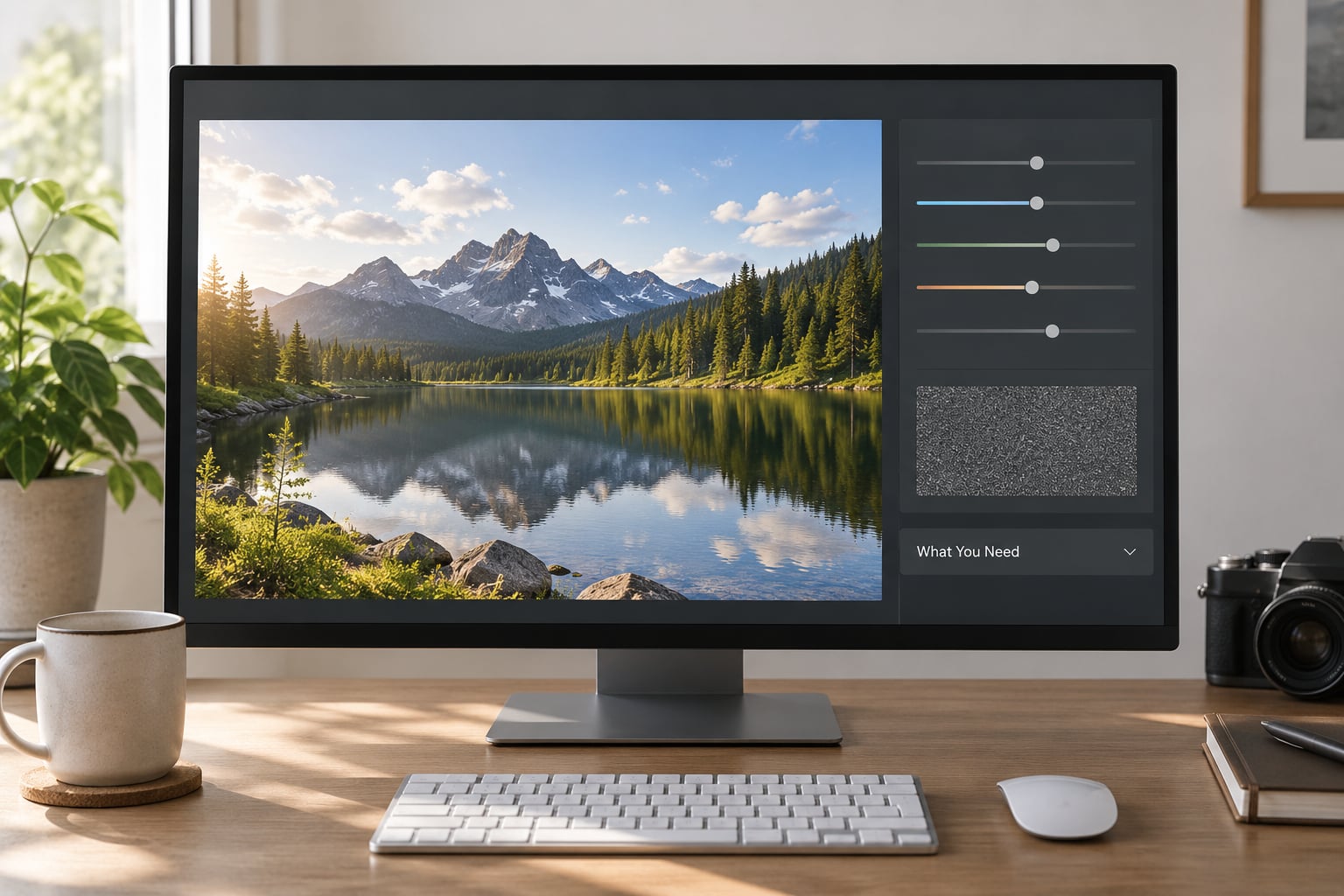
You need a photo editor with curve, colour and grain controls. Adobe Lightroom Classic and Lightroom Mobile both qualify, as do Capture One, Affinity Photo, GIMP and Photoshop. The panel names differ slightly between them, but the concepts — tone curve, temperature, colour grading, grain — are the same everywhere.
You also need the original file, not a screenshot or a compressed social download. Editing a small, already-crushed JPEG gives you almost no shadow detail to lift and no highlight information to recover, and no amount of curve work will fix that.
Optional extras help but are not required: a grain or texture overlay scanned from real film, a soft brush for selective dodging and burning, and a layer with a real halation glow if you are chasing a cinematic night look.
One habit pays off immediately. Before touching a single slider, decide which film stock you are imitating and write it down. Aiming at Kodak Gold 200 gives you a warm, contrasty, consumer-film target; aiming at a vague “vintage mood” gives you the faded-yellow result most people recognise as a bad preset.
Step-by-Step
1. Start With a Well-Exposed Digital Photo
Fix the technical problems first, because every effect afterwards depends on them. Correct the lens distortion, vignetting and chromatic aberration, and set the white balance with a neutral reference in frame if you have one.
Shoot RAW rather than JPEG. RAW keeps the highlight and shadow data you need to lift blacks and roll off highlights without banding, which is the entire mechanical reason the workflow works.
To check that you have usable data, turn on the clipping indicators in the histogram panel. Press the key to cycle highlight warnings and look for speckles in the brightest areas. If you see them, pull exposure down a fraction of a stop until they disappear. Film compresses highlights; it cannot recover ones that were already recorded as pure white.
Most cameras also reward you for shooting slightly under the meter reading. A third of a stop down protects the highlights and gives you more room to shape the curve.
2. Set the Overall Color and Contrast
The tone curve is where most of the film effect lives. In Lightroom, switch the profile to Adobe Color or a compatible custom profile first — a camera profile built for contrast will fight everything you do afterwards.
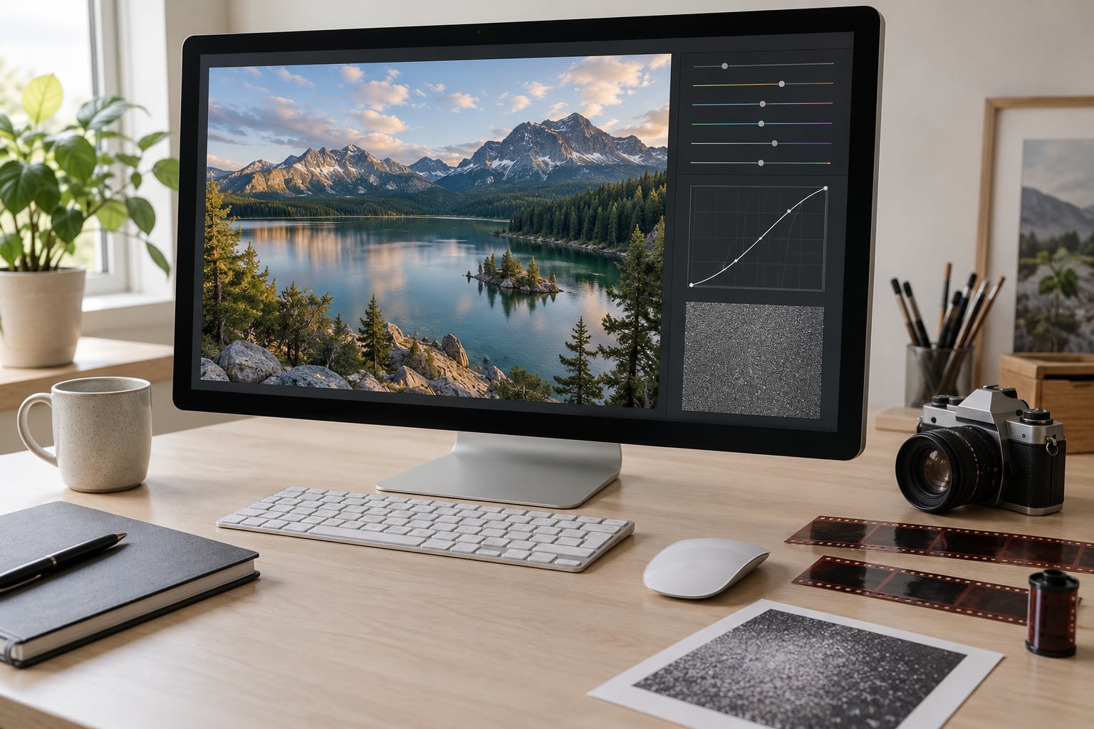
Drag the bottom-left anchor point upward until the deepest shadow sits around 8 to 15 on the tone scale. Those lifted blacks are the single biggest difference between a digital image and a matte, filmic one. Watch the shadows as you move: if faces start losing detail, you have gone too far.
Then pull the top-right point down a little so highlights top out around 90 rather than 100. That soft ceiling is what film does with a bright window or a face against the sun, and removing it is what makes photos look harsh and over-processed.
Finish with a gentle S-curve through the midtones. Keep it subtle. A steep S adds contrast in the middle of the range, which reads as crunchy digital rendering rather than film.
Then lower Clarity by 10 to 30. Clarity adds local contrast at the mid-scale and is the main culprit behind the “digital” edge; Texture does a similar job at a different scale, so reduce it too if the frame still looks crunchy. Dehaze down a small amount adds the flat, hazy quality of a lens that was never corrected.
Because lifting blacks reduces apparent sharpness, check the result at 100% and re-sharpen selectively if needed. In Lightroom, hold Alt (Windows) or Option (Mac) while dragging the Sharpening Amount slider to reveal a masking overlay, then paint sharpness back only onto the subject.
3. Add a Film-Inspired Color Palette
Colour comes after contrast, not before. Grain over the wrong colour just makes the wrong colour louder.
Nudge the Temperature slightly warm — a few hundred kelvin is usually plenty — and pull Tint a touch toward magenta if skin has gone green. If the whole frame reads orange, you have gone too far, and that orange cast is one of the fastest ways to make an edit look like a filter.
For most consumer film stocks, vibrance up and saturation slightly down is the right pairing. Vibrance protects already-saturated colours such as skies and skin, while a small saturation cut pulls the overall colour back from the poster-like look digital sensors default to.
In the Color Grading panel, add warmth to the highlights and either cool or cyan to the shadows. This split is what gives colour film its separation between bright and dark areas. Keep the balance slider near the middle, and keep the tint subtle — heavy cyan shadows are a stylistic choice, not a film truth.
Then open HSL and make two or three targeted moves. Shifting blue toward cyan and pulling red toward orange are common film tendencies; large saturation drops on green and yellow keep foliage and skin from turning lurid. Adjust each hue on a photo of the specific stock you chose — Portra 400, Kodak Gold 200, CineStill 800T — because the balance between channels changes with lighting and there is no honest way to claim an exact match from memory.
4. Add Grain, Texture, and Softness
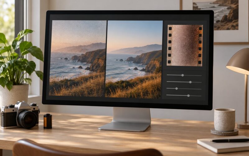
Film grain comes from silver-halide crystals in the emulsion, and bigger, coarser crystals appear as film speed rises. That is why a fast stock looks rougher. If you want the texture to follow suit, match the grain size and roughness to the ISO of the stock you are imitating rather than picking the defaults.
| Stock and ISO | Grain amount | Grain size | Grain roughness |
|---|---|---|---|
| Portra 400, ISO 400 | 20-30 | 30-40 | 40 |
| Kodak Gold 200, ISO 200 | 15-25 | 25-35 | 40 |
| Portra 800, ISO 800 | 35-45 | 45-55 | 50 |
| CineStill 800T, ISO 800 at night | 40-50 | 50-60 | 55 |
The defaults of Size 25 and Roughness 50 are a starting point, not a finished look. Amount is the one slider people overdo — push it until you can see individual grains at 100%, then pull it back until they only appear when you look for them.
If you use an overlay instead, set it to Soft Light or Overlay at low opacity rather than pasting it on top at full strength. Overlays carry baked-in colour and vignetting, which is exactly how an image ends up looking dirty rather than analog.
For softness, avoid a global blur — it makes the subject mushy and looks like a mistake. Instead use a soft brush at very low opacity on the edges of the frame, or a light diffusion filter over the whole image at around 5% strength. Local softness on the background and sharpness on the eyes reads as shallow depth of field, which is what a fast vintage lens actually gave you.
Halation is the glow that appears where bright light hits the film base and bounces back through the emulsion, usually red. The CineStill 800T look people chase at night is mostly halation. Lightroom has no native halation tool, so the usual workaround is a duplicate layer, a high-pass or channel-blended red tint, screen blend mode, and a wide blur applied only to the highlights.
5. Finish With Restraint and Export
Every extra effect needs to earn its place. Turn the whole edit off, look at the photo at normal viewing size, then look at it at 100%. If you notice the effect immediately at normal size, it is too strong.
Compare against the original side by side. If the difference is dramatic, you have probably stacked changes that fight each other, and the fastest fix is usually to halve the grain and the vignette rather than to rebuild anything.
Watch your export size. Grain is rendered at the pixel level, so a grain setting that looks right in a small preview becomes far more prominent in a large export or a print. Export once at final size, review that file, then adjust the grain amount based on what you see rather than on the screen preview.
For web use, sRGB JPEG at a quality setting around 80 to 90 is fine. For printing or archiving, export TIFF or a 16-bit file so you keep the shadow detail you spent the edit lifting. Then save your slider settings as a preset.
A saved preset is not the end of the process. Professional photographers apply the same preset across a shoot, then make three to five small adjustments per image, usually temperature and HSL. That per-image correction is the difference between a consistent look and a flat, obviously filtered one.
Common Mistakes
Grain added first, colour never. This is the single biggest reason an edit looks fake. Grain on top of unmodified colour reads as digital noise because there is no tonal softness underneath it. Fix: colour and curve first, grain last, amount lower than you think.
Crushed blacks. If the darkest areas sit at zero and the subject separates from the background with hard edges, the image looks digital. Fix: lift the bottom-left curve point to around 10 and re-check shadow detail.
Clipped pure-white highlights. Pure white reads as harsh and over-exposed, not analog. Fix: pull the top-right point down until the brightest area sits near 90 to 95.
Grain that looks like noise. Usually two causes: too much amount, or grain applied at 100% to a downsized image. Fix: reduce amount, raise size slightly, and confirm you are comparing against the full-size file.
Everything warm. An orange cast on skin instantly identifies a filter. Fix: pull the temperature back, and check the Color Grading highlights are subtle rather than heavily tinted.
Over-sharpening. Lifting blacks dulls an image, so it is tempting to add sharpening to compensate. Push too far and skin texture turns crunchy, especially on faces. Fix: mask the sharpening to the subject only.
Effects applied at full strength to every photo. A look tuned for a flat midday portrait will wreck a night street frame. Fix: apply the preset to all, then adjust per image.
Two habits that help more than any single slider: keep a before-and-after note for each effect so you know what each one bought you, and check the frame at thumbnail size. If it does not look wrong there, it is fine.
Frequently Asked Questions
What is the easiest way to make digital photos look like film?
Open a RAW file, lift the bottom-left point of the tone curve to around 10 for matte blacks, pull the top-right point down to 90 for soft highlights, lower Clarity by 10 to 30, warm the temperature slightly, then add grain matched to the ISO of the stock you are imitating. Colour and curve first, grain last. That sequence takes about 15 minutes and gets you most of the way.
Can I make a digital photo look like film using a smartphone?
Yes. Shoot in ProRAW or the highest quality format your phone offers, then edit in Lightroom Mobile or Snapseed, which both have curve, HSL and grain controls. Skip phone-only retro apps if you care about control: they add light leaks and frame borders you cannot tone down, and they compress your file before you get to edit it.
Should I use a film emulation preset or edit manually?
Use a preset as a starting point, then edit manually. A preset saves the first ten minutes of slider work but rarely survives contact with a whole shoot, because every frame needs a small temperature and HSL correction. If you are building a consistent look for clients, save your own corrected preset rather than buying a pack you will fight.
How much grain should I add to a digital photo?
Start near 20 to 30 at Amount with Size around 30 to 40, then cut it back until the grain only shows when you look for it. High-ISO stocks need more and coarser grain, low-ISO stocks need less and finer. If you can see individual grains at normal viewing size, it is too much.
Can a film look make a photo look more professional?
Yes, when it is subtle and consistent. Soft highlights, lifted blacks and restrained colour make an image feel deliberate, and applying the same look across a series is what reads as professional to a client. A heavy grain-and-leak overlay on a single frame reads as a filter, and that is the opposite of the effect.
How do I make film-inspired edits consistent across a whole series?
Build one preset, apply it to the whole set, then make the same three to five corrections on each frame: temperature, tint, vibrance, one HSL hue, and grain amount. Fixed shooting conditions matter more than the slider values. If a batch varies wildly in exposure, no preset will make it look like one roll of film.
Start with the tone curve, not the grain. Lift your blacks to around 10, pull your highlights to 90, drop Clarity by 10 to 30, then do colour, then add grain last. Pick one stock to imitate and stay with it until the numbers feel natural — that is the whole difference between film emulation and a preset.