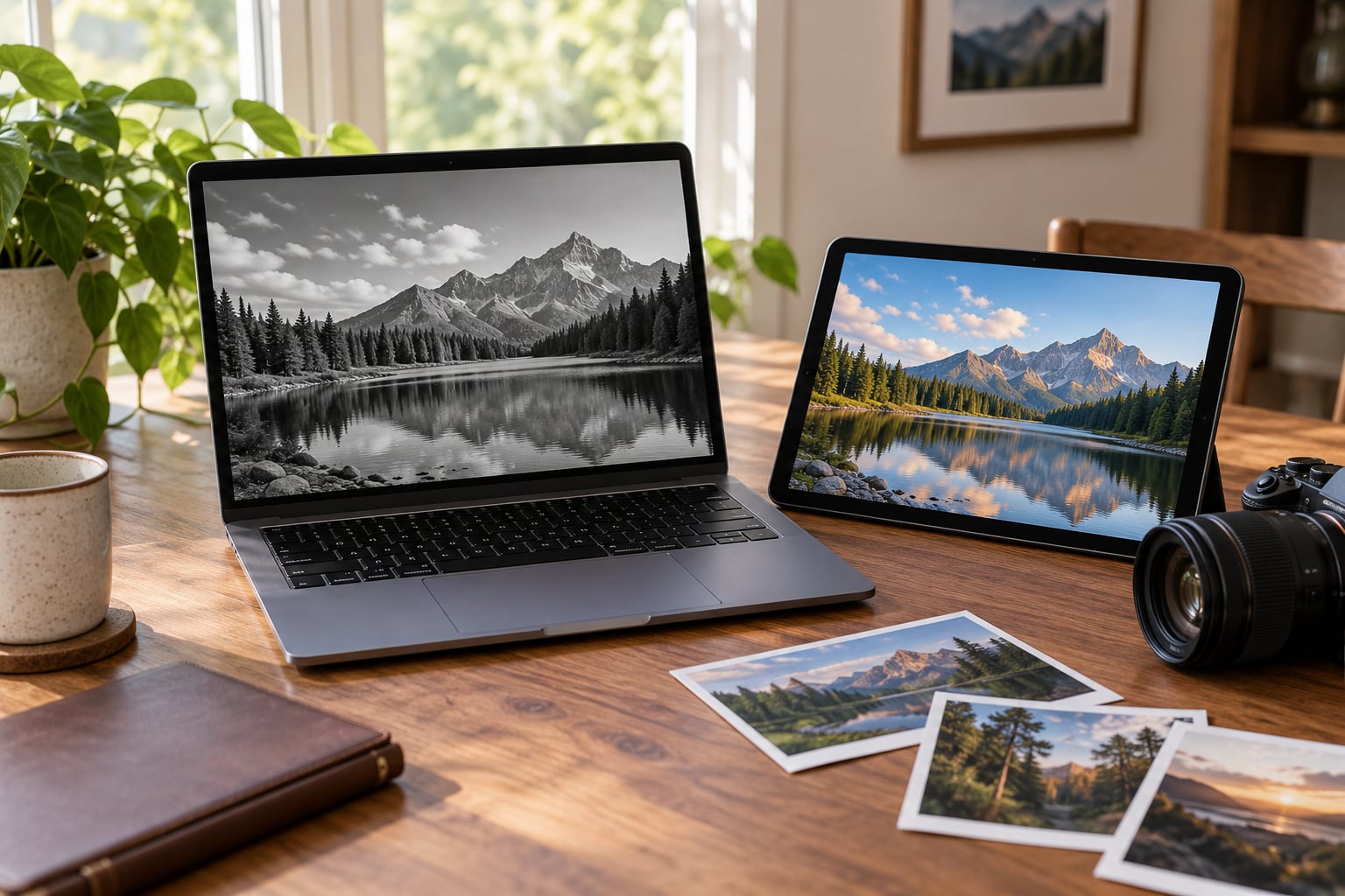
To convert photos to black and white in Lightroom, select the image in the Library grid, open the Develop module, and use the B&W panel in the right-hand column. Or right-click the photo and choose Treatment > Black & White. Then mix the color sliders so skin, skies and foliage land on the tones you actually want.
The whole thing takes about two minutes and it is fully non-destructive, so nothing in your catalog file changes permanently. That speed is also why a lot of photographers get it wrong: they click once, glance at the result, and move on with every slider sitting at zero.
The panel is doing more work than it looks like it does. Instead of deleting color, it reads each color range and decides how bright that range should be in gray. Get that mapping right and a flat photo gains depth. Get it wrong and the sky, the face and the jacket all collapse into the same muddy patch.
Table of Contents
- What You Need
- How to Convert Photos to Black and White in Lightroom: Step by Step
- Common Mistakes
- Frequently Asked Questions
- Where is the Bu0026amp;W panel in Lightroom?
- How do I convert a black and white photo back to color?
- Can I batch convert a whole folder to black and white?
- Why does my black and white photo look flat?
- How do I keep one color in a black and white conversion?
- How do I export a black and white photo from Lightroom?
- Conclusion
What You Need
You need Adobe Lightroom and one color photo. Everything in this guide is built into the software, so there are no presets to buy and no plugins to install.
Lightroom comes in three forms and the B&W controls sit in a different place in each one:
- Lightroom Classic (desktop, catalog based). The B&W panel is in the right-hand panel, above the Profile menu. It has a Presets menu with None, Color and Black & White.
- Lightroom (CC) (desktop and web, cloud based). The equivalent controls live in the Edit panel under the color channel sliders, with a B&W mix section.
- Lightroom Mobile. Tap Edit, then the color icon in the bottom toolbar to reach the same mix sliders on a phone or tablet.
A RAW file gives you the most room to work, because a monochrome conversion still has plenty of color data left in it to remap. A JPEG works fine too, just with less give before things break.
You have two built-in routes to monochrome. The B&W panel remaps whole color ranges at once, which is the main method in this guide. The HSL and mask route treats one area of the frame differently from the rest, and that is how you keep one color alive in an otherwise gray image.
How to Convert Photos to Black and White in Lightroom: Step by Step
1. Open the Photo in the Lightroom Develop Module
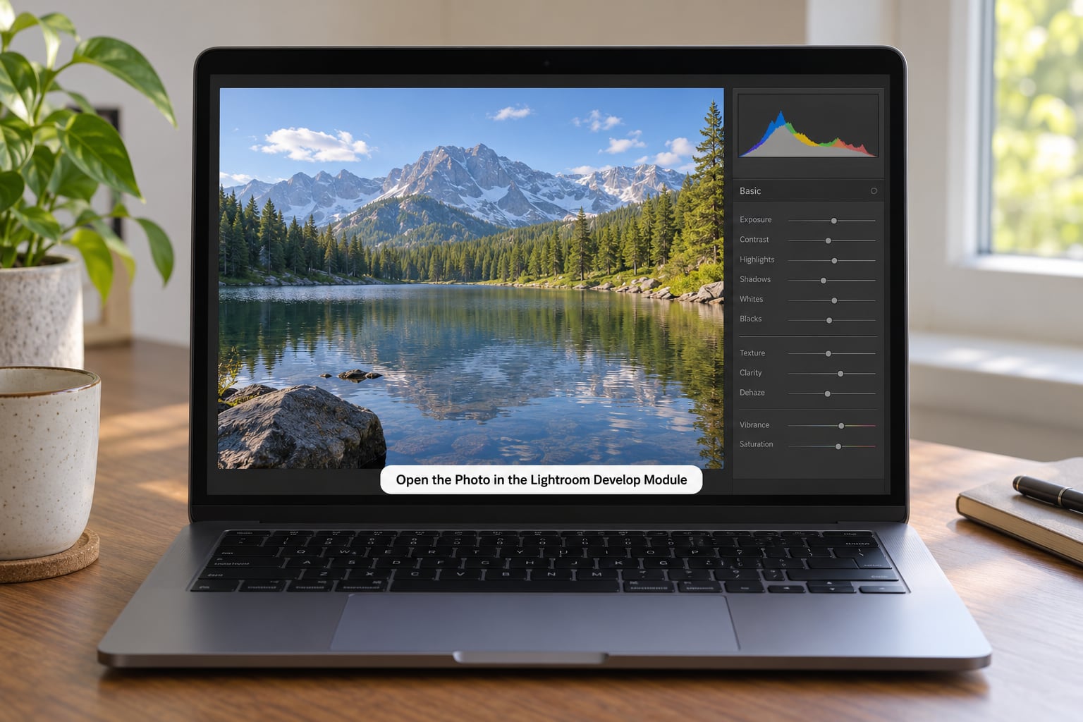
Click once on the image in the Library grid to select it, then press D or click Develop in the Module Picker at the top. That loads the file into Develop without copying it anywhere.
Before you touch the color, check the file type in the Info panel. If you are working on a JPEG that came out of a camera or a phone, expect the shadows to clog sooner than you would like. The same slider push that looks fine on a RAW file can look broken on a small JPEG.
One habit worth keeping: never flatten the file while you are still deciding. Everything from this guide happens inside the catalog, and you can undo or reset at any point.
2. Adjust the Black & White Panel Mix
Scroll down the right-hand panel in Classic until you reach the B&W panel, just above the Profile menu. Open its Presets menu and choose Black & White. In Lightroom CC the same switch is the Black & White mix option in the Edit panel.
You now have six sliders: red, orange, yellow, green, aqua and blue. Drag one up and everything in that color range gets brighter. Drag one down and it goes darker. Next to them sits a Preserve Luminosity toggle that keeps brightness steady as you move the sliders, plus an eyedropper and a point target with a ring around it that sample a color directly from the image when you click on it.
| Color | What it usually controls | Portrait start | Outdoor start | Architecture start |
|---|---|---|---|---|
| Red | Lips, warm skin, red objects | +25 | -20 | -10 |
| Orange | Skin tones, the main lever on a face | +40 | -10 | 0 |
| Yellow | Foliage, sand, autumn leaves | -20 | -40 | -30 |
| Green | Grass, leaves, green clothing | -30 | -40 | -20 |
| Aqua | Cyan water, reflections | -10 | -20 | 0 |
| Blue | Sky and denim | -20 | -60 | -30 |
Treat these as starting points, not a preset. The orange slider brightens and smooths skin, which is why portraits usually run positive. Blue dragged well down darkens a sky so clouds separate from it, which is why outdoor work wants a much bigger negative number than a portrait does.
Watch for halos. Pushing a slider far past roughly plus or minus 60 is where bright fringes start appearing along hard edges, and they are more obvious on JPEG files than on RAW.
3. Balance Tones With Basic Corrections
Now switch your attention to the Basic panel, but only after the mix is roughly where you want it. The order matters, because the mixer sliders change how much of each tone you have to work with.
Open the Histogram with Ctrl+Y on Windows or Cmd+Y on a Mac. Set Whites and Blacks so the ends of the histogram just touch the edges without a gap, rather than dialling in a fixed number for every image.
From there, work on exposure, contrast, highlights and shadows. Small moves are the point. A conversion can carry more contrast than the color original because the eye reads shape rather than hue, so a little more punch survives as impact rather than as a harsh look.
If the histogram shows a spike bunched in the middle with empty space on both sides, the image will look washed out no matter what else you do. Stretch the tones before you touch clarity.
4. Add Selective Contrast and Texture
Texture, Clarity and Dehaze each add a different kind of bite, and on a black and white file all three can go too far quickly.
Texture is the polite one. It adds micro-contrast to edges and is usually safe on faces and fabric at small values. Clarity works on a wider scale and starts to look harsh on skin fast, so keep it under about 15. Dehaze pushes atmosphere and depth into distant scenes, but it will outline tree canopies against a sky with a hard bright rim if you go past 20.
Use the Adjustment Brush for any of these when you want the effect in one place rather than everywhere. Hold Alt on Windows or Option on a Mac while you paint to bring the brush value back down after it has been set.
5. Refine the Result With HSL and Masking
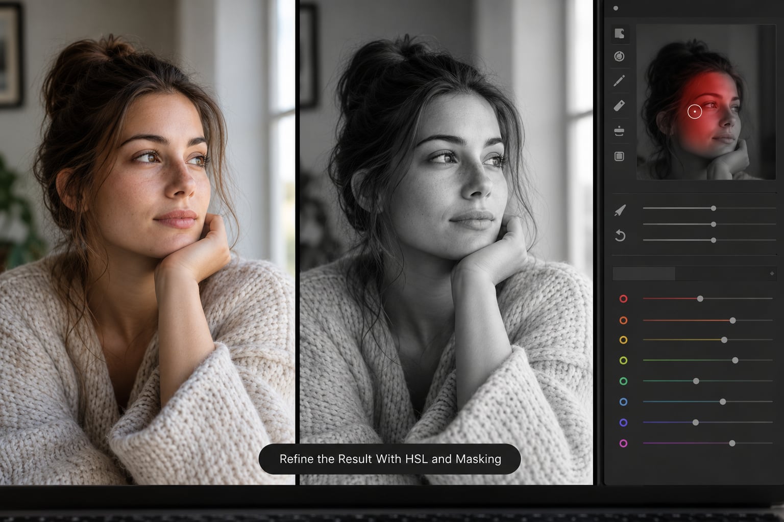
This is the route to selective black and white, the effect where everything turns gray except one color. It comes up constantly as a request, and most tutorials stop before showing it.
First convert the frame using the B&W panel as normal. Then click the masking icon above the Histogram, and use Select Subject, or paint a mask with the Brush tool, over the thing you want to keep in color. Lipstick, a single flower, a painted door, one person’s jacket in a crowd.
With that mask active, flip the B&W Presets menu back to Color. Only the masked area returns to color, because the mask is holding the rest of the frame. Then open the HSL panel, set that color’s saturation to around -100, and nudge its luminance or hue until it sits naturally against the gray.
The same trick works in reverse. Leave the frame in black and white, add a mask, and push that masked area to Color. You get one colored region instead of a whole colored image.
6. Compare, Reset if Needed, and Export
Hold the backslash key to see the color original, then release it to see your conversion. That split-second comparison is the fastest way to catch a mix that has gone too gray or too contrasty.
If you want to start over, click the Reset button at the bottom of the right-hand panel in Classic. If you want to reverse just the conversion, set the B&W Presets menu back to Color and your tone edits are still there underneath.
When the edit is right, open the Export dialog rather than Save As. For delivery online, choose JPEG at quality 90 to 100 in sRGB. For printing or handing the file to another editor, choose TIFF at 16 bit with ProPhoto RGB or Adobe RGB.
To run the same look across a whole shoot, right-click the finished image in the Library grid and choose Copy Settings, then tick Black & White along with any Basic panel sliders you tuned. Select the rest of the shoot and choose Paste Settings, leaving Treatment unchecked so each photo keeps its own exposure and white balance.
Common Mistakes
The image looks flat. Almost always the mixer sliders are all sitting at zero, which leaves every color mapped to its untuned default. Move orange, blue and green away from center before you change anything else.
Shadows are crushed into solid black. Pull the Blacks slider back up until you can just make out detail in the darkest areas. If that leaves the image flat, you pushed the green or aqua sliders too far down.
There is a bright fringe around edges. That is a halo, and it comes from an over-pushed channel slider. Move the offending slider back toward zero, usually the blue or yellow one on outdoor work.
Skin looks leathery. Clarity and Dehaze are the usual culprits. Drop Clarity back under 15 and use Texture instead for the same effect in a lighter hand.
It looks worse than the color original. Compare with the backslash key. If the conversion has flattened everything, the white balance or exposure was already wrong before you converted, and those need fixing in the Basic panel first.
Grain and noise appear after heavy channel work. Pulling channels apart amplifies whatever noise was in the shadows. Use the Detail panel noise reduction on luminance only, and remember that a little grain suits a monochrome file better than colored noise does.
Frequently Asked Questions
Where is the Bu0026amp;W panel in Lightroom?
In Lightroom Classic, scroll the right-hand panel down past Color Grading and the Bu0026amp;W panel is near the bottom, with a Presets menu reading None, Color, Black u0026amp; White. In Lightroom (CC) the same controls sit in the Edit panel under the color channel sliders. On mobile, tap Edit, then the color icon in the bottom toolbar.
How do I convert a black and white photo back to color?
If you converted with the Bu0026amp;W panel, set the Presets menu back to Color and the original color returns straight away, because the conversion is non-destructive. If you used a Monochrome profile instead, choose your camera profile in the Profile menu. If you exported a flat file already, that conversion is baked in and you need the original RAW to recover the color.
Can I batch convert a whole folder to black and white?
Yes. Edit one photo until the mix looks right, right-click it in the Library grid and choose Copy Settings, tick Black u0026amp; White plus any Basic panel sliders you tuned, then select the rest of the shoot and choose Paste Settings. Leave Treatment unchecked so every photo keeps its own exposure and white balance.
Why does my black and white photo look flat?
Two causes account for most of it. Either the sliders are all still at zero, which leaves each color at its untuned gray, or you removed the saturation instead of using the Bu0026amp;W panel. Open the mixer, move at least orange, blue and green away from center, then check the histogram again before touching contrast.
How do I keep one color in a black and white conversion?
Add a mask over the object you want in color using Select Subject or the Brush tool, then flip the Bu0026amp;W Presets menu back to Color while that mask is selected. Open HSL, set that color’s saturation to roughly -100, and fine tune its hue and luminance until the lips or the jacket sit naturally inside the gray frame.
How do I export a black and white photo from Lightroom?
Use the Export dialog rather than Save As. For web delivery pick JPEG at quality 90 to 100 with sRGB, which suits most screens and keeps file size sane. For print or further retouching pick TIFF at 16 bit with ProPhoto RGB or Adobe RGB. The catalog copy stays editable either way because nothing is flattened inside Lightroom.
Conclusion
Start in the Develop module, switch the B&W panel to Black & White, and move the sliders that matter for your subject before touching anything else. Orange for skin, blue for a sky, green for foliage.
Then set the tone, compare against the color original with the backslash key, and export a high-quality file. Everything stays reversible, so the worst outcome is a Reset and another try.