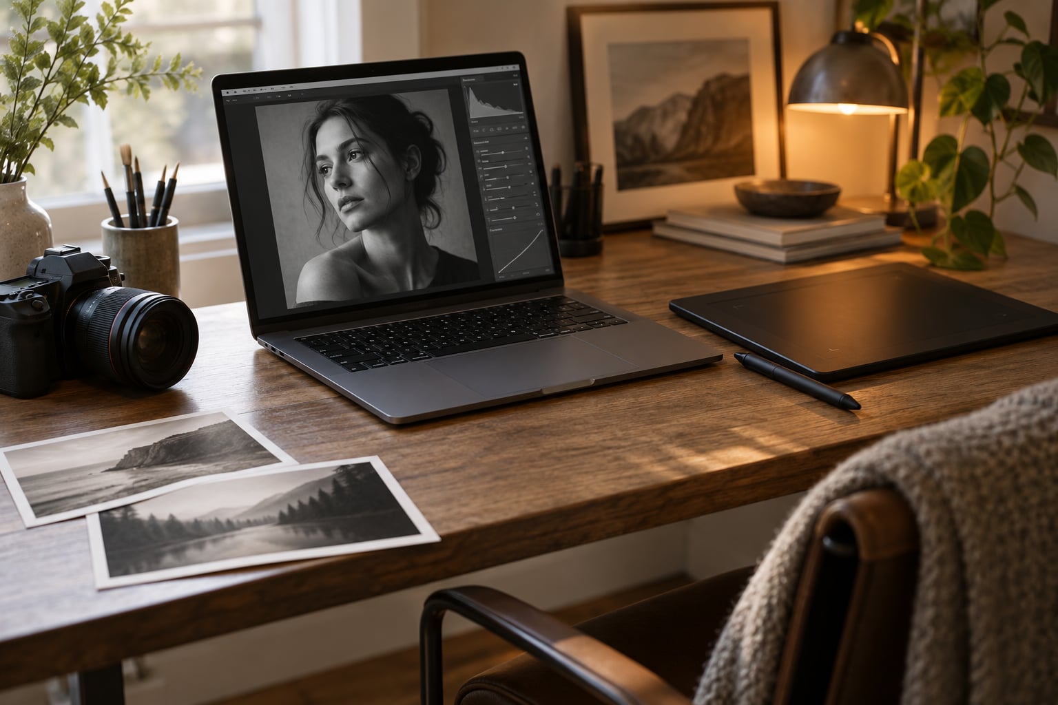
Dodge and burn is how you move light around after the shoot: you dodge (add light) the planes of the face that face your light source, burn (remove light) the areas next to them, and the result looks sculpted instead of flat. Learning how to dodge and burn a portrait well is mostly a lesson in restraint. Budget 15 to 30 minutes for a straightforward headshot, and expect to be faster once you stop over-painting.
This guide covers Lightroom Classic, Lightroom Mobile and Photoshop, plus the mistakes that make the technique look fake. It assumes you are comfortable opening a RAW file and painting with a brush. If you are new to layers, start with the Lightroom sections since every adjustment there stays reversible.
Table of Contents
- What You Need Before You Start
- Step-by-Step: How to Dodge and Burn a Portrait
- Common Mistakes and How to Fix Them
- Frequently Asked Questions
- Can I learn how to dodge and burn a portrait as a beginner?
- What brush opacity and flow should I use for dodge and burn?
- Should I use Curves or a dodge-and-burn action?
- How do I keep dodge and burn from creating harsh patches?
- Does frequency separation replace dodge and burn for portraits?
- How much dodging and burning is natural-looking?
What You Need Before You Start
Honestly, the gear list here is short. The technique is about judgment, not equipment, and a cheap tablet without pressure sensitivity will get you most of the way.
- Layer-based software. Lightroom Classic, Lightroom Mobile, or Photoshop. Each has a working dodge and burn method covered below. Layer-based matters because it keeps every stroke adjustable after the fact.
- A RAW file. Working from RAW gives you more latitude than a JPEG, where clipped highlights cannot be recovered.
- A soft round brush. One brush with 0% hardness or close to it. A hard-edged brush is the single biggest cause of visible halos.
- A graphics tablet. Optional, but pressure control makes subtle passes much easier. With a mouse or trackpad, drop the flow further and zoom in.
- Separate layers for dodging and burning. One dodge layer, one burn layer. Keeping them apart means you can see all your lightening at once and all your darkening at once.
- Patience with low settings. Flow of 1 to 5% and exposure in fractions of a stop. If your only reaction is to crank a slider, the edit will look overcooked.
One habit worth building early: turn on the mask overlay while you paint. It shows you exactly what you have covered before you judge the result, which stops the most common error of painting twice over the same area.
Step-by-Step: How to Dodge and Burn a Portrait
The sequence below runs in Lightroom Classic. The Photoshop steps sit inside the relevant stage, since the order matters more than the tool.
1. Duplicate the image and set up a non-destructive workflow
Before you touch anything, get your original out of harm’s way. In Lightroom Classic, snapshots do this for free: right-click the image in the filmstrip and choose Create Snapshot. Any mistaken dodge or burn can then be walked back without re-editing.
In Photoshop, duplicate the background layer so you always have an untouched comparison underneath. Set the blending mode of the duplicate to something neutral if you need to see it on its own.
Now think about order. Dodge and burn belongs after your main skin cleanup and before final colour grading. Grading last means your dodge decisions are judged on accurate tone, not on a colour cast you are about to change.
2. Choose the right tools for light and shadow
Pick one method for the whole portrait. Mixing methods mid-shoot leaves you with two different intensities fighting each other.
| Method | Where it lives | Main strength | Best for |
|---|---|---|---|
| Adjustment Brush | Lightroom Classic and Mobile | Fast, adjustable exposure | Most portraits, especially if you want to stay out of Photoshop |
| Curves layers | Photoshop | Precise control, saved as a preset | Series and batch work where consistency matters |
| 50% grey layer | Photoshop, Overlay blend mode | Simple, forgiving, easy to undo | Beginners and any low, even adjustments |
| Dodge and Burn tools | Photoshop toolbar | Range controls for shadows, midtones, highlights | Working on a single tonal range at a time |
For the brush settings, start softer than feels useful. A soft round brush at very low flow, with feather or a large brush radius, is what keeps transitions invisible.
| Method | Flow | Feather or hardness | Strength per pass |
|---|---|---|---|
| Lightroom Adjustment Brush | 15 to 25% | Feather 80 to 100 | Plus or minus 0.2 to 0.5 EV |
| Curves layers | 1 to 3% | Soft round brush, 0% hardness | Point a quarter stop above or below the midpoint |
| 50% grey Overlay layer | 1 to 3% | Soft round brush, 0% hardness | White to lighten, black to darken |
| Dodge and Burn tools | 1 to 3% | Soft round brush | Exposure around 5 to 10% |
In Lightroom Classic, open the Adjustment Brush (keyboard shortcut K), set Effect to Dodge (Lighten), and type your exposure value into the small field to the right of the slider. Set Effect to Burn (Darken) for the opposite. When you use the Burn and Dodge effects, the Exposure field is what controls the strength. That matters more than flow in Lightroom, and readers often miss it.
Set Show Selected Mask Overlay to On so you can see your strokes in red as you paint.
Know the Lightroom trap before it costs you an hour: changing Size, Feather, Flow, Auto Mask or Density affects the brush for new strokes but does not repaint the strokes you already made. Only moving the Effect (exposure) slider changes every painted area at the same time. So if your dodge came out too strong, drag the exposure value down rather than repainting.
3. Dodge the areas that need more light
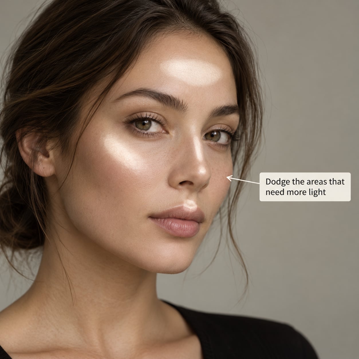
First, look at the frame before you paint anything and decide where the light came from. A window on one side, a softbox above and slightly forward, an overcast sky outdoors. Your dodge work should agree with that direction rather than inventing a new one.
On the dodge side of the light, the areas that usually benefit from a small lift are:
- The forehead centre and upper forehead, just off the hairline
- The tops of the cheekbones, along the line under the cheek
- The bridge and tip of the nose
- The cupid’s bow of the upper lip and the centre of the chin
- The iris and the small highlight on the wet edge of the eye
- Any hair highlights, hands, or the lip of a collar
Paint one area, then stop and look. Do not evaluate a single stroke at 100% zoom, because at that magnification almost every dodge looks too strong. Zoom out to fit and judge from there.
Build transitions rather than edges. Where a lit plane meets a shadow, let the brush fall off across the boundary. A hard stop in the middle of a cheek is what creates the plastic look later on.
4. Burn the areas that need more depth
Burning is what makes the dodge read as light instead of as a grey haze. It restores the shadow side and separates the subject from the background. The contrast between the two is doing the sculpting, so dodging without a matching burn usually leaves a face looking flat and unfinished.
Common burn zones:
- The crease of the upper eyelid and the socket just above it
- The area under the lower lash line and the inner corner of the eye
- The nostrils, and the shadow beneath the lower lip
- The sides of the face, from temple down past the jaw
- The hairline edges where hair meets forehead and cheek
- The sides of the neck, the shadow under the chin, and collarbone grooves
- The background directly behind the subject, if it is competing for attention
Burn more gently than you dodge. Shadows hold detail, and once those pixels are crushed they are gone. If you cannot read texture in a shadow area, you have gone too far, and the fix is to lower the layer’s strength rather than to paint over it.
In Photoshop with Curves layers, this is where the preset approach helps. Create one Curves layer with a point lifted above the midpoint, name it Dodge, and one with a point dropped below the midpoint named Burn. Paint at 1 to 3% flow with a 0% hardness brush and build passes until you see the change. Keep the points close to the midpoint; pushing them far creates a chalky, plastic look that no amount of careful painting will hide.
5. Refine transitions and correct unevenness
This is the stage that separates a good dodge and burn edit from an obvious one, and it is where most people stop too early.
Turn on the mask overlay and scan your work. You are looking for three things: edges with a visible line, patches where one area is clearly stronger than its neighbour, and any spot you painted twice by accident.
- Hard edges. Pick up a very large, very soft brush at low flow and feather the boundary, or hold Alt while dragging in Photoshop to pull the mask back where it strayed.
- Mismatched strength. Match the lighter area to the weaker one, not the other way around. If one cheek reads brighter, soften it rather than pushing the other one up.
- Doubled strokes. With curves or grey layer methods, lower the layer opacity slightly instead of painting more. Layer opacity affects the whole layer at once, which is why separate dodge and burn layers are worth the extra rows in your layer stack.
- Colour shift. If dodging has pushed skin toward grey or blue, set that layer’s blending mode to Luminosity so it only changes tone, or correct it with the Sponge tool on a duplicate.
Stay out of the habit of one heavy pass. Several thin passes give you a gradient you can steer, and you can always stop.
6. Check the portrait at full size and export
Quality control takes about two minutes and catches most of the damage. Zoom to 100% and check the skin, the eye corners, the hairline, and the boundary where the neck meets the background. Zoom out and check the overall shape: does the light now describe a face, or does it describe a set of bright patches?
Compare against the original with a toggle. In Photoshop, press the number keys above the top row with Alt held to switch between layers, or just set the dodge and burn layers to 0% opacity and watch what changes. In Lightroom, snapshot before you started and step back and forth between the two.
One more check worth doing: desaturate the image or convert a copy to black and white. Tone errors that hide in colour become obvious in black and white, particularly halos around the jaw and hair.
Export a full-size version first and look at it on a second screen or a phone before you size anything down for the web. Compression hides soft gradient banding, which means banding that shows up on the web usually exists in the master file too.
Common Mistakes and How to Fix Them
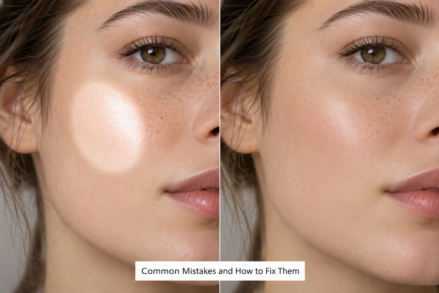
Every one of these comes up in editing forums and comment threads, usually from someone whose first attempt went too far. The fixes are specific because vague advice is what leaves people stuck.
Why does my dodge and burn edit look fake or pasted on? Usually three things at once: the dodge is too strong, the transition is too hard, and the skin texture was smoothed before the tone work. Fix it by dropping the dodge layer opacity a little, feathering the boundary with a large soft brush, and leaving visible pores alone. If a face reads as a mask sitting on the body, the jaw and neck edges have probably been over-dodged, so burn those edges back down.
How do I stop dodge and burn creating halos? A halo is just a hard edge with a light or dark ring around it. Keep hardness at 0% or near it, use a big feather value, and paint in thin passes. If you already have one, hold Alt and drag inside the mask to erase it back to the transition, then feather with a soft brush. Halos around hair are the most common version and they show up badly against a dark background, so check that edge last.
Why does my dodge look brighter in one place than another? Because you painted some areas more times than others. Turn on the mask overlay and even out the coverage with a low-flow pass, or drop the layer opacity until the patchiness disappears.
Why does dodging alone leave the portrait flat? Because light only reads as light when there is shadow next to it. Burn the shadow side, the eye sockets, the sides of the nose and the background. This is the most common beginner mistake and the easiest to fix.
Why does my skin look grey after dodging? Dodging pushes tones toward the middle of the range and desaturates them. Fix it on a duplicate layer with a Sponge tool at low flow, or set the dodge layer’s blending mode to Luminosity so it can only change tone and never colour.
Can I dodge and burn a portrait in Lightroom Mobile? Yes. Use the Adjustment Brush, pick Burn (Darken) or Dodge (Lighten) from the Effect dropdown, and tap and drag to pin a mask on the area. Size, Feather, Flow and Exposure sliders appear under the mask for the whole pinned region, which makes it a fast way to check a dodge on a phone before you commit to it at your desk.
Should I dodge and burn before or after skin retouching? After cleanup and before colour grading. Clean up first so your dodge is not painting over blemishes you are about to remove anyway, and grade last so you are judging tone rather than a colour cast.
Is dodge and burn a substitute for better lighting in camera? No. It shapes the light you already have, and it cannot invent a light source that was never in the frame. If a face was lit flat by overhead light, no amount of burning brings back the modelling a reflector or an off-camera flash would have given you.
Frequently Asked Questions
Can I learn how to dodge and burn a portrait as a beginner?
Yes, and the technique is more forgiving than it looks. Start in Lightroom Classic with the Adjustment Brush, dodge one area, and let go. Judge the result at a zoomed-out view rather than at full size, and remember that a first attempt which looks slightly too strong is easy to dial back. Most beginners get a usable result in their first sitting.
What brush opacity and flow should I use for dodge and burn?
Start low and build up in passes. For Photoshop layers and the grey layer method, use a soft round brush at 0% hardness with flow around 1 to 3%. In Lightroom Classic, flow of 15 to 25% with feather at 80 to 100 and exposure between 0.2 and 0.5 EV is a sensible starting point. Several thin passes beat one heavy one every time.
Should I use Curves or a dodge-and-burn action?
Curves if you want precise control or plan to reuse the setup across a series, because a saved layer preset keeps every portrait consistent. A dodge-and-burn action is fine for speed, but actions hide the numbers, which makes them harder to correct later. If you use a 50% grey Overlay layer instead, you get the same control with even less precision to worry about.
How do I keep dodge and burn from creating harsh patches?
Keep the brush soft, keep the flow low, and feather every boundary rather than painting to a defined edge. Turn on the mask overlay to find where you covered twice, then correct it by lowering layer opacity instead of painting more. If patches persist, your exposure value is too high, so reduce it and let several thin passes rebuild the effect.
Does frequency separation replace dodge and burn for portraits?
No, they solve different problems. Frequency separation smooths texture and colour blotches while keeping pores visible. Dodge and burn changes the light itself, which is what creates shape and depth. Editing communities tend to recommend dodge and burn for tone over frequency separation, and many retouchers now use it instead of frequency separation entirely.
How much dodging and burning is natural-looking?
Less than you think. If the result is obvious at a glance, it is too strong. Turn the dodge and burn layers off and on to check, and if you can see the difference without zooming, back off. Follow the direction of the light already in the frame and treat matching burns as half the work, since shadow is what makes added light believable.
Start with one portrait and do nothing but tone: dodge the forehead, the tops of the cheekbones and the bridge of the nose in thin passes, then burn the eye sockets, the sides of the face and the background to match. Toggle the layers off and on a few times, resist the urge to add more, and export. That single exercise teaches the judgment the rest of the technique depends on, and it is current guidance as of 2026 for Lightroom Classic, Lightroom Mobile and Photoshop alike.