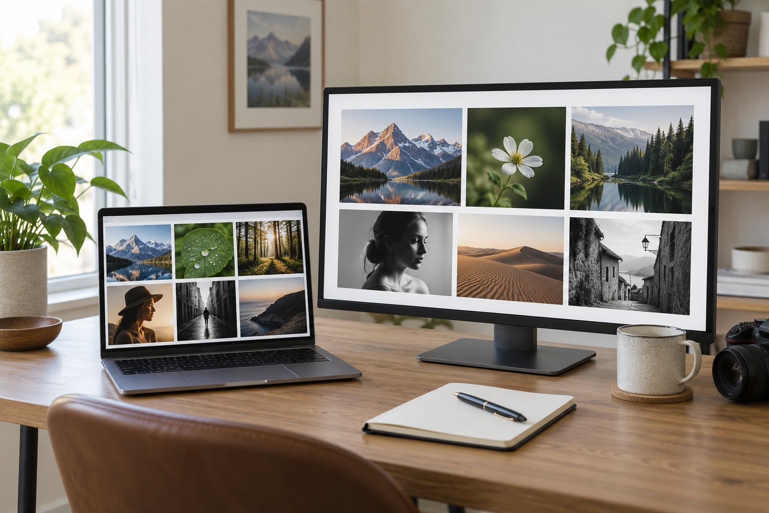
To build a photography portfolio website, you need three things: a small set of images that genuinely represent your style, a website builder or hosting account to hold them, and a custom domain so the site looks like yours. Most photographers get a working version live in a weekend, and the first version does not have to be the last.
That first sentence matters more than it sounds. The reason a portfolio site works is not the software, it is that a client lands on one page, sees thirty photographs that all look like the same photographer took them, and gets a clear way to start a conversation. A phone gallery or a social feed cannot do that consistently, because the algorithm decides the order and your best frame ends up fourth.
Here is what I have learned watching people go through this: the ones who finish their sites are rarely the best technicians. They are the ones who made a decision about who the site is for, cut their images down hard, and shipped something before they felt ready. The plan below walks through the whole process, from choosing images to connecting a domain and getting found in search.
A note on where I am coming from: I run a working photography site and help newer shooters put together theirs, so most of what follows is the process I would follow myself, not an abstract guide. If you read only one section, read step 2. Curating the images is the hard part, and the rest is clicking.
Table of Contents
- What You Need
- Step-by-Step: Build a Photography Portfolio Website
- Frequently Asked Questions
- What is the best platform for a photography portfolio website?
- How many photos should I include in my photography portfolio?
- Should I build a photography portfolio with WordPress?
- How do I display client photography without permission?
- Do I need a custom domain for my photography portfolio?
- How often should I update my photography portfolio website?
What You Need
You need far less than the checklist below suggests. Here is the honest list of what has to exist before you start building, gathered from the portfolios I have seen succeed and the ones that stalled.
- 30 to 50 edited photographs. Not 500. This is enough to build four or five gallery categories without repeating yourself.
- An editing workflow you can repeat. A preset, a Lightroom or Capture One develop setting, or a consistent recipe in whatever you use. The consistency matters more than the look.
- A website platform decision. A hosted builder, a WordPress theme, or a custom site. You can change this later, but changing after a year of work is painful.
- A domain name. Buy it from a registrar yourself and renew it annually on your own card, rather than letting a builder hold it in their account. Moving a domain later is the most common headache people hit.
- Your business details in writing. Name, location, service area, email, phone if you want calls, and three to five sentences about how you work.
- Testimonials, if you have any. Even three quotes from people you shot last year do more persuading than another gallery image.
- Analytics. Every major hosted builder includes it, and it takes one click to turn on. Skip it and you are guessing which pages work.
One decision I would make before the weekend starts: decide how many pages you are building. A one-page scrolling site is a legitimate choice and it can look excellent, but it will not hold a large body of work or a deep category structure. Five to eight pages is the sweet spot for a working photographer.
If you already have your images sorted into folders by subject, you are ahead of most people starting from a single folder called final_final_edited. I have seen that folder. It is never as final as the name promises.
Step-by-Step: Build a Photography Portfolio Website
The process runs in six steps: decide who the portfolio is for, prepare the images, plan the pages, choose how to build, design and write, then publish, test, and promote. Budget two focused days for the first pass and expect a small revision cycle afterward. The order is not flexible, because every later step depends on the decisions the earlier one settles.
1. Define Your Portfolio’s Goal and Audience
Start by naming one audience and one job for the site, because a portfolio that tries to serve everyone persuades nobody. Write it in a single sentence: “This site is for couples in the Portland area who want documentary wedding coverage, and its job is to get them to send an inquiry.” If your sentence needs the word “and” twice, it is too broad.
Your specialty is the first filter. Portrait shooters, fine art printers, and commercial photographers attract different visitors, and mixing all three in the same gallery makes the site feel unfocused. You can absolutely shoot all three for yourself, but the portfolio you publish should be led by the work you want more of.
Next, list the questions that audience brings to your site. A couple wants to know your style, your process, and what a wedding with you looks like. A commercial buyer wants turnaround, licensing, and reliability. A family wants to see whether you are warm with children. Those questions decide what evidence each page has to provide.
Write the evidence down per section. The home page needs a clear statement of what you shoot and where, plus one strong image and a way to contact you. The portfolio pages need work that answers the style question. The about page needs to address trust. The services page needs the practical details. The contact page needs to be impossible to miss.
If you cannot write that one sentence, take an hour and look at where your last five paying jobs came from. The answer is almost always sitting in your inbox or your inquiry form history, not in the hobby shoots you enjoy most.
2. Curate and Prepare Your Best Photographs
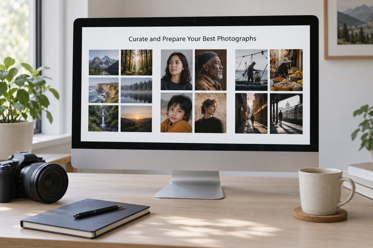
Select a cohesive body of work first, then edit it consistently. A useful shortcut is the 20/60/20 approach photographers use for curation: roughly 20 percent of your selections are the strongest images, the standouts that will hold the first screen of a gallery; about 60 percent are work that shares the same visual approach and supports the lead images; the last 20 percent shows range, a different subject, lighting, or treatment so the site does not read as one shoot on repeat.
In practice that means each gallery has a few images that do the talking, a supporting set in the same vein, and a couple that stretch you. If you cannot fill a gallery of eight to twelve images with work you would print, you do not have a gallery yet, you have a folder.
Editing consistency is what makes a portfolio read as a single body. Set up a repeatable starting point in your editor and apply it across the whole selection, then adjust per image. A slight variation in contrast or warmth between two images of the same series is instantly visible when they sit next to each other in a grid.
Next, export the sizes you will actually use. You need a large version for the gallery view, a medium size for a two or three column grid, and a thumbnail around 300 pixels for layout work. Exporting one oversized file and letting the browser shrink it is the most common reason a portfolio feels slow. Modern browsers do a decent job with moderate JPEG files, so you do not need to become an expert in image formats, but you do need to stop uploading 12-megabyte originals straight from the camera.
Progressive loading matters as much as file size. Ask the builder to load large images as a visitor scrolls toward them rather than all at once on page load. On a phone connection, that single setting is often the difference between a visitor waiting two seconds and a visitor leaving.
Write alt text for every image, and write it as a description, not a keyword list. “Bride and groom walking between rows of trees at golden hour” tells a screen reader user what they would otherwise miss. If the image is purely decorative behind a heading, leave the alt empty rather than repeating the caption. This is the fastest accessibility win on the whole site and it takes about a minute per image.
A contact sheet, whether built in Lightroom, Bridge, or a simple grid layout, keeps the sequencing honest. Look at your selection as thumbnails before you build anything. If the set feels scattered on a contact sheet, it will feel scattered on the page.
3. Plan the Pages and Navigation
Build a simple site map before you open a template, and you will avoid the most common rebuild later. Seven pages cover nearly every working photographer: home, portfolio index, two to five category pages, about, services, and contact. A booking or inquiry page can replace or sit inside contact if you use a scheduling tool.
The home page does one job: get someone to your work or into contact. Put a short line about what you shoot, your location or service area, one strong photograph, and a clear link. Everything else on that page is competing with the work.
The portfolio index page is a menu of categories, not a dumping ground. Four or five labelled categories with a single representative image each beats one page of mixed thumbnails, because it lets a visitor self-select and arrive at the work that matches what they need.
Category pages hold eight to fifteen images each in a clean grid, with a slideshow or lightbox view on click. Keep the grid to two or three columns on desktop and let the images keep their aspect ratio so nothing gets cropped awkwardly without a reason.
The about page answers three things: who you are, what you shoot, and how it feels to work with you. A short paragraph, two or three frames from a working session, and your location. Skip the childhood biography unless clients are actually booking you for a family session.
The services page lists what you offer, what is included, and how people start. Keep the language plain: what the session is, how long it runs, what they receive, and what happens next. If a booking form is available, put it on this page as well as on contact.
Contact is the page you will lose the most revenue by getting wrong. Use a real email address, a form that reaches your inbox, your phone number if you take calls, and your location or service area. A visitor who has to hunt for a way to start a conversation simply leaves.
Keep the navigation flat. Home, Portfolio, About, Services, Contact, with the portfolio categories as a dropdown or a second-level row is plenty. Every extra click between the home page and an image costs you views.
4. Choose How to Build the Website
There are three real routes to a finished portfolio, and picking the wrong one is the most expensive mistake a new photographer makes. Hosted builders are the fastest and the least flexible. WordPress themes sit in the middle: more control, more work, more ways to break. Custom development gives you total control and asks you to maintain a server yourself.
Hosted builders cover Squarespace, Wix, Adobe Portfolio, Webador, Format, and similar tools. You sign up, pick a template, drag your images in, and connect your domain. Adobe Portfolio is a different model: it comes with a Creative Cloud subscription and builds directly from your Lightroom catalog, so the images you publish stay in sync with the folders you already maintain. It is a strong fit for a photographer who already lives inside Adobe software and wants almost no design decisions. It is a weaker fit if you want a custom domain-driven site with a specific structure.
Wix and Squarespace give you far more layout control, a wide template library, and their own form, booking, and ecommerce tools. Both are capable of holding a serious professional portfolio. The trade-off is that you are inside someone else’s system: pricing changes, features move between plans, and your content lives in their database.
WordPress is the flexible middle route. A photography-specific theme gives you full control over gallery layouts, ordering, and page structure, and a plugin ecosystem covers client proofing, password-protected galleries, watermarking, and print sales. The costs are real and mostly hidden: updates to break, plugin conflicts, web hosting to pay for, and a learning curve that can eat a whole weekend the first time.
One problem photographers report repeatedly with WordPress themes is image management. Files often upload into dated folders and the reordering interface fights you, especially with very large galleries. Test the ordering workflow with thirty images before you commit, not after.
Custom development means building it yourself with code, or hiring a developer. A static site generator such as Hugo, Jekyll, or Astro, hosted on a small server or a platform like GitHub Pages, produces extremely fast pages and near-zero maintenance. It also assumes you are comfortable with command lines, DNS, and SSL, or that you have someone who is. Pick this route when the site is part of a professional identity and you want it to load in under a second on a phone.
Client delivery platforms such as Pixieset and SmugMug sit in their own category. They excel at sending proofs, collecting selections, and handling download rights for a specific client. They are not designed as public portfolio sites with category structure, service pages, and search visibility. Many photographers run one of each: a public site for the work, a delivery platform for the client. If client proofing is central to how you work, evaluate those features on their own terms.
Here is the decision I would make with a new photographer’s situation in mind. If you shoot weekends and want the site live before your next booking cycle, use a hosted builder and put your energy into image selection. If you already have paying clients, move to WordPress when you need a booking system, proofing, or print sales, and not before. If your work is fine art or editorial and speed is part of the pitch, the custom route is worth learning.
Whatever you choose, buy the domain separately. Keep control of the nameserver and the renewal, so leaving a platform later is a settings change rather than an argument.
Worth considering alongside any of the above: if you only want a printable or downloadable version of your work, the photo editing and workflow guides cover the preparation stage, which is where most of the quality lives.
5. Design and Write the Pages
Build a simple visual system and stick to it: one typeface in two weights, one neutral background, and a consistent amount of white space around images. Photography should be the only thing that changes from page to page. If your accent color, button styles, and heading treatments shift between sections, the site starts to feel assembled rather than designed.
Write short copy. Most pages need three or four sentences, not paragraphs. Say what you shoot, where you work, and what the experience is like. Tell the story behind one or two specific images, because a paragraph about a real commission does more for your credibility than any template feature. Cut anything that exists to fill space.
On the services page, be concrete about what a client receives: how long the session runs, how many images, when they arrive, and what the next step is. Clear expectations here prevent most of the awkward inquiry emails later.
Design for a phone first. Open every page at a narrow width and check that the images fit, the menu works, and the contact button is reachable with a thumb. Most of your traffic will come from a phone held in one hand, often on cellular data, and a layout that only works on a wide monitor is a layout that only works for you.
Check contrast while you are in there. Body text sitting on a pale photograph is difficult for many people to read, even with sharp eyesight. Put text on a solid background or a solid overlay rather than directly across a busy image, and make sure focus outlines are visible so the site is usable with a keyboard alone.
6. Publish, Test, and Promote the Portfolio
Before you announce the site, run through a technical pass. Confirm the domain points at your hosting, the SSL certificate is active and the address bar is secure, every internal link resolves, images have alt text, the contact form delivers to an inbox you actually check, and no draft page is reachable from the navigation.
Test the whole thing on a real phone, not just a browser window resized on your laptop. Load a gallery on cellular data and note how long it takes before the first images appear. Then run a page speed check and fix whatever it flags, usually oversized images and scripts that are not needed on an image-heavy page.
On search visibility, three basics do most of the work. Write a unique page title and meta description for each page rather than repeating one across the site. Keep the address structure simple and human-readable. Submit the site to Google Search Console and generate a sitemap so new work can be indexed without waiting. Add structured data marking the images as images; most hosted builders have a toggle for this in the page settings.
Set up analytics, then look at three numbers each month: which pages get visits, where visitors arrive, and what they do next. If a category page gets traffic and nobody moves to your contact page, the problem is usually the missing path between them, not the photography.
Promotion starts the day you launch and it is mostly repetition. Post one image from a new gallery to your social channels with a link back to that specific page rather than the home page. Add your site link to your email signature and your profiles. Submit a handful of genuine images to relevant photography communities rather than spamming links. If you serve a local area, a Google Business Profile with your best work listed is one of the cheapest sources of local inquiries you can set up.
Then let the site do its job. Reach out to every person who has shot with you and ask directly whether they would leave a testimonial or send you to a friend. Referrals still drive more photography work than any portfolio feature, and a portfolio site simply makes that conversation easier by giving people somewhere to look first.
Common Mistakes
Almost every bad portfolio I have reviewed fails in the same handful of ways, and every one of them has a straightforward fix.
Too many images, not enough strong ones. Forty near-identical frames from one session reads as volume, not skill. The fix is the 20/60/20 balance from step 2: fewer images, a clear lead frame, and a supporting set that shows range.
Uploading original files straight from the camera. Huge images make galleries slow on mobile data, which is exactly where most visitors are. Export display-sized versions, load them progressively, and let the grid thumbnails stay small.
Confusing navigation. Categories buried three levels deep, or portfolio pages linked only from a carousel nobody clicks, are functionally invisible. Keep the menu flat, link every category from the portfolio index, and link to the galleries from the home page.
No obvious path to contact. If the only route to your email is a contact page with no navigation link from the gallery, you will miss inquiries. Put the same contact link in the header, the footer, and at the end of each category page, and keep it a single click from anywhere.
Ignoring search basics. Duplicate titles, missing alt text, and no sitemap all limit how much of your work gets found. Fifteen minutes in Search Console plus real alt text on your strongest images is enough to matter.
Inconsistent presentation. Mixed color treatment, five different crops, and images at three different aspect ratios make even good work look careless. Fix it with a develop recipe, one aspect ratio for grid images, and a single set of type and spacing rules.
Hiding the person behind the work. If your about page is three words long, you have removed every reason for a client to trust you with their wedding or their family. Write a real paragraph and add a frame or two of yourself working.
A few closing suggestions. Publish on a schedule you can sustain, even if that is one new gallery a quarter. Ask five photographers and five non-photographers to look at the site without explaining anything, and watch where they hesitate. Then fix the first thing they struggled to find, and stop working on the site for a while.
Frequently Asked Questions
What is the best platform for a photography portfolio website?
For most working photographers, a hosted builder such as Squarespace or Wix gives the best balance of design quality, image handling, and maintenance. Adobe Portfolio suits photographers already inside Creative Cloud who want galleries that pull directly from Lightroom. WordPress pays off once you need booking, proofing, or print sales, and a custom build is worth it when speed and full control matter more than your time.
How many photos should I include in my photography portfolio?
Thirty to fifty edited images across your whole portfolio is a solid starting point, split into four or five category galleries of eight to fifteen images each. Add new work slowly and archive older galleries rather than letting the total climb. A smaller, tightly edited set consistently makes a stronger impression than a large archive of mixed quality.
Should I build a photography portfolio with WordPress?
Choose WordPress when you need features hosted builders do not offer, such as password-protected client proofing, detailed booking workflows, print sales, or a gallery layout that matches your images exactly. It costs more of your time: updates, plugin conflicts, and hosting all become your responsibility. If you just want a beautiful, fast public site, a hosted builder is the faster and safer route.
How do I display client photography without permission?
Get written permission before publishing, and agree on scope in writing before the session. A model or property release is the standard document, and many commercial clients require one before any image is used. If a client hesitates, offer a private gallery for a limited time instead of a public portfolio page, and never publish images of minors without a parent or guardian release.
Do I need a custom domain for my photography portfolio?
Yes, and you should register it yourself rather than letting a builder hold it. Your own name looks more professional, it keeps your address if you switch platforms later, and the annual cost is minor. Most builders will point any domain you buy elsewhere at your site, and the setup takes under an hour including the SSL certificate.
How often should I update my photography portfolio website?
Refresh it in small increments rather than in a total rebuild. Add a new gallery every few weeks, swap your strongest image on the home page, and check once a quarter that contact forms, links, and your analytics still work. A full redesign is rarely needed, and starting over usually costs you a month of progress for very little gain.
Start with the images, not the platform. Pick your specialty, choose thirty to fifty frames that all look like the same photographer took them, and put them in four or five categories. Once that set is finished, choosing a builder takes an afternoon instead of a month.
Then build one complete page before you build six. Home page, one gallery, one contact form, live on a domain you own. Get that in front of two people you trust and watch them use it. Everything after that is a matter of patience and small improvements.